Today the Women’s Tennis Association (WTA) and SAP announced the launch of the official WTA Finals mobile app just in time for the BNP Paribas WTA Finals in Singapore – press release.
 The app has been in progress for much of 2015 so I was happy to finally see SAP and WTA deliver on their promise of “taking the fan experience to the next level.”
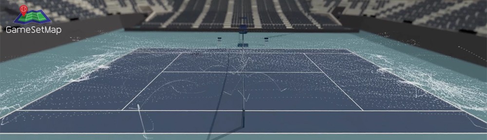
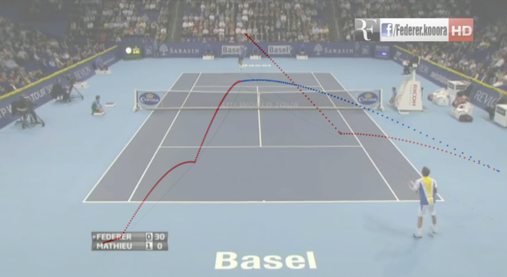
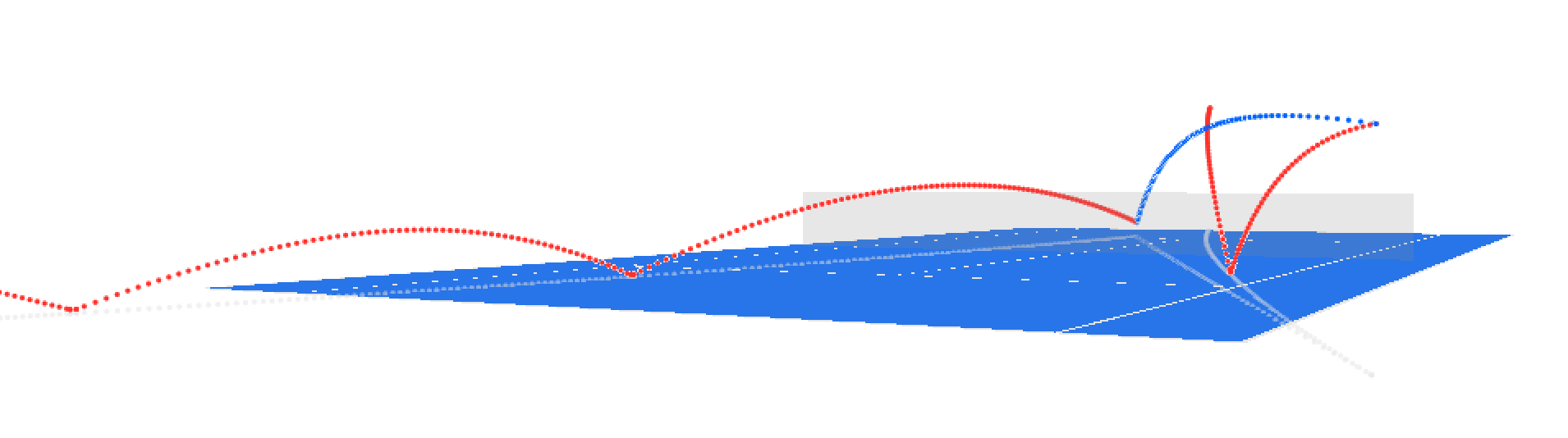
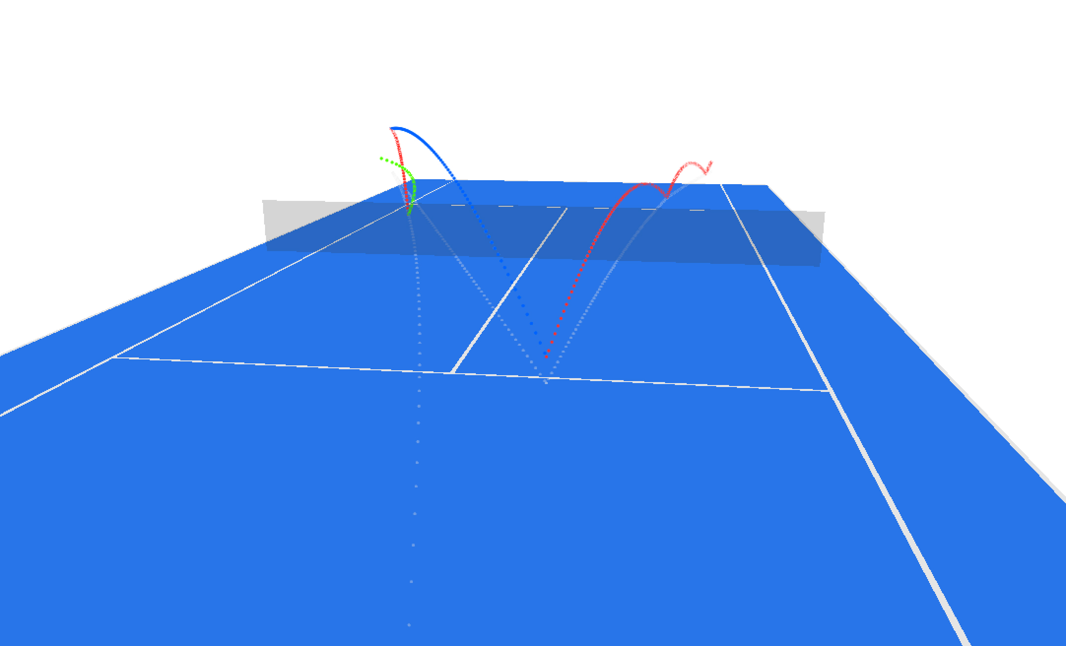
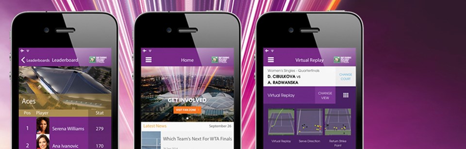
The app has all the usual features of a tennis app; live scores, news and videos, schedules, draws etc. But what makes this app “groundbreaking” is a feature called Virtual Replay where users can watch an animated point-by-point replay of the match unfolding right before their very eyes. It’s kind of cool to watch the ball trajectory animate over the net between the players (for what it’s worth). Unfortunately it’s not clear which player is playing at which end as the animation runs through. You will need to read the commentary of the point from below the animation to figure that out.
The default view of the animation is a normal camera view (from one end of the court) but users have the ability to change the view to 3 other camera angles which is a nice touch.

Users can then choose which point they want to watch from the point-by-point breakdown, which is a neatly organized commentary of each point from the match showing the point score, and key actions made by each player.
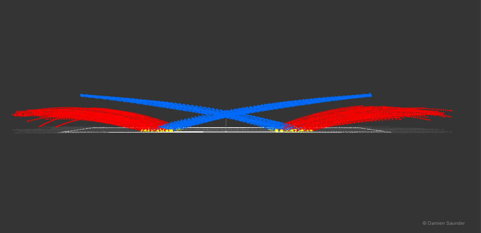
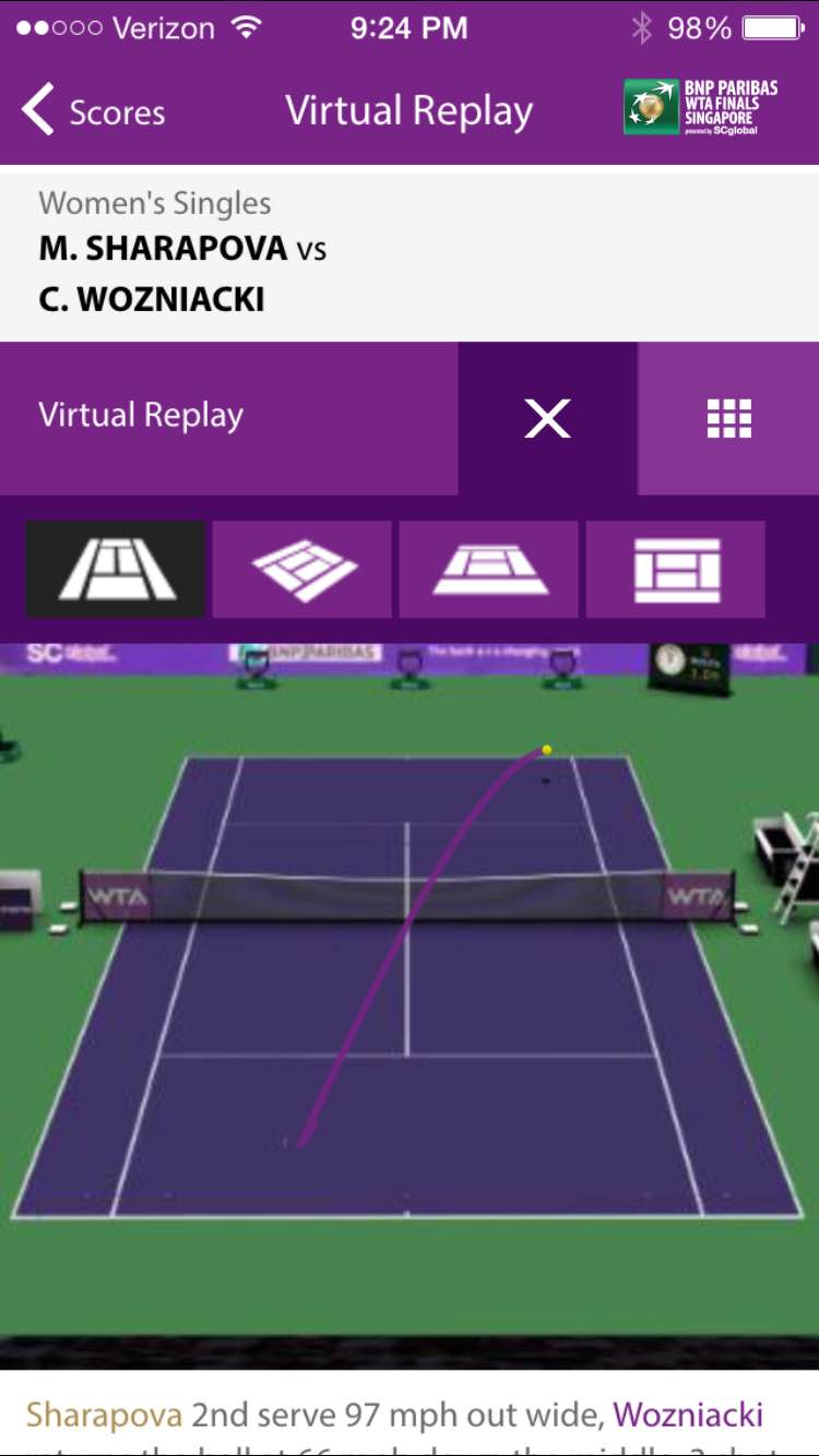
The app also includes additional visualisations like Serve Direction (below).
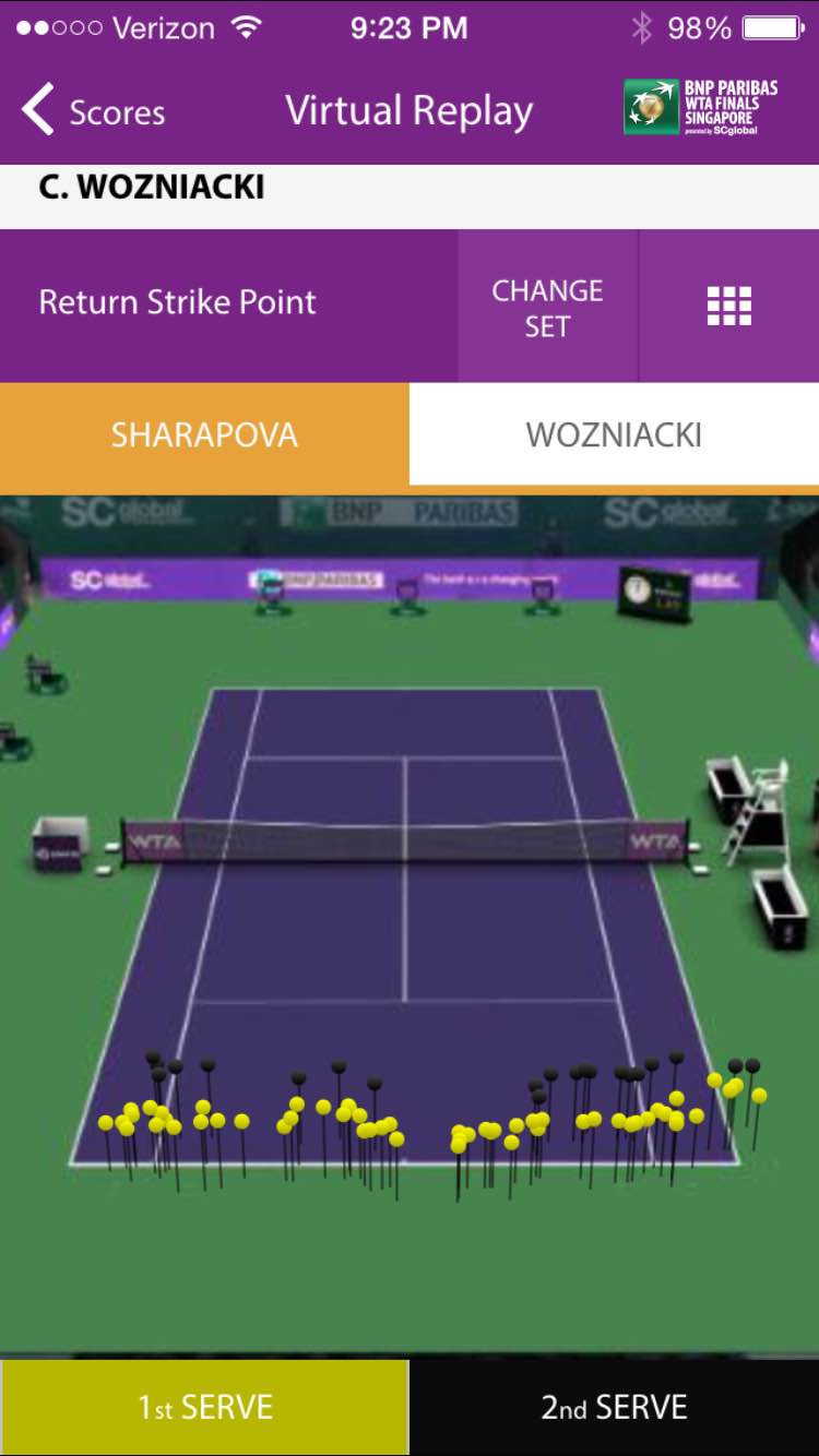
Return Strike Points
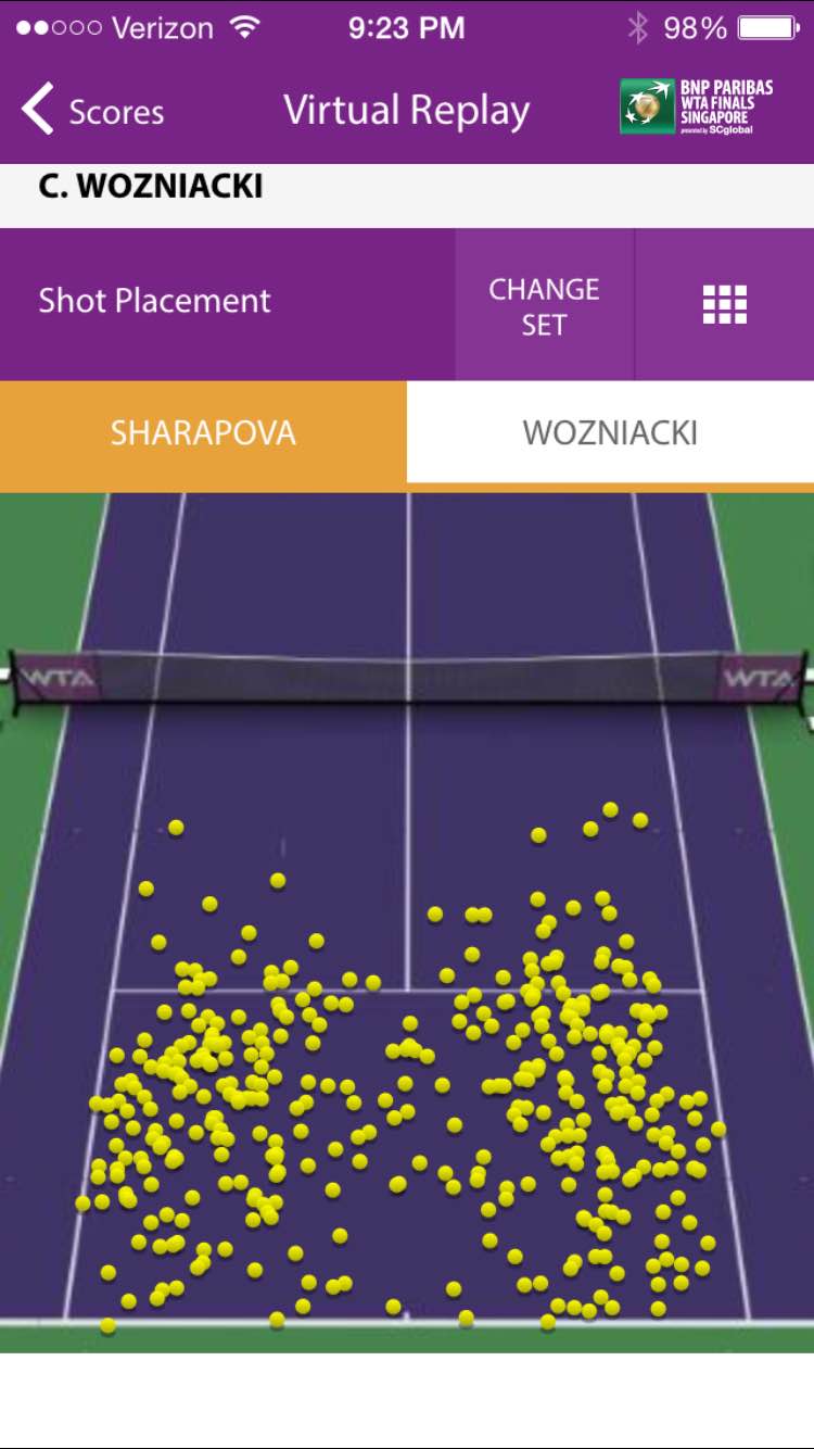
Shot Placement
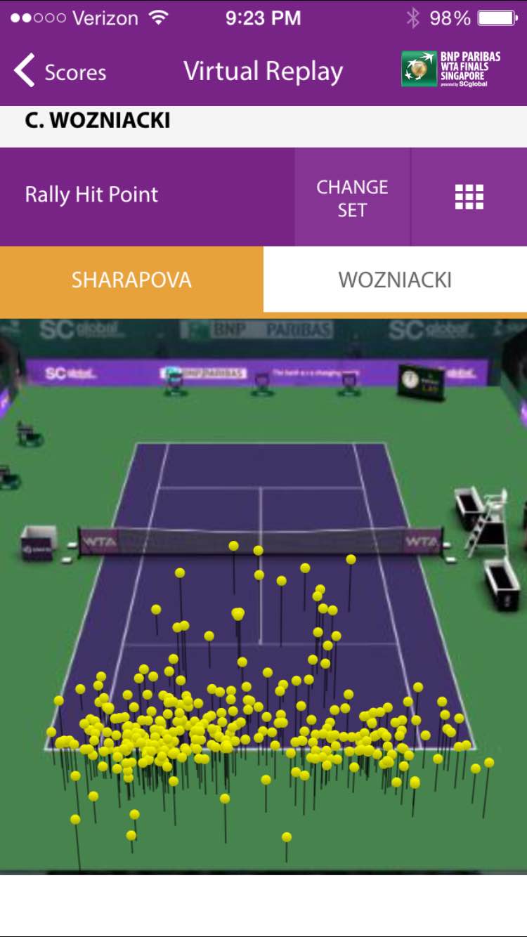
Rally Hit Point
All of the visualizations allow you to switch between players, and you can change the Set you want to view at any time. It all makes for a very impressive mobile application, and is certainly light years ahead of any other tennis app I have seen. It is also no mean feat to package all of this content up in a very usable, and engaging mobile app that fans are sure to love and embrace.
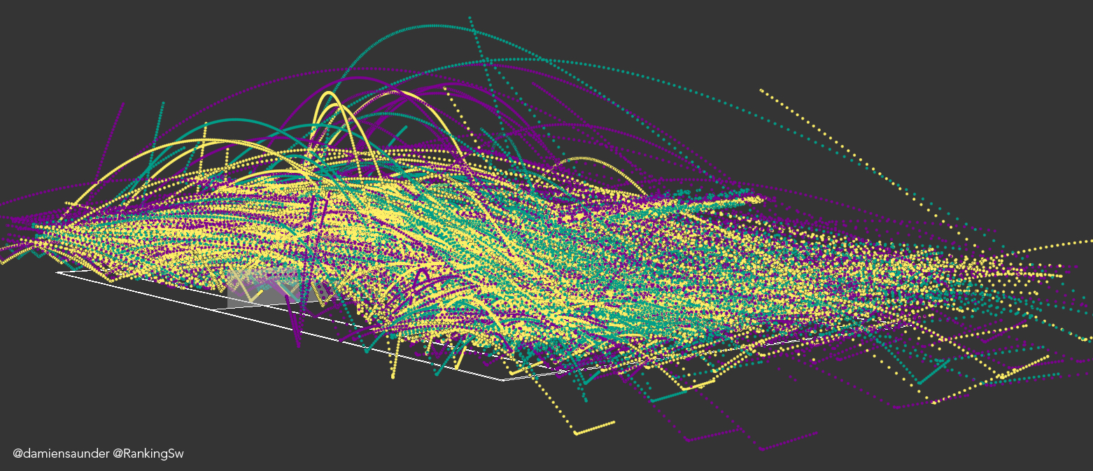
So how useful is all of this? Well, to be honest we’ve kind of seen it all before. Hawk-Eye through their various relationships with TV Broadcasters like ESPN and the BBC have been publishing these types of visualizations for a number of years. Admittedly we have not had access to this level of information post match and in the palm of our hand before, so this is new ground definitely. But we are not really seeing anything new here.
The visualizations in the app unfortunately lack some valuable context in order to make them really useful for players, coaches and the fans. For example they are simply static representations of the data. You can’t query them (by touch), or filter them, or overlay one player’s points on another in order to perform any additional analysis. There is no significance attached to the data, like winners, unforced errors, big point plays etc. There is no way of knowing whether the patterns we see are expected, or a cause for alarm given the sate of the match, or past performances against this player. Perhaps we’ll see this kind of contextual information added in future releases. SAP and the WTA claim they have worked closely with the players to develop the app to their needs. However my feeling is most astute coaches and players will see these visualizations as nothing more than eye candy (for now).
As a tennis fan, and analyst of the game, the application naturally left me wanting more, and I suspect coaches and players will feel the same. What the WTA has effectively done is open up a big can of worms. The visualizations in the app leave so many questions unanswered, which is not untypical of a all-in-one app like this. But it does provide a wonderful insight into the potential of these kinds of visualizations. In order for players to really benefit from the true potential of this rich dataset from Hawk-Eye they are likely to still undertake independent analysis which dives much deeper in geographic patterns and tendencies than what we see here.
Hats off to the WTA for leading the way with this new-age tennis app. It has raised the bar and expectation going forward, and it definitely takes the mobile fan experience to a new level. I look forward to hearing what the players and coaches really think. My understanding is they will be given a more comprehensive app for on-court coaching, which may pack a few more tricks than what we see here. That may or may not be a good thing given visualisations like these tend to take time to digest, assess, and decide what action to take. This will be a new challenge for coaches, particularly in the heat of the battle. My sense is this kind of information will be primarily used post-match when emotions and the tension from a match have passed. It will also be interesting to see how the ATP respond over the coming months/years. Perhaps they too will partner with SAP to deliver a similar app for the mens tour if this takes off.
The WTA application was tested on an iPhone 6.