The research below was completed in early January, 2013.
Geovisualizing spatio-temporal patterns in tennis:
An alternative approach to post-match analysis
Damien Demaj
Esri
380 New York Street, Redlands, CA 92373
Abstract
Traditional methods for summarizing tennis matches have long ignored the spatio-temporal component of the match, and often fail to geovisualize patterns by way of map or graphic. This paper presents alternative approaches to post-match analysis using geospatial data analysis with a Geographical Information System (GIS). A case study focusing on the spatial variation of serving from the London Olympics Gold Medal match, where Andy Murray defeated Roger Federer 6-2, 6-1, 6-4, is conducted. By mapping the relationship between space and time, we were able to visually and statistically quantify that Federer served with more spatial variation during the match. Murray, however, served with greater spatial variation at key points during the match. Results suggest that there is potential to better understand players serve tendencies using spatio-temporal analysis. The importance of such analysis for coaches, players, fans and the media to further explore player tactics and strategies are discussed.
1 Introduction
Traditional tennis statistics have long ignored the spatio-temporal component of the game and it is often overlooked in post-game media and TV commentary. A typical summary of tennis match statistics fails to answer many important questions about the match. Using geospatial and visual analysis with a GIS, there is a real opportunity to better understand tennis matches. Geospatial analysis can be defined simply as “what happens where and when” [1] and can vary from a simple map to more complex methods such as, models that mimic match like conditions by combining numerous data layers [2]. The benefits of visual analysis have long been recognized [3], but is rarely used to study the results of matches using maps.
Most research in tennis reports the probability of winning tennis matches and predicting outcomes [4,5,6,7,8]. Klaasen and Magnus [4], Barnet and Clarke [6,8] used mathematical models to forecast the results of tennis based on totals and percentages providing valuable forecasting models for the field of tennis. Schroeder et el [9] and Terroba et el [10] both explored patterns from tennis matches in an attempt to find similarities between events and event sequences. ESPN, the New York Times and the BBC have a recent history of producing simple graphics during match play and post match. Most of these graphics are limited in their content and knowledge transfer, either due to time limitations (TV) or page space (print and online), or data attribution. Within sport but outside of tennis, some spatio-temporal research has been completed. Moore et el [11] questioned if rugby and time geography was a good match? Gatrell and Gould [12] used data from a Liverpool v Manchester United football match to define the spatial relations between players and teams. Goldsberry [13] revealed spatial differences of shooting tendencies for NBA players. In tennis however, spatio-temporal analytics is a relatively new area of study, even though much about the game of tennis is about space and time, like player movement and the location and direction of shots.
The serve is arguably the most important shot in tennis. The location and predictability of a players serve has a big influence on their overall winning serve percentage. A player is who is unpredictable with their serve, and can consistently place their serve wide into the service box, at the body or down the T is more likely to either win a point outright, or at least weaken their opponent’s return [14].
The results of tennis matches are often determined by a small number of important points during the game. It is common to see a player win a match who has won the same number of points as his opponent. The scoring system in tennis also makes it possible for a player to win fewer points than his opponent yet win the match [15]. Winning these big points is critical to a player’s success. For the player serving, their aim is to produce an ace or, force their opponent into an outright error, as this could make the difference between winning and losing. It is of particular interest to coaches and players to know the success of players serve at these big points.
This research focuses on using geospatial analytics and compelling maps to capture key serving patterns of each player. These maps have the potential to support the tactical preparation for players and coaches and allow them to better understand their opponent’s probable serve tendencies through match analysis.
2 Methodology
2.1 Subjects
The Olympic Gold Medal tennis match was played on Sunday, August 5th, 2012. Andy Murray defeated Roger Federer 6-2, 6-1, 6-4, in 1hr 56min. The match was played on Centre Court at Wimbledon. Roger Federer was the number 1 seed; Andy Murray was the number 4 seed. Both Federer and Murray appeared to be both playing without injury in the final. The roof remained opened at all times during the match, and the playing conditions appeared ideal for a grass court tennis match.
2.2 Data Collection
We collected 1706 discrete spatial points associated with the ball position using Esri’s ArcScene 3D GIS visualization application. The data were collected from streaming video of the match and stored in a file geodatabase (Figure 1). This spatial accuracy of each point was recorded to +/-20 cm (7.8 inches).
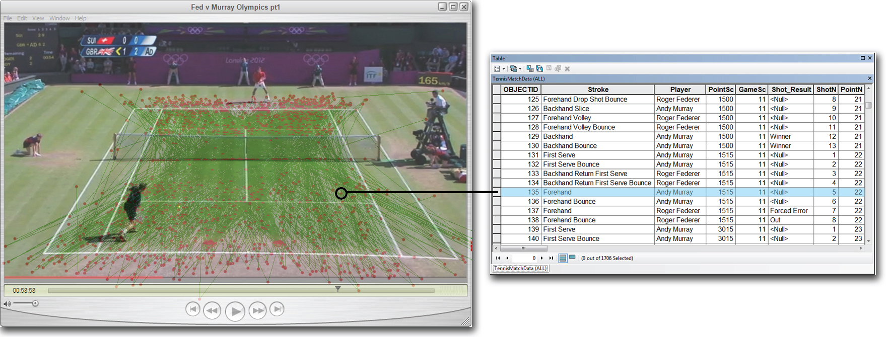
Figure 1. The complete set of spatial data associated with the Gold Medal match. The red dots represent the player’s stroke position and ball bounce. The green lines represent the direction of ball travel for each shot. By using GIS we were able to quickly capture, store and visualize the spatial point data from the match. (click to enlarge image)
For each ball location we were able to define an x, y location in relation to the court. A set of attributes associated with each event were collected and stored in the file geodatabase, including; who played the stroke, what type of stroke was played, who was serving etc. The table in Figure 1 displays a snapshot of the fields and field values from the file geodatabase.
At the time of research, Hawk-Eye data (which uses a series of fixed positioned tracking camera’s to model the flight of the ball [16]) was not publically available. Many other content-based indexing systems have been tested and researched to retrieve data from sports matches [17]. Wang and Parameswaran [18] discuss some of the methods and issues with automated detection of events from sports video. Accurate ball detection and attribution from tennis videos still remain a challenge due to the relatively small, fast moving ball which when in motion blurs its shape. There are also many distractions during play that make automated ball detection difficult; such as line markings, players and court assets [17]. Given these limitations, the data collection process for this research was largely a manual one, however this allowed us to build a data model to specifically meet our requirements with an acceptable level of accuracy.
2.3 Geospatial Analysis
In order to demonstrate the effectiveness of geo-visualizing spatio-temporal data we conducted a case study to determine the following: Which player served with more spatio-temporal variation at important points during the match? As such, this analysis aims to identify where each player served and introduce spatial variation as a means of finding who the more predictable server was during the match. Furthermore, we will evaluate the relationship between where each player served and their success at important points during the match.
To find out where each player served during the match we plotted the x,y coordinate of the serve bounce. A total of 86 points were mapped for Murray, and 78 for Federer. Only serves that landed in were included in the analysis. Visually we could see clusters formed by wide serves, serves into the body and serves hit down the T. The K Means algorithm [19] in the Grouping Analysis tool [20] in ArcGIS (Figure 2) enabled us to statically replicate the characteristics of the visual clusters. It enabled us to tag each point as either a wide serve, serve into the body or serve down the T. The organisation of the serves into each group was based on the direction of serve. Using the serve direction allowed us to know which service box the points belong to. Direction gave us an advantage over proximity as this would have grouped points in neighbouring service boxes.
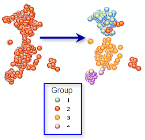 Figure 2 [20]. The K Means algorithm in the Grouping Analysis tool in ArcGIS groups features based on attributes and optional spatial temporal constraints.
To determine who changed the location of their serve the most we arranged the serve bounces into a temporal sequence by ranking the data according to the side of the net (left or right), by court location (deuce or ad court), game number and point number. The sequence of bounces then allowed us to create Euclidean lines (Figure 3) between p1 (x1,y1) and p2 (x2,y2), p2 (x2,y2) and p3 (x3,y3), p3 (x3,y3) and p4 (x4,y4) etc in each court location. It is possible to determine, with greater spatial variation, who was the more predictable server using the mean Euclidean distance between each serve location. For example, a player who served to the same part of the court each time would exhibit a smaller mean Euclidean distance than a player who frequently changed the position of their serve. The mean Euclidean distance was calculated by summing all of the distances linking the sequence of serves in each service box divided by the total number of distances.
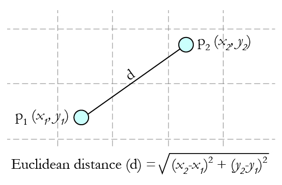 Figure 3. Calculating the Euclidean distance (shortest path) between two sequential serve locations to identify spatial variation within a player’s serve pattern.
To identify where a player served at key points in the match we assigned an importance value to each point based on the work by Morris [21]. The table in Figure 4 shows the importance of points to winning a game, when a server has 0.62 probability of winning a point on serve. This shows the two most important points in tennis are 30-40 and 40-Ad, highlighted in dark red. To simplify the rankings we grouped the data into three classes, as shown in Figure 4.
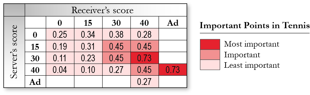 Figure 4. The importance of points in a tennis match as defined by Morris. The data for the match was classified into 3 categories as indicated by the sequential colour scheme in the table (dark red, medium red and light red).
In order see a relationship between outright success on a serve at the important points we mapped the distribution of successful serves and overlaid the results onto a layer containing the important points. If the player returning the serve made an error directly on their return, then this was deemed to be an outright success for the player. An ace was also deemed to be an outright success for the server.
3 Results
Federer’s spatial serve cluster in the ad court on the left side of the net was the most spread of all his clusters. However, he served out wide with great accuracy into the deuce court on the left side of the net by hugging the line 9 times out 10 (Figure 5). Murray’s clusters appeared to be grouped overall more tightly in each of the service boxes. He showed a clear bias by serving down the T in the deuce court on the right side of the net. Visually there appeared to be no other significant differences between each player’s patterns of serve.
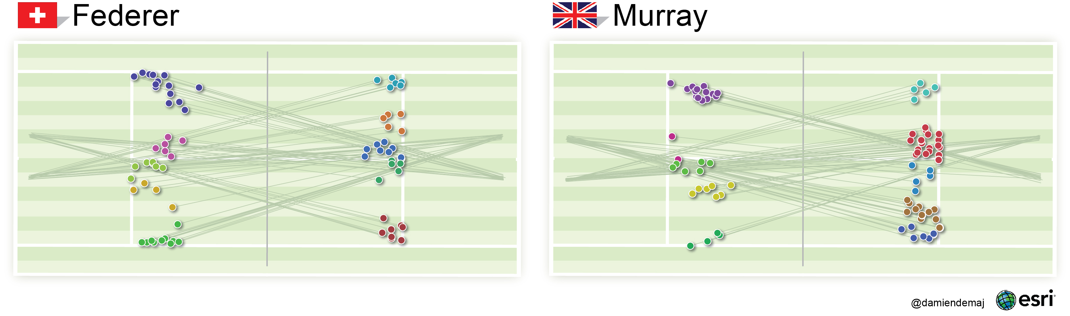
Figure 5. Mapping the spatial serve clusters using the K Means Algorithm. Serves are grouped according to the direction they were hit. The direction of each serve is indicated by the thin green trajectory lines. The direction of serve was used to statistically group similar serve locations. (click to enlarge image)
By mapping the location of the players serve bounces and grouping them into spatial serve clusters we were able to quickly identify where in the service box each player was hitting their serves. The spatial serve clusters, wide, body or T were symbolized using a unique color, making it easier for the user to identify each group on the map. To give the location of each serve some context we added the trajectory (direction) lines for each serve. These lines helped link where the serve was hit from to where the serve landed. They help enhance the visual structure of each cluster and improve the visual summary of the serve patterns.
The Euclidean distance calculations showed Federer’s mean distance between sequential serve bounces was 1.72 m (5.64 ft), whereas Murray’s mean Euclidean distance was 1.45 m (4.76 ft). These results suggest that Federer’s serve had greater spatial variation than Murray’s. Visually, we could detect that the network of Federer’s Euclidean lines showed a greater spread than Murray’s in each service box. Murray served with more variation than Federer in only one service box, the ad service box on the right side of the net.
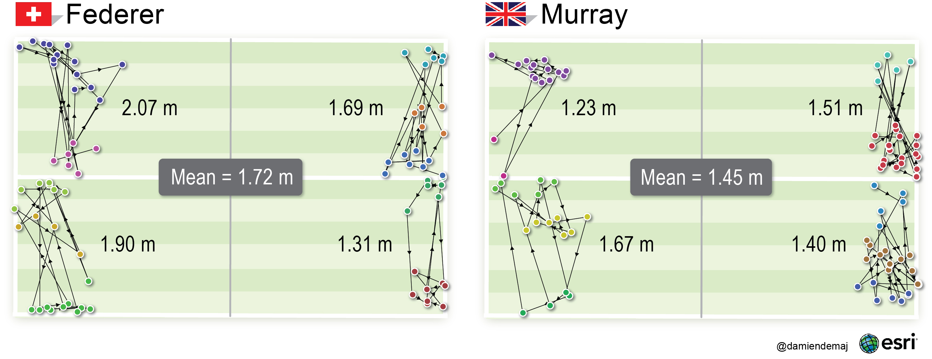
Figure 6. A comparison of spatial serve variation between each player. Federer’s mean Euclidean distance was 1.72m (5.64 ft) – Murrray’s was 1.45m (4.76 ft). The results suggest that Federer’s serve had greater spatial variation than Murray’s. The lines of connectivity represent the Euclidean distance (shortest path) between each sequential service bounce in each service box. (click to enlarge image)
The directional arrows in Figure 6 allow us to visually follow the temporal sequence of serves from each player in any given service box. We have maintained the colors for each spatial serve cluster (wide, body, T) so you can see when a player served from one group into another.
At the most important points in each game (30-40 and 40-Ad), Murray served out wide targeting Federer’s backhand 7 times out of 8 (88%). He had success doing this 38% of the time, drawing 3 outright errors from Federer. Federer mixed up the location of his 4 serves at the big points across all of the spatial serve clusters, 2 wide, 1 body and 1 T. He had success 25% of the time drawing 1 outright error from Murray. At other less important points Murray tended to favour going down the T, while Federer continued his trend spreading his serve evenly across all spatial serve clusters (Figure 7).
The proportional symbols in Figure 7 indicate a level of importance for each serve. The larger circles represent the most important points in each game – the smallest circles the least important. The ticks represent the success of each serve. By overlaying the ticks on-top of the graduated circles we can clearly see a relationship between the success at big points on serve. The map also indicates where each player served.
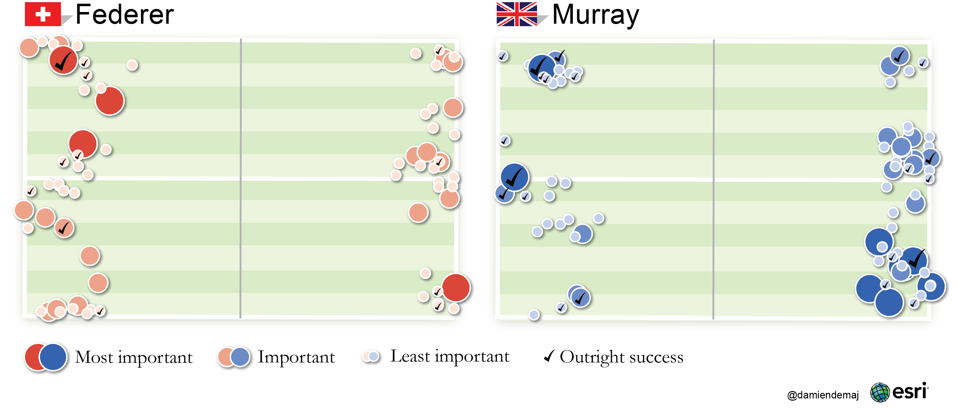 Figure 7. A proportional symbol map showing the relationship of where each player served at big points during the match, and their outright success at those points. (click to enlarge image)
The results suggest that Murray served with more spatial variation across the two most important point categories, recording a mean Euclidean distance of 1.73 m (5.68 ft) to Federer’s 1.64 m (5.38 ft).
4 Discussion
In this paper we presented the K Mean algorithm to statistically find and group similar spatial events. We used the Euclidean distance measure to quantify and represent spatial variation in a players serve. We also introduce the technique of feature overlay, where we laid two variables on-top of each other to visually explore their relationship. Given the vast range of geospatial analysis techniques that have been developed over the last century [1] there remain many tools, algorithms and methods that would be valuable for the analysis of tennis matches. For example, we could potentially detect if a players shot making tendencies were randomly distributed using the Nearest Neighbour technique [22]. We could summarize the direction of a player’s groundstroke from either side of their body by calculating the linear directional mean of their shot.
We should exercise some caution about each players serving tendencies as a whole due to the very small data sample used in the study. The cluster analysis revealed that both players clearly target their opponents backhand when serving, as expected. Federer showed incredible accuracy with his wide serve to the deuce court on the left side of the net. The cluster analysis only revealed part of the serving strategies and patterns of each player. Further analysis revealed that Roger Federer appeared to serve with the most overall spatial variation on his serve during the match. Andy Murray, however, was the player with the most spatio-temporal variation of serve at key points. He also won a higher percentage of serves at key points in the match.
The data collection process used for this analysis was not able to capture all important variables during the game including, speed and spin on the serve. Further serve analytics could be extended to include these important variables. Consideration must also be given to the weather, court surface, the physical and mental condition of a player and their form. Incorporating these factors into spatial modeling is a logical progression in sporting spatial analytics.
Tennis matches are spatio-temporal by nature and the search for patterns or anomalies in a match begins by mining the data that may lead to further exploration (Figure 8). Mapping these preliminary findings can raise further questions about the data. Using effective statistical analytics we can begin to quantify such initial visual observations. This statistical quantification not only provides strong support to an argument or hypothesis but, significantly reveals patterns providing us with increased understanding of a match. The analysis of space-time interactions is complex and numerous approaches exist, only some of which may be suitable for the analysis of tennis matches. Quantifying space-time relationships is a relatively new field and there is much work to do in this area to identify reliable models that accurately plot relationships between space and time.
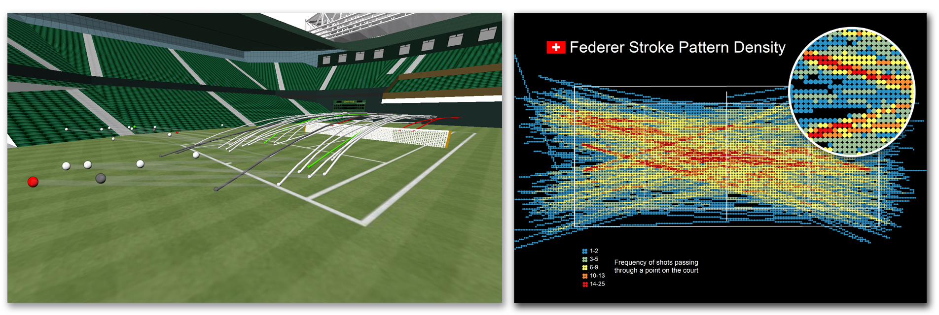
Figure 8. Future Work: igniting further exploration using visual analytics. The 3D visualization on the left is from of a study into the effectiveness of a player’s second shot in the rally. The visualization on the right is from a study into the frequency of shots passing through a given point on the court. (click to enlarge image)
5 Conclusion
Successfully identifying patterns of behavior in sport in an on-going area of work [23], be that in tennis, football or basketball. This paper has introduced GIS to sports analytics and has provided a framework for future work in this area. The examples in this paper show that GIS can provide an effective means to geovisualize spatio-temporal sports data, in order to reveal potential new patterns within a tennis match. By incorporating space-time into our analysis we were able to focus on relationships between events in the match, not the individual events themselves. The results of our analysis were presented using maps. These visualizations function as a convenient and comprehensive way to display the results, as well as acting as an inventory for the spatio-temporal component of the match [3].
Ultimately players, coaches, the media and fans will determine to what extent geospatial analytics plays a role in tennis. Coaches, institutions or team captains assume responsibility for providing the most useful pre or post-game analytical message to players. In future this tactical message may include maps about where and when a player shows bias at particular points in a match. Visualizing these patterns and banking them to our memories could make the difference between winning and losing. TV broadcasters, have their own geospatial analytical requirements, like real-time delivery of such results. The message may need to be much simpler so it can be relayed through their commentators to the fans in a very small time frame. Fans demand analytics about the game, not only to better understand the results of a match, but so they can attempt to mimic the top player’s patterns in their own game.
Expanding the scope of geospatial research in tennis relies on open access to reliable spatial data. At present, such data is not publically available from the governing bodies of tennis. An integrated approach with these organizations, players, coaches, and sports scientists would allow for further validation and development of geospatial analytics for tennis. The aim of this paper is to evoke a new wave of geospatial analytics in the game of tennis. Furthermore, to encourage statistics published on tennis to become more time and space aware to better improve the understanding of the game, for everyone.
References
[1] M.J. Smith et el, “Geospatial Analysis, a comprehensive guide to principles, techniques and software tools”, Matador, 2007.
[2] A. Mitchell, “The Esri guide to GIS Analysis”, Esri Press, 1999.
[3] J. Bertin, “Semiology of Graphics: Diagrams, Networks, Maps”, Esri Press, 2nd Edition, 2010.
[4] Franc J.G.M. Klaassen and Jan R. Magnus, “Forecasting the winner of a tennis match”, European Journal of Operational Research, no. 148, pp. 257-267, Sept. 2003.
[5] J.K Vis et el, “Tennis Patterns: Player, Match and Beyond”, In 22nd Benelux Conference on Artificial Intelligence (BNAIC 2010), Luxembourg, 25-26 October 2010.
[6] T. Barnett and S.R. Clarke, “Combining player statistics to predict outcomes of tennis matches”, IMA Journal of Management and Mathematics, vol. 16, pp. 113-120, 2005.
[7] F. Radicchi, “Who is the best player ever? A complex network analysis of the history of professional tennis”, PLoS ONE 6(2): e17249. doi:10.1371/journal.pone.0017249.
[8] T. Barnett and S.R. Clarke, “Using Microsoft Excel to model a tennis match”, In Proceedings 6th Australian Conference on Mathematics and Computers in Sport, Bond University, pp. 63-68, 2002.
[9] B. Schroeder, “A methodology for pattern discovery in tennis rallys using the adaptive framework ANIMA”, In Second International Workshop on Knowledge Discovery from Data Streams (IWKDDS), 2005.
[10] A. Terroba et el, “Tactical analysis modeling through data mining, Pattern discovery in racket sports”, In International Conference on Knowledge Discovery and Information Retreival (KDIR 2010), 2010.
[11] A. Moore et el, “Sport and Time Geography: a good match?”, Presented at the 15th Annual Colloquium of the Spatial Information Research Centre (SIRC 2003: Land, Place and Space), 2003.
[12] A. Gatrell and P. Gould, “A micro-geography of team games: graphical explorations of structural relations”, Area, 11, 275-278.
[13] K. Goldsberry, “CourtVision: New Visual and Spatial Analytics for the NBA”, In Proceedings MIT Sloan Sports Analytics Conference, 2012.
[14] United States Tennis Association, “Tennis tactics, winning patterns of play”, Human Kinetics, 1st Edition, 1996.
[15] G. E. Parker, “Percentage Play in Tennis”, In Mathematics and Sports Theme Articles, http://www.mathaware.org/mam/2010/essays/
[16] Hawk-Eye Innovations, http://www.hawkeyeinnovations.co.uk/
[17] J Ren, “Tracking the soccer ball using multiple fixed cameras”, Computer Vision and Image Understanding, vol. 113, pp. 633-642, 2009.
[18] J.R. Wang and N. Parameswaran, “Survey of Sports Video Analysis: Research Issues and Applications”, In Proceedings of the Pan-Sydney area workshop on Visualization, pp.87-90, 2005.
[19] J. A. Hartigan and M. A. Wong, “Algorithm AS 136: A K-Means Clustering Algorithm”, Journal of the Royal Statistical Society. Series C (Applied Statistics), vol. 28, No. 1, pp. 100-108, 1979.
[20] ArcGIS Resources Help 10.1, http://resources.arcgis.com/en/help/main/10.1/index.html – /Grouping_Analysis/005p00000051000000/
[21] C. Morris, “The most important points in tennis”, In Optimal Strategies in Sports, vol 5 in Studies and Management Science and Systems, , North-Holland Publishing, Amsterdam, pp. 131-140, 1977.
[22] C.D. Lloyd, “Spatial data analysis, an introduction to for GIS users”, Oxford University Press, 1st edition, New York, 2010
[23] M. Lames, “Modeling the interaction in games sports – relative phase and moving correlations”, Journal of Sports Science and Medicine, vol 5, pp. 556-560, 2006
Best analysis of tennis I have seen. Would love to analyse it myself. Wonder where I could get hold of the data you used, or that of another other match among top players. Perhaps you could send me a dataset. If not, I’d like to get box score data for a major event. Thanks!
Pingback: Mapping Roger Federer’s backhand | GameSetMap
This is just brilliant to see and help understand the eb and flow of the game 🙂
Thanks for all your hard work guys, most appreciated!!!
Thanks for the feedback Ashley. Much appreciated!
Pingback: Journal of Medicine and Science in Tennis publish Spatial Serve Variation article | GameSetMap