Late last year we published an interactive game tree celebrating Rafael Nadal’s historic 2013 season. The Game Tree allows users to visually explore how easily, or not, Nadal won each of his 666 service games in the Masters 1000 Tournaments, Grand Slams and World Tour Finals he played in 2013. This rare point-by-point summary shows where Nadal’s history breaking season was won and rarely lost.
Figure 1. Nadal’s Interactive Game Tree was released after the completion of the World Tour Finals, November, 2013. Click here to view the application.
How the Project Began…
The idea for the project came about after years of frustration by never really knowing how close a match was by just looking at the final score. For example, a 6-4, 6-4 score-line could mean multiple things; one break of serve, or multiple breaks of serve. The winner may have won their service games easily, or they might have been hotly contested. Clearly, the final score gives no indication of the competitiveness of the match. To ease this frustration we set out to find a way to graphically present how hard Nadal was challenged in his matches during the 2013 season.
Our Inspiration
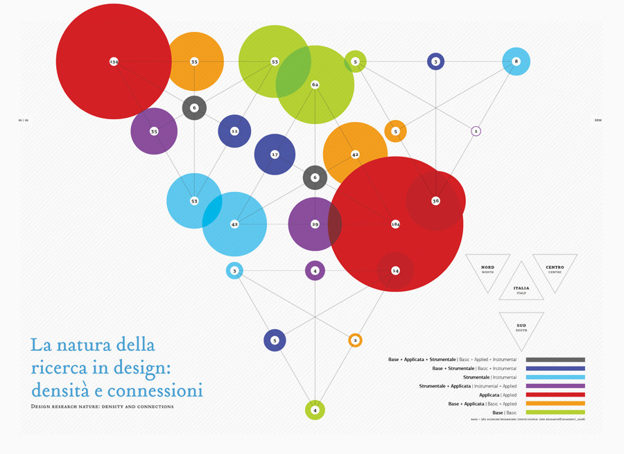
Inspired by Donato Ricci et al’s, (2008) game tree-like infographic (Figure 2), we set out to illustrate the path to victory using game tree theory. Sometimes referred to as a tree of possibilities, a game tree represents paths from a starting point to an end point, often in a game scenario like chess. Tennis plugs perfectly into a game tree as each player starts at 0-0 and makes a move in one direction only through the tree, depending on their success at the 0-0 point.
Figure 2. Mapping relationships between events. Ricci et al’s, (2008) map of the most common research methodologies used by various Italian design firms.
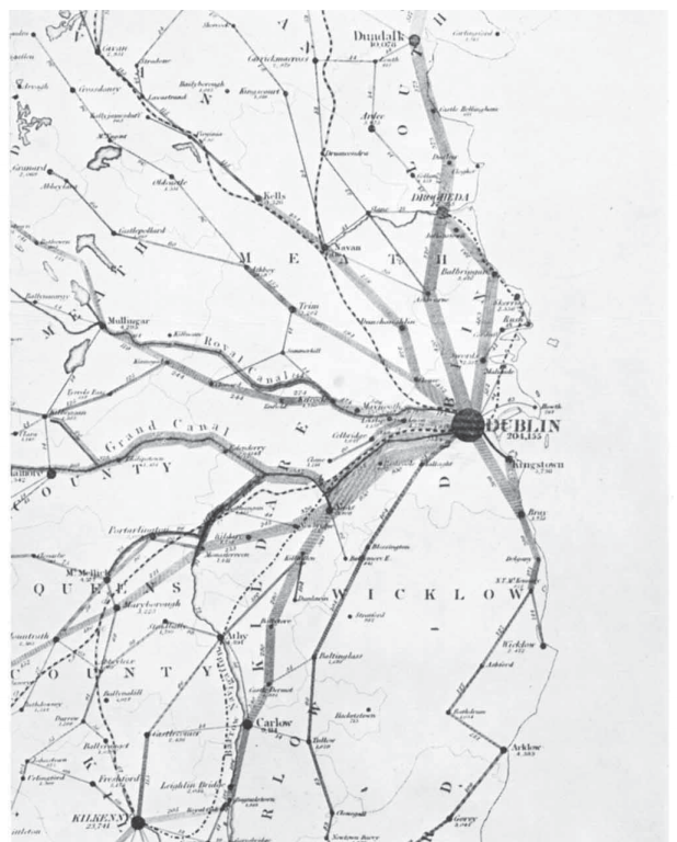
In order to determine the effectiveness of Nadal during his service games we mapped the frequency of paths from one point in a game to the next. To do this, we borrowed concepts from a 19th century cartographic method, called flow mapping. Flow maps were first introduced by Henry Drury Harness in the Atlas to Accompany Second Report of the Railway Commissioners, Ireland (1837) (Figure 3).
Figure 3: Henry Drury Harness introduced the first flow map in 1837. The map uses a variety of line thickness to convey a quantity of traffic flow between Irish cities.
The lines connecting each point in the Game Tree became the quantitative flow lines, and were scaled proportionally representing the number of times Nadal played through each point. The various line thicknesses allowed us to very quickly identify the most common path during each service game.
The Data & Technology Behind the Game Tree
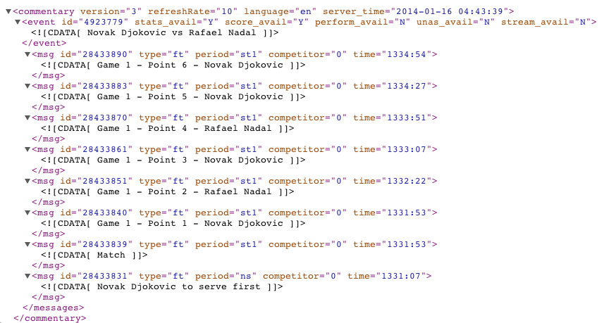
To create the game tree we began by downloading all of the appropriate matches from the William Hill sports website as XML files. Each match was available as a separate XML file and these files contained high-level information about the match (players, tournament info, date, etc.), along with a detailed point-by-point breakdown of the match. After a preliminary assessment of the data we developed a javascript application, which looped through the files and began to process the points.
Figure 4. An extract of data from the xml game files used in the game tree.
We then prepared a series of functions using javascript, to mimic the behavior of the game tree. The Game Tree at present only maps Nadal’s service games, therefore all point values of the opponents’ service games were simply skipped over and tie break points ignored. As the points are looped through and processed, we used the Rapheal javascript library to draw and animate the entire game tree using SVG (Scalable Vector Format). Some additional jQuery code was then added to hook up the tournament and match filters. The application was framed using HTML5, CSS3, SASS, Compass, and the Mueller Grid System.
Designing the Application
Our design work started off defining what the users expectations were from the application, and working out the simplest way of fulfilling their needs.
We defined a number of core functions the app should support:
- The ability to compare game tree patterns at both the tournament and game level.
- Multiple filtering at the season, tournament, and match level.
- Interaction with the flow lines should reveal the exact quantities per line.
- Tournaments should appear in the order they occurred, and the score should appear alongside each match.
Once we defined the core functions of the app we started sketching out how the game tree would support the application, and how we would visually organize the content for mobile, tablet and desktop devices.
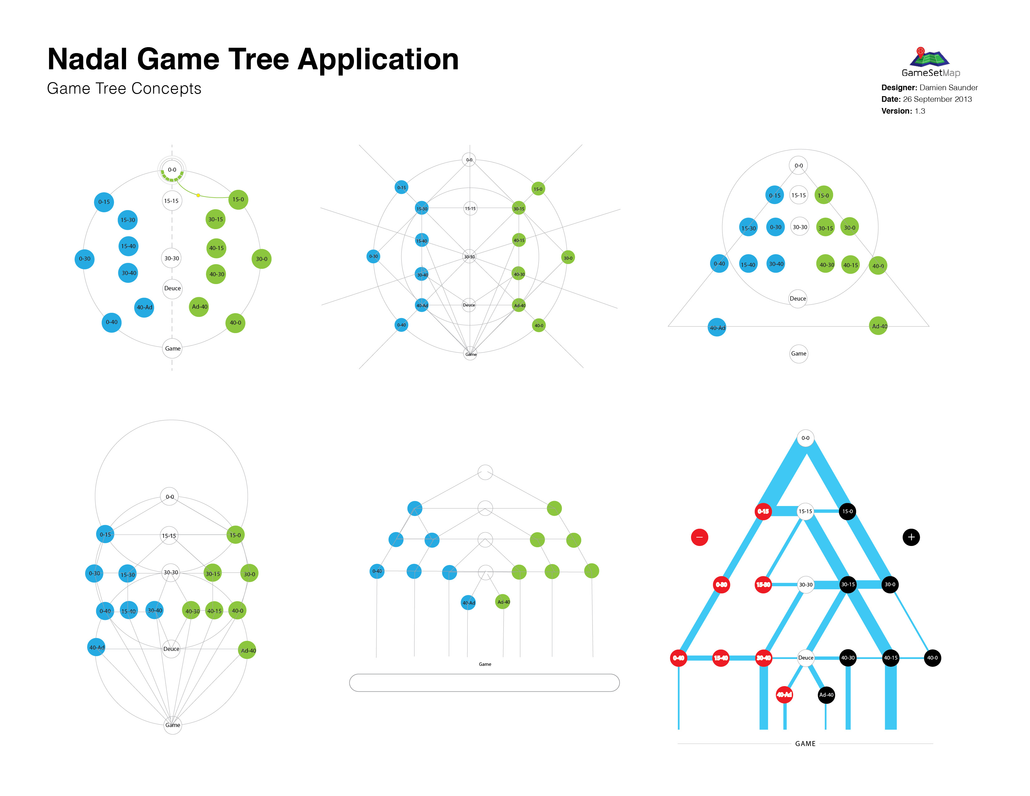
Some of the earlier game tree concepts were centered on a circular game tree, before slowly transitioning to a more conventional representation of the tree diagrams (Figure 5).
Figure 5. Sketching the game tree designs. From here it was a matter of refining the triangular game tree until the design begun to solidify.
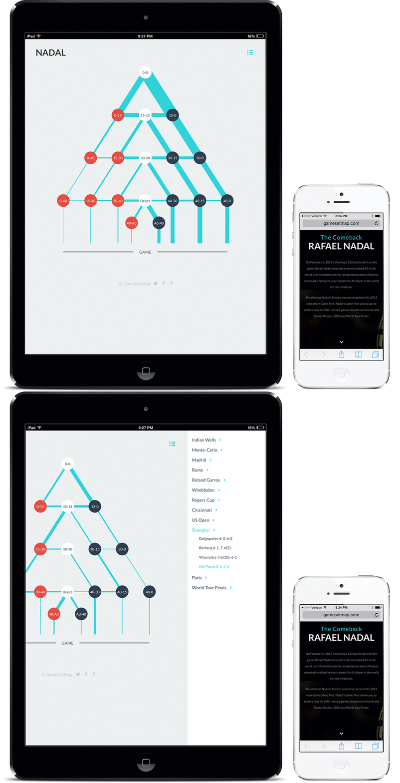
It was important that we designed the game tree to be responsive across small and large devices. We needed to ensure a seamless user experience regardless of device type or size. To do this we introduced some mobile ready functions into the design. For example we collapsed the menu on smaller devices so the game tree remained the focal point of the application. And we re-arranged the text on the opening page for smaller devices (Figure 6).
Figure 6. Designing the optimal viewing experience across tablet and mobile devices forced a reshuffle of some of the key elements of the application.
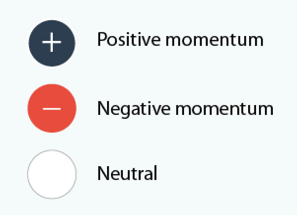
Each point in the Game Tree was color coded to reflect the momentum in each game. Dark blue representing + positive momentum, red – negative momentum and the neutral points down the spine of the tree were colored white (Figure 7).
Figure 7. Each point in the Game Tree is color coded to reflect momentum in the match.
Results and Analysis
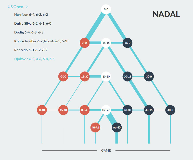
Nadal’s (6-2, 3-6, 6-4, 6-1) win against Novak Djokovic at last years US Open final illustrates the analytical power of the game tree (Figure 8).
Figure 8. The US Open final played between Rafael Nadal and Novak Djokovic. The game tree clearly highlights where Nadal played the majority of points on his serve (Deuce to Ad-40 – 12 times)
The score from the match, 6-2, 3-6, 6-4, 6-1 indicates a fairly one-sided match. But the game tree tells us that Nadal won 6 of his service games from Ad-40, (more than any other point). He and Novak wrestled back-and-forth between Deuce and Ad-40 12 times on Nadal’s serve. The frequency/line thickness through this part of the tree suggests that Novak had many opportunities to break Nadal’s serve, and that perhaps this match was much closer than the score suggests.
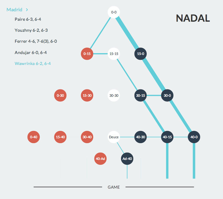
Nadal’s victory against Stanislas Wawrinka in the final of Madrid (6-2, 6-4) shows us how brutal Nadal can be when serving (Figure 9).
Figure 9. An almost perfect service pattern. Nadal’s victory against Wawrinka in the final of Madrid (6-2, 6-4).
In 9 service games, Wawrinka never saw an opportunity to break Nadal in this match, coming close only once at deuce. Nadal’s remaining service games were won from commanding positions in the game (4 times each from 40-15, and 40-0). Nadal was only twice in the red zone (at 0-15). But each time he quickly pulled the momentum in his favor for a quick path to winning each game. Whilst the final score suggests a relatively straight forward win for Nadal, it’s not until we see his service games visualized in this manner that we truly understand his dominance in the match.
Conclusion
We believe this is the first ever-interactive point-by-point Game Tree of a tennis match covering an entire season for one player.
In both the Djokovic and Wawrinka examples presented above the game tree enabled a better understanding of the match than simply seeing the final score. The game tree presents opportunities for further analysis as well. For example we are able to determine where Nadal is most effective on serve. We can see that at Deuce, Nadal beats his opponents more than any other point. He fights back-and-forth between 40-Ad and Ad-40 (like against Djokovic in the US Open Final), but rarely losses when he is serving at Deuce. Across his 666 service games last season, his opponents only had a 1 in 5 chance (0.2) of winning the game from Deuce onwards.
The simplicity of the Game Tree application, and its ability to graphically present traditional statistical data in a unique and informative way allows users to better understand the final score of a match and how games are played out over time.
Craig O’Shannessy, leading tennis analyst for the NY Times, the ATP, and former panelist at the MIT Sloan Sports Analytics Conference labeled the application, “pioneering, and groundbreaking”. It has featured heavily on well-respected data visualization websites like visual.ly, and visualisingdata.com. Nadal’s Game Tree captured the imagination of tennis analyst, fans, and data visualization experts worldwide for it’s originality and function.
Stay tuned for further interactive sports visualizations in 2014!
Click here to view the Nadal Game Tree application.
This article was written for the MIT Sloan Sports Conference.
Damien Saunder (formerly Demaj) is a Geospatial Designer at Esri where he designs and builds online interactive maps. He is continually rethinking spatial analytics for tennis via GameSetMap.com. @damiensaunder
David Webb is the web team lead at Rady Children’s Hospital-San Diego, where he builds responsive web sites and web applications. He enjoys experimenting and tackling interesting challenges via mor.gd.


