Shot charts in tennis.

During the Australian Open this year I wrote an article for tennismash.com about the use of shot charts in tennis. Below is the intro paragraph to the article:

Shot charts are critical in understanding a player’s on court behaviour. They have become commonplace in other sports like the NBA and Soccer and are now used frequently in tennis to map shot patterns from particular areas of the court. These patterns are of particular interest to coaches and players for pre and post match tactical analysis. Here we present 2,443 shots from Kei Nishikori that were played over a period of 6 months in 2014–15 against opponents like Federer, Djokovic, Murray and Wawrinka.

You can read the rest of the article here.

Tennis Shot Charts

Game tree: the unstoppable Novak Djokovic

The digital content team at the Australian Open contacted me late last year to write a few articles for ausopen.com. The first article (published on the 24th Jan) is a celebration of Novak Djokovic’s 2015 season titled “Game tree: the unstoppable Novak Djokovic“. The article uses our innovative game tree to better understand how dominate Novak was on his 1,033 service games in 2015.

To view the article click here:

Game TreeWe also highlighted some of Novak’s more interesting matches throughout the year (see below):

Game Tree

I encourage you to use the interactive game tree to take a deeper dive into some of Novak’s classic matches last year and to see what might have been for some of his closest rivals, as they begin their assault to dethrone the undisputed 2015 king of men’s tennis.

Read the full article here.

Rafa Nadal Academy Map

Rafa Nadal Academy Map

Rafa Nadal Academy Map

On December 2nd, 2015 Rafa Nadal’s Academy asked their social media friends to share their location with the academy so they could create a map that showed off their global network of support. Over 1,000 of their friends responded via Twitter and Facebook and here we present the location of those 1,000+ friends. The academy commissioned GameSetMap to design and build the interactive map. View the map here.

Using Maps and Data Vis to Understand Tennis, by National Geographic

Recently I had a chat with Geoff McGee who is a journalist and data visualizer at Stanford University’s Bill Lane Center for the American West about understanding tennis through data visualisation and analysis. The article featured on National Geographic’s Data Points website. National Geographic are pioneers and masters of story telling using data so it was a real pleasure to chat with them about my work.

National Geographic Tennis

The full article can be read here. Enjoy!

Kei Nishikori. Hawk-Eye Analysis Part 2

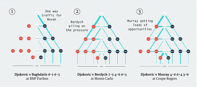
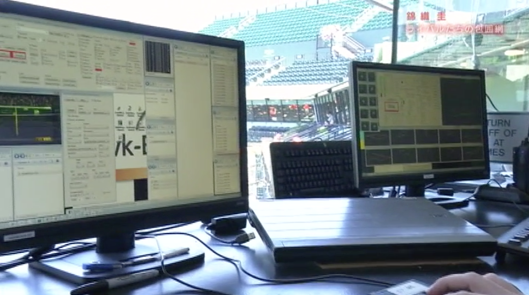
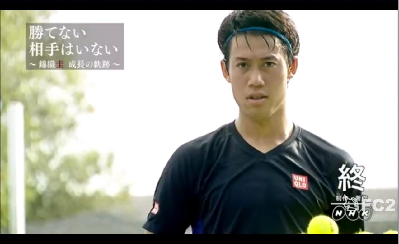
Earlier this Japan’s National Broadcaster (NHK) contacted me to provide analytical support for a documentary they were preparing on Kei Nishikori. Part II of the documentary went to air in Japan recently and I thought I would share a few screenshots with you of the final animations and analysis.

Kei Nishikori Documentary

The analysis focused on a number of key matches Kei had played over the last 12 months including:

  • Wawrinka at the US Open, and Aus Open.
  • Murray at Madrid and the World Tour Finals
  • Djokovic at the US Open and Rome.

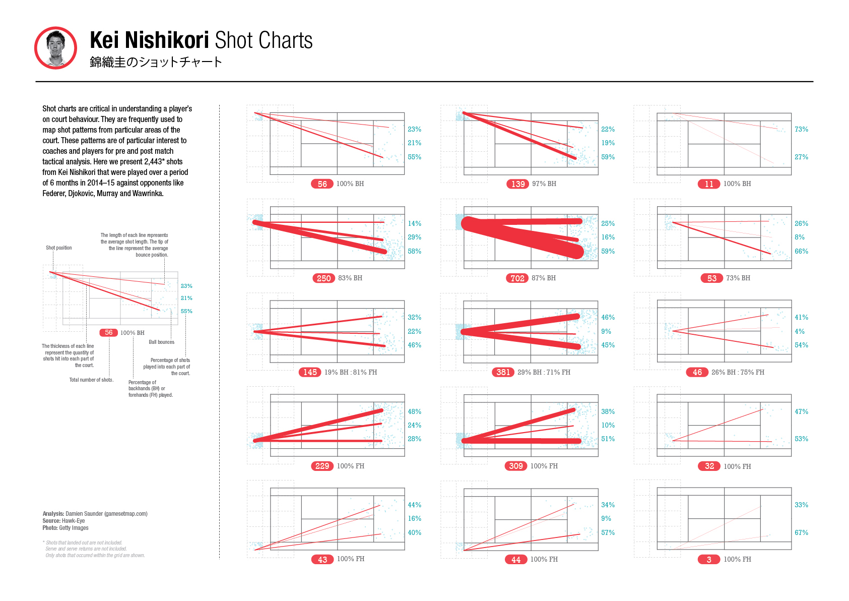
Below is a brief explanation and some examples of the analysis:

Nishikori v Wawrinka (US Open, and Aus Open)

Screen Shot 2015-07-12 at 2.43.09 pm

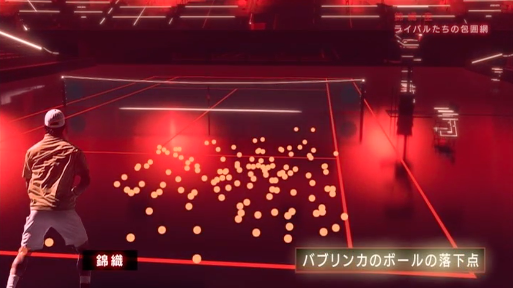
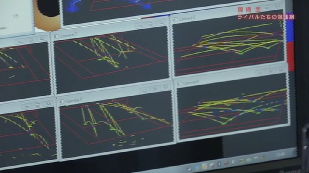
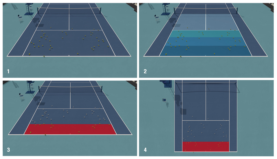
Wawrinka made some adjustments to his game after loosing to Kei at the US Open. The above graphic shows you the balls Wawrinka directed to the deuce side of the court at the US Open.

Screen Shot 2015-07-12 at 2.43.41 pm

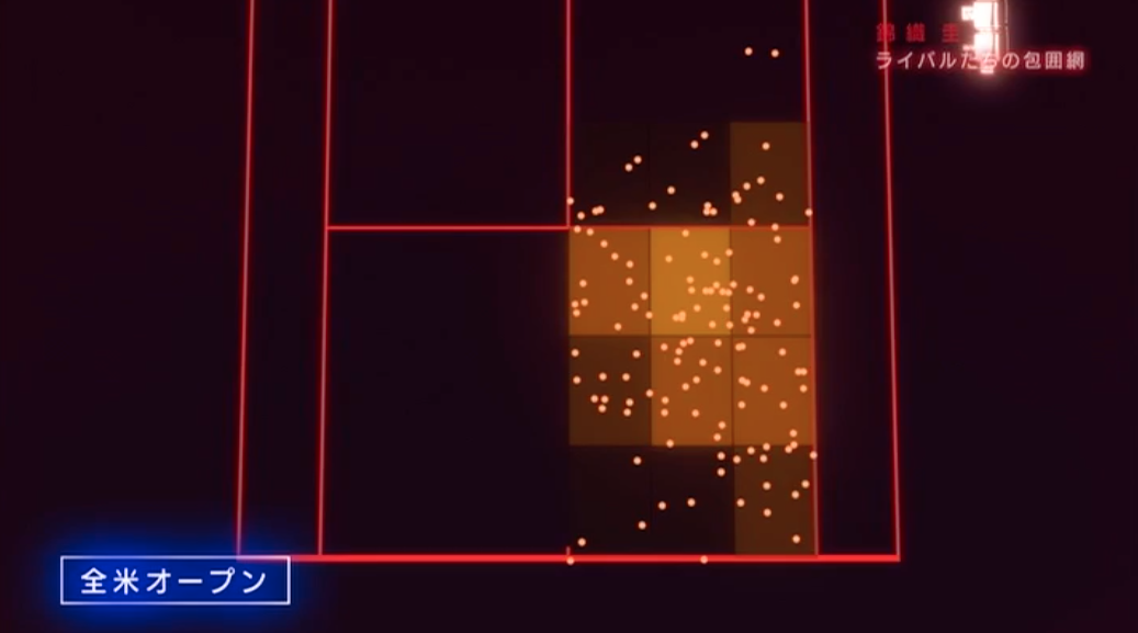
We saw from the footage that Wawrinka was targeting Nishikori’s forehand out wide and so we ran some numbers on it. We created a simple density surface of the shot location for Wawrinka at the US Open (pictured above) and at the Australian Open.

Nishikori Wawrinka

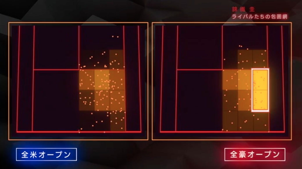
At the US Open Nishikori was given too much space and angle on his backhand and really made Wawrinka pay hitting a number of winners of this side. At the Australian Open Wawrinka made an adjustment and targeted Nishikori’s forehand, pulling him off the court with a number of short angled forehands. Below is footage of where Nishikori ended up on a number of important points which gave Wawrinka an easy shot into the open court.

Nishikori Australian Open

Nishikori v Murray at Madrid and the World Tour Finals

Nishikori beat Andy Murray at the World Tour Finals in 2014 but Murray was able to turn the result around in Madrid during the clay court season earlier this year. One of the reasons why was because of his serving. In particular his accuracy and depth at important points. Murray also served far fewer second serves at important points in Madrid than he did at the World Tour Finals. If you’re serving short 2nd serves to Nishikori at important points than Nishikori is going to be all over the return and you’ll be playing catch up all point!

Murray Serve Position Hawk-Eye

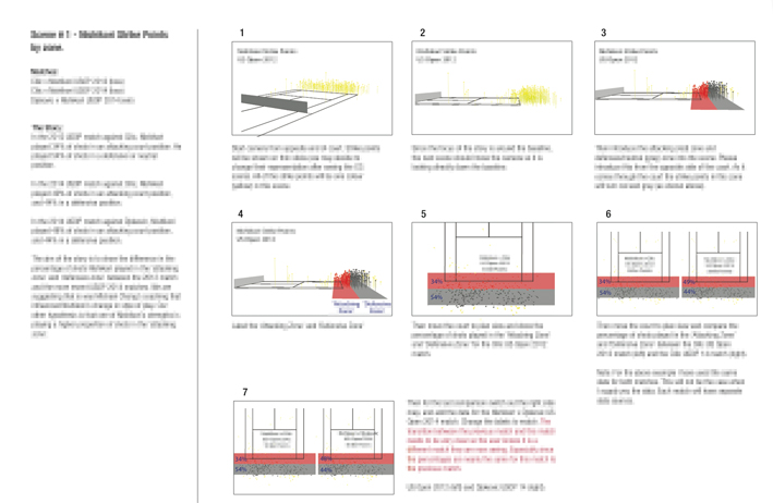
Above is Andy Murray’s serve pattern at the World Tour Finals (where he lost).

Murray at Important Points

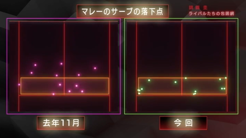
In the purple are Murray’s serve locations at important points at the World Tour Finals. In the green are Murray’s serve locations at important points in Madrid. Check out the six short serves that Murray dropped at the World Tour Finals (these were all second serves). These provided easy pickings for Nishikori. By comparison, Murray only served 1 second serve in Madrid, and his 1st serves were much closer to the lines in Madrid.

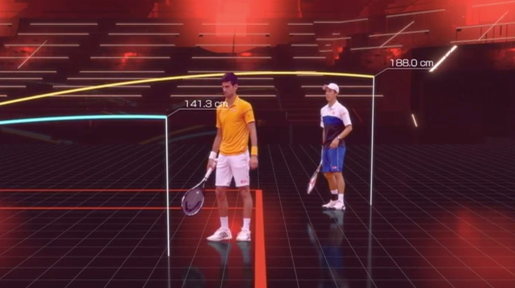
Murray was also getting some heavy rip on his serves in Madrid which forced Nishikori to regularly hit the serve return above his shoulder making it hard for him to get any real pop on the return. Murray’s serve in Madrid made it very difficult for Kei to gain the ascendency in the rallies. Players are looking to expose Nishikori’s height particularly on the serve return where he can be very damaging. Both Murray and Djokovic (in Rome) went after this as the neat little graphic below illustrates. It shows a comparison of the average height Nishikori’s was playing his returns against Djokovic at the US Open (blue) and Rome (yellow).

Screen Shot 2015-07-12 at 3.34.55 pm

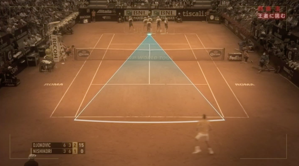
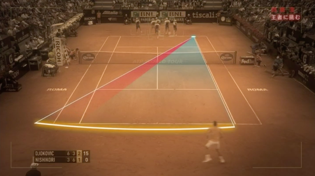
We also identified that the three opponents (Wawrinka, Murray and Djokovic) played much straighter through the court against Nishikori after their losses at the US Open and World Tour Finals. The two graphics below highlight what this means for Kei. His opponents took away the angle from him on his groundstrokes and didn’t allow him to pull the trigger, particularly from the backhand corner which is one of his favourite shots.

Nishikori Angle of shot

Screen Shot 2015-07-12 at 3.44.23 pmWell there’s just a few examples of the visualisations and analysis we run for the show. Millions of data points, and hundred of hours of data mining and statistics were run in search for answers to so many questions. Unfortunately I can’t share any of the analysis in depth with you but hopefully this gives you a little taste of the some of the analysis that was completed. It was a real privilege to work with the talented team at NHK, they have an extraordinary high work ethic and seek perfection in their work. We are all extremely proud of the result.

Images copyright NHK. Do not share the contents of this web page without permission from Gamesetmap or NHK. 

Murray’s Act of Tennis Espionage

Screen Shot 2015-07-12 at 4.03.53 pm

Andy Murray training with Nishikori in Miami earlier this year. Source: NHK.

In a recent documentary on NHK it was revealed that a new level of espionage was creeping into men’s professional tennis. It was reported that Andy Murray approached Hawk-Eye to track his practice session with Kei Nishikori at Miami earlier this year. It was also revealed that Murray was now a regular customer of Hawk-Eye and is using the data to seek new insights into his game, and his opponents.

In recent years there have been a number of high profile spying events in sport that have made headlines. In 2007 the New England Patriots were caught filming the New York Jets defensive coaches’ signals during a game. In 2014 the French National Football (soccer) team sighted a drone over one if its practice sessions prior to the 2014 world cup and in the same year Australian Rules Football club Port Power ejected an opposing spy from one of their training sessions.

Spying on rival players in tennis is not new. Tennis coaches have long sat courtside at practice sessions to try and catch a glimpse of their next opponent or an up and coming player making headlines in the junior ranks. Coaches and players regularly use video to scout opponents technique, tactics and fitness. But Murray’s request for Hawk-Eye to secretly track a training session is perhaps a whole new level of spying that we have not seen in tennis before. Did Murray crossed the line? Are there even rules in place to prevent this?

Players can request match data from Hawk-Eye at any time. Few do, but the option is available for them and this is within the rules. What’s interesting is that this is the first time we have heard players requesting that the Hawk-Eye system be turned on to secretly track the ball and player movement in a training session. From what we understand Nishikori had no knowledge about Murray’s request.

Screen Shot 2015-07-12 at 4.06.40 pm

Inside the Hawk-Eye bunker in Miami during Murray’s training session with Nishikori.

The richness of the Hawk-Eye dataset cannot be underplayed, evidence of this was on display during the NHK documentary. One of the huge advantages to players is that when they make a request for the data they are supplied with both their data and their opponents data. So not only can the player answer questions about their own game but they get valuable insights into their opponents too. It does however raise the question about what benefit a single training session would provide to Murray. From my experience a single match, and in this case a single training session only provides a limited insight into a players patterns and tendencies. Studying trends and patterns over time is where the real value lies.

Hawk-Eye

The output from Hawk-Eye during the Murray Nishikori training session.

Murray is no stranger to technology. He recently joined the board of Seedrs Advisory where he gives business advice in the areas of health, sport and wearable technology. His growing interest in UK tech starts ups shows he has a genuine interest in this area, and he seems keen to use the latest technology to his advantage on and off the court.

Other sports like the NBA, EPL and NHL are caught up in an analytics storm at the moment. Tennis has traditionally been left in the dark ages with respect to analytics but perhaps Murray’s actions are confirmation that the game is changing. Tennis players and coaches are becoming more intrigued by analytics, and the data that is being collected on them. Murray is now a regular user of Hawk-Eye data, but it seems he is keen to take advantage of the system one step further. Perhaps Murray was simply being curious? Or perhaps he and Amélie Mauresmo had genuinely planned to gain insights from the training data. Players are starting to ask the right questions, and some of them are clearly pushing forward with their own independent analytics and detective work. I say fair play to Andy Murray for pushing the boundaries, and seeking an edge wherever he can. Tennis may be on the edge of a new frontier in analytics after-all.

Stroke Pattern Analysis

Late last week I was running some exploratory analysis on stroke patterns for a client when I stumbled across this during one of my 3D sessions.The image is a 3D heat map and shows the frequency of ball movement on the court. A heat map is a essentially a graphical representation of the data where individual values contained in a each cell on the grid are represented as colours, or by height. For example the tallest and darkest areas show where the ball was most frequent, and the shortest lightest grey areas show where the ball was the least frequent. You can see (as expected) that the ball passed over the central part of the net more than anywhere else on the court. Both these players were right handers and the majority of cross court exchanges were played from the backhand side of the court. You will also notice that tall pillars exist at each end of the court where the serve is hit from.

3D Tennis Hawk-Eye<click image to enlarge>

The data used in this visualisation is from official Hawk-Eye data played over 5 sets at the US Open. The raw data contains 10’s of thousands of data points and it is impossible to detect any sort of pattern in the data without applying some sort of cluster analysis to the data. The 3D aspect of the visualisation accentuates the values in each cell even more. Unfortunately in this static image the tall pillars hide other pillars behind them making it difficult to get a true feel for the overall pattern in the data. Thankfully in the live 3D scene you have the ability to constantly change your viewing angle so the problem of hidden data is largely void. The grid spacing used above is 30 cm.

There are many ways which you can cluster your data to provide more meaningful insights. Heat maps provide a quick snapshot of your data and help better understand the key components of your data. From here I’m taking a deeper dive into analysing stroke patterns. The analysis continues…

Future Clay Court Stars of Tennis

Earlier today Josh Meiseles who writes for the ATP World Tour tweeted some pretty interesting stats about the players who were about to kick off their qualifying campaign for Roland Garros. He said that there were 39 countries represented at the Roland Garros qualifying (1 less than last year). I figured it was worth mapping the 39 countries to see where all of the players were coming from (see below).

Roland Garros Qualifying Map

To create the map I joined up the list of countries that Josh supplied to a country database and then chose a suitable projection to visualise the 39 countries. Since these young players are up and coming future stars I decided to use a Berghaus Star projection. The Berghaus Star projection does exactly what its name suggests. It projects the world’s surface onto a star shape. The Berghaus Star projection was created in 1879 and is perfect for this type of world projection. I also wanted to make sure Roland Garros (Paris) was near the center of the map since it is the focal point of the story. The map is centred on the north pole with Europe and North America dominating the centre of the projection (since that’s where the majority of tennis players who were playing in qualifying come from). Areas highlighted yellow indicate the countries participating in the qualifying.

There’s a huge opportunity in tennis (and all sports) to integrate media stories with maps. So much of the game and its players is about location, like this story was. And it is far more visually stimulating to see the facts presented this way than perhaps in a table or simply in writing. Maps draw an audience, they fascinate people and as a result they drive traffic to stories.

We hope you enjoy this media map. We’ll keep an eye out for further opportunities as the season rolls out over Summer.

Kei Nishikori – Hawk Eye Analysis

Recently Japan’s National Broadcaster (NHK) contacted me to provide Hawk-Eye analytical support for a documentary they were preparing on Kei Nishikori. I was asked to process and analyze the raw Hawk-Eye data. I teamed up with Jordan Montreuil, an animator from LA to provide high-quality 3D scenes that would support the analysis. The documentary aired in Japan on the 13th January prior to the Australian Open. You can watch the program here.

Blog Pic Nishikori

The rise in popularity of Kei Nishikori is illustrated in NHK’s documentary titled “Kei Nishikori: Trails of the Progress” (translated). The documentary explores Nishikori’s growth and development as a player.

Below are a few samples from the project. Unfortunately I can’t share too many details but I hope this gives you some idea of the work completed.

Hawk-Eye Animation

The results of the Hawk-Eye analysis were told using a series of 3D computer generated (CG) animations. The images above are stills taken from the story surrounding Djokovic’s shot depth against Nishikori at the World Tour Finals.

For each scene, storyboards and animation concepts were drafted in order to understand how the story would unfold.

Kei Nishikori storyboard

A typical storyboard which was used to prepare and support the animations. Text is blurred on purpose.

The following clip (2:14 min) from the documentary introduces the viewer to the millions of Hawk-Eye data points that were analyzed for the documentary, and how the data was used to identify trends and patterns in Nishikori’s game.

The video then goes on to compare Nishikori’s hit point location from his 2012 and his 2014 US Open matches against Cilic. One of Nishikori’s strengths under Chang is that he plays ‘up’ on the baseline, taking time away from his opponent. In 2012 before Chang, Nishikori played only 34% of shots 1 m either side of the baseline. We refer to this zone as the attacking zone. In 2014 against Cilic again at the US Open, Nishikori played 49% of his shots in the attacking zone.

Finally we graph Nishikori and Wawrinka’s shot speed trend at the 2014 US Open. Nishikori’s shot speed trended constantly upwards throughout the entire match, while Wawrinka’s trended downwards. This was a distinguishing feature of Nishikori’s game at the US Open.

The complete documentary can be viewed here.

The analysis of the Hawk-Eye data provided ‘scientific’ proof of Nishikori’s strengths and weaknesses. It was also clear during the analysis and cross validating the results against player interviews that the players and coaches don’t always have a clear understanding of why they won or lost a match. We were able to validate the many assumptions, or commentary about a match with the use of such data.

The producer’s primary goal was to tell a story that was backed by real data. The animations played a critical part in delivering the story and messaging. They allowed us to simplify the 1 million plus data points that were analyzed, crunched, and spat out. Unfortunately there is only 43 minutes of tape in the final cut, but there were many revealing patterns and trends identified that are no doubt valuable to tennis players, coaches and sports reporters. If you would like to know more please get in touch. But for now, as they say in show business – that’s a wrap!

Video’s copyright NHK. Analysis and images copyright GameSetMap. Do not share the contents of this webpage without permission. 

ATP World Tour Venue Map – 2015

With the ATP World Tour well underway in 2015, I figured it was time to update our ATP World Tour Venue Map. The map allows fans to explore the tournaments that play host to the world’s greatest players in 2015.

ATP World Tour Map

The ATP World Tour Venue Map – 2015. Click here to access the map.

The 2015 ATP World Tour includes:

  • 35 tournaments in Europe
  • 13 in North America
  • 5 in South America
  • 6 in Asia
  • 2 in the Middle East
  • 4 Australia and NZ

Clay and hardcourt tournaments dominate the tour with 21 and 22 events respectively. There are 14 indoor hardcourt tournaments, 7 grass and 1 indoor clay tournament (Brasil Open, São Paulo).

Use the map to check out the first ever tournament in Turkey, the TEB BNP Paribas Istanbul Open which will be played on clay from 27 April – 3 May.

ATP World Tour Turkey

The first ATP tournament to be played in Turkey, the TEB BNP Paribas Istanbul Open

Explore each tournament in more detail by clicking on each of the map icons or by the using the menu to reveal further information about the tournament like the draw, prize money on offer, the defending champion, and links to the official tournament websites.

The map also features spectacular high resolution satellite imagery, meaning you can see the tournaments up close like never before. Click on the “Zoom to location” link in the map pop-up to quickly navigate to each tournament.

ATP World Tour Wimbledon

The Championships – Wimbledon.

ATP World Tour Map US Open

Arthur Ashe Stadium and Flushing Meadows

CreditAgricoleMap

The Swiss Alps overlooking the Credit Agricole Suisse Open Gstaad tournament.

Each tournament is colour coded to reflect its status on the tour. The Grand Slams – blue, Masters 1000 – red, ATP 500 – green and ATP 250 – orange.

I hope you have fun exploring the map throughout the year and I hope it inspires you to plot your next tennis adventure!

View the full 2015 ATP World Tour calendar on the official ATP World Tour website here.