Presenting a Diorama of Player Movement in Sport

Earlier today Sports Performance and Tech magazine published my article on visualizing Hawk-Eye player tracking data. The article explores the value of 3D and Space Time Cubes when displaying spatio-temporal data.

To create the Diorama I used 3D optical tracking data from an official Hawk-Eye tennis match played between Roger Federer and Paul-Henri Mathieu at the Swiss Indoors in Basel, 2012.

Sports Performance and Tech Magazine

A Diorama of Player Movement in Sport

A Diorama of Player Movement in Sport

The full article can be read here.

A Diorama of Player Movement in Sport

To explore the 3D Diorama in more detail please visit the app here.

*** The app is best viewed on a computer or laptop using Google Chrome ***

How We Made Nadal’s Interactive Game Tree

Late last year we published an interactive game tree celebrating Rafael Nadal’s historic 2013 season. The Game Tree allows users to visually explore how easily, or not, Nadal won each of his 666 service games in the Masters 1000 Tournaments, Grand Slams and World Tour Finals he played in 2013. This rare point-by-point summary shows where Nadal’s history breaking season was won and rarely lost.

Nadal Game Tree

Figure 1. Nadal’s Interactive Game Tree was released after the completion of the World Tour Finals, November, 2013. Click here to view the application.

How the Project Began…

The idea for the project came about after years of frustration by never really knowing how close a match was by just looking at the final score. For example, a 6-4, 6-4 score-line could mean multiple things; one break of serve, or multiple breaks of serve. The winner may have won their service games easily, or they might have been hotly contested. Clearly, the final score gives no indication of the competitiveness of the match. To ease this frustration we set out to find a way to graphically present how hard Nadal was challenged in his matches during the 2013 season.

Our Inspiration

Inspired by Donato Ricci et al’s, (2008) game tree-like infographic (Figure 2), we set out to illustrate the path to victory using game tree theory. Sometimes referred to as a tree of possibilities, a game tree represents paths from a starting point to an end point, often in a game scenario like chess. Tennis plugs perfectly into a game tree as each player starts at 0-0 and makes a move in one direction only through the tree, depending on their success at the 0-0 point.

Ricci et al’s, (2008) map

Figure 2. Mapping relationships between events. Ricci et al’s, (2008) map of the most common research methodologies used by various Italian design firms.

In order to determine the effectiveness of Nadal during his service games we mapped the frequency of paths from one point in a game to the next. To do this, we borrowed concepts from a 19th century cartographic method, called flow mapping. Flow maps were first introduced by Henry Drury Harness in the Atlas to Accompany Second Report of the Railway Commissioners, Ireland (1837) (Figure 3).

Henry Drury Harness Map

Figure 3: Henry Drury Harness introduced the first flow map in 1837. The map uses a variety of line thickness to convey a quantity of traffic flow between Irish cities.

The lines connecting each point in the Game Tree became the quantitative flow lines, and were scaled proportionally representing the number of times Nadal played through each point. The various line thicknesses allowed us to very quickly identify the most common path during each service game.

The Data & Technology Behind the Game Tree

To create the game tree we began by downloading all of the appropriate matches from the William Hill sports website as XML files. Each match was available as a separate XML file and these files contained high-level information about the match (players, tournament info, date, etc.), along with a detailed point-by-point breakdown of the match. After a preliminary assessment of the data we developed a javascript application, which looped through the files and began to process the points.

William Hill Data

Figure 4. An extract of data from the xml game files used in the game tree.

We then prepared a series of functions using javascript, to mimic the behavior of the game tree. The Game Tree at present only maps Nadal’s service games, therefore all point values of the opponents’ service games were simply skipped over and tie break points ignored. As the points are looped through and processed, we used the Rapheal javascript library to draw and animate the entire game tree using SVG (Scalable Vector Format). Some additional jQuery code was then added to hook up the tournament and match filters. The application was framed using HTML5, CSS3, SASS, Compass, and the Mueller Grid System.

Designing the Application

Our design work started off defining what the users expectations were from the application, and working out the simplest way of fulfilling their needs.

We defined a number of core functions the app should support:

  • The ability to compare game tree patterns at both the tournament and game level.
  • Multiple filtering at the season, tournament, and match level.
  • Interaction with the flow lines should reveal the exact quantities per line.
  • Tournaments should appear in the order they occurred, and the score should appear alongside each match.

Once we defined the core functions of the app we started sketching out how the game tree would support the application, and how we would visually organize the content for mobile, tablet and desktop devices.

Some of the earlier game tree concepts were centered on a circular game tree, before slowly transitioning to a more conventional representation of the tree diagrams (Figure 5).

Sketching out the Game Tree

Figure 5. Sketching the game tree designs. From here it was a matter of refining the triangular game tree until the design begun to solidify.

It was important that we designed the game tree to be responsive across small and large devices. We needed to ensure a seamless user experience regardless of device type or size. To do this we introduced some mobile ready functions into the design. For example we collapsed the menu on smaller devices so the game tree remained the focal point of the application. And we re-arranged the text on the opening page for smaller devices (Figure 6).

Responsive Design

Figure 6. Designing the optimal viewing experience across tablet and mobile devices forced a reshuffle of some of the key elements of the application.

Each point in the Game Tree was color coded to reflect the momentum in each game. Dark blue representing + positive momentum, red – negative momentum and the neutral points down the spine of the tree were colored white (Figure 7).

Figure7_Nadal

Figure 7. Each point in the Game Tree is color coded to reflect momentum in the match.

Results and Analysis

Nadal’s (6-2, 3-6, 6-4, 6-1) win against Novak Djokovic at last years US Open final illustrates the analytical power of the game tree (Figure 8).

Nadal v Djokovic Game Tree

Figure 8. The US Open final played between Rafael Nadal and Novak Djokovic. The game tree clearly highlights where Nadal played the majority of points on his serve (Deuce to Ad-40 – 12 times)

The score from the match, 6-2, 3-6, 6-4, 6-1 indicates a fairly one-sided match. But the game tree tells us that Nadal won 6 of his service games from Ad-40, (more than any other point). He and Novak wrestled back-and-forth between Deuce and Ad-40 12 times on Nadal’s serve. The frequency/line thickness through this part of the tree suggests that Novak had many opportunities to break Nadal’s serve, and that perhaps this match was much closer than the score suggests.

Nadal’s victory against Stanislas Wawrinka in the final of Madrid (6-2, 6-4) shows us how brutal Nadal can be when serving (Figure 9).

Nadal v Wawrinka Game Tree

Figure 9. An almost perfect service pattern. Nadal’s victory against Wawrinka in the final of Madrid (6-2, 6-4).

In 9 service games, Wawrinka never saw an opportunity to break Nadal in this match, coming close only once at deuce. Nadal’s remaining service games were won from commanding positions in the game (4 times each from 40-15, and 40-0). Nadal was only twice in the red zone (at 0-15). But each time he quickly pulled the momentum in his favor for a quick path to winning each game. Whilst the final score suggests a relatively straight forward win for Nadal, it’s not until we see his service games visualized in this manner that we truly understand his dominance in the match.

Conclusion

We believe this is the first ever-interactive point-by-point Game Tree of a tennis match covering an entire season for one player.

In both the Djokovic and Wawrinka examples presented above the game tree enabled a better understanding of the match than simply seeing the final score. The game tree presents opportunities for further analysis as well. For example we are able to determine where Nadal is most effective on serve. We can see that at Deuce, Nadal beats his opponents more than any other point. He fights back-and-forth between 40-Ad and Ad-40 (like against Djokovic in the US Open Final), but rarely losses when he is serving at Deuce. Across his 666 service games last season, his opponents only had a 1 in 5 chance (0.2) of winning the game from Deuce onwards.

The simplicity of the Game Tree application, and its ability to graphically present traditional statistical data in a unique and informative way allows users to better understand the final score of a match and how games are played out over time.

Craig O’Shannessy, leading tennis analyst for the NY Times, the ATP, and former panelist at the MIT Sloan Sports Analytics Conference labeled the application, “pioneering, and groundbreaking”.  It has featured heavily on well-respected data visualization websites like visual.ly, and visualisingdata.com. Nadal’s Game Tree captured the imagination of tennis analyst, fans, and data visualization experts worldwide for it’s originality and function.

Stay tuned for further interactive sports visualizations in 2014!

Click here to view the Nadal Game Tree application.

This article was written for the MIT Sloan Sports Conference.

Damien Saunder (formerly Demaj) is a Geospatial Designer at Esri where he designs and builds online interactive maps. He is continually rethinking spatial analytics for tennis via GameSetMap.com. @damiensaunder

David Webb is the web team lead at Rady Children’s Hospital-San Diego, where he builds responsive web sites and web applications. He enjoys experimenting and tackling interesting challenges via mor.gd.

Pinpointing the serve. Who missed, and by how much.

(Part 3 of 3)

In the final part of this three part series, I determine who picks up the most free drinks as a result of hitting the centre of the USTA target zone, and by how much. I also extend the analysis to see how much each player missed the ‘optimum’ serve locations.

Who picks up the most free drinks?

For a bit of fun let’s see who would have picked up the most free drinks by hitting the ‘imaginary’ cone in the center of each target zone. We know coaches run this drill with their players, so let’s see how well each player fared in a match environment. Let’s assume the cone is 20 cm in diameter.

Federer Murray Serve Map Spider DiagramFigure 1. Federer v Murray. Mapping spatial serve patterns from the centre of each target zone. (click to enlarge)

The results show us that Federer picked up 4 free drinks, while Murray picked up only 3.   I don’t feel too bad since each player hit 100 or so serves each. That’s a pretty poor strike rate given these guys are best players in the world!

Each player missed the target by almost the same amount. Federer was on average     0.76 m from the centre of the each target  zone, while Murray was out by an average of 0.82 m.

Let’s take a look at the School Boys…

NCAA Tennis Serve Spider DiagramFigure 2. School Boy A v School Boy B. Mapping spatial serve patterns from the centre of each target zone. (click to enlarge)

The results show us that School Boy A picked up only 1 free drink, while School Boy B went thirsty not hitting the center of any of the targets! Ok, so now I’m feeling really good.

School Boy A on average missed the centre of the target zone by 0.94 m, while School Boy B was only out by an average of 0.80 m.

As discussed in part 2 of the blog, it’s reasonable to assume that perhaps the players weren’t targeting the centre of each zone. What if they were aiming for a ‘optimum’ but higher risk serve position? In part 2 of the blog we argued that the corners and lines were the ‘optimum’ positions to land your serve. So let’s see how far each player was from these ‘optimum’ serve positions.

Federer Murray Serve Map Spider Diagram 2Figure 3. Federer v Murray. Mapping spatial serve patterns from the ‘optimum’ serve locations. (click to enlarge)

Figure 3 shows us that Federer missed the ‘optimum’ serve locations on average by     0.88 m, while Murray missed on average by 1.04 m.

NCAA Serve map Spider DiagramFigure 4. School Boy A v School Boy B. Mapping spatial serve patterns from the ‘optimum’ serve locations. (click to enlarge)

Figure 4 shows us that School Boy A missed the ‘optimum’ serve locations on average by 1.15 m, while School Boy B missed on average by 1.22 m.

What can we learn from this?

Well we know that Federer takes home as many free drinks as the other three put together! We also know that Federer was on average serving closer to the ‘optimum’ locations than Murray which supports our analysis in part 2 of the blog, where we found Federer to target the high risk zones more than any other player.

We all expected the spread of the School Boy serves around the ‘optimum’ zones to be greater than the Big Boys due the results in part 2, where the Big Boys landed more balls in these ‘optimum’ areas. When we changed the target position back to the centre of each zone the School Boys and Big Boys numbers pretty much evened up, again supporting the results in part 2.

Spider Diagrams: The spider diagrams allowed us to visually link the serves to their target points and see the spread (length and direction) around each point. The spider lines for each zone allow us to very quickly see any bias in direction and distance towards the spread of serve around the points.  Without the lines it would be difficult to identify the serve clusters, and which central point they belong to.

Outliers: There were a couple of serve outliers for the Big Boys but these didn’t affect their averages enough to remove them from the calculations. The School Boys certainly had some big misses, but because there were multiple instances of these so they were left in the calculations.

More Data: With a larger dataset across different players we would be able to determine what is the expected norm, and whether these results are above or below that. Unfortunately, large serve datasets that are easily accessible to the players, coaches or analyst do not exist in tennis (hint hint ATP and WTA).

0.75 m: Let’s think back to part 2 of the blog for a minute. The size of the USTA target zones are 0.75 m square. Perhaps this tells us something. On average the four players missed by 0.83 m. Maybe the USTA set their targets knowing these missed averages and that is the reason for the particular size of the boxes?

To Summarize…

Over the course of the three blogs I have presented an alternative way of assessing a player’s serve accuracy using the USTA defined serve zones, and an additional two ‘higher risk’ zones. When comparing serve accuracy around the USTA zones there was very little difference between the four players. However once we started to analyze the serve towards the higher risk zones (the ‘optimum’ serve areas) the results started to lean in favor of the Big Boys, Federer and Murray.

I also set out to determine whether serve location really matters in tennis. The results suggest that it depends on what level of tennis is being played. The Big Boys clearly had more outright success on serves that landed in the USTA zones, and the higher risk zones than if they missed these zones. It was a different story for the School Boys however, as it didn’t appear to make any difference to their outright success rate whether they served in or outside the zones.

There is much work to be done in expanding the analysis of serve accuracy, serve success, and general serve patterns. Let’s hope we start to see more meaningful statistics from broadcasters and commentators about the serve in order to better understand who really are the best servers in the game!

Pinpointing the serve. Who’s better? The Big Boys or the School Boys?

(Part 2 of 3)

In part 1 of this 3 part series, I set out to find which player out of Federer, Murray and two NCAA Division 1 players were able to land the highest proportion of their serves in the USTA target zones.

Surprisingly the School Boys outranked the big boys in this simple comparison. However once we moved the target to include zones closer to the lines, Federer’s serving clearly stood out as being the most accurate. See part 1 for the complete results of the analysis. In order to gain some real value out of this analysis, I set out to determine if there was a positive relationship between serve position and outright serve success.

To explore this relationship I classified each serve into an ‘outright success’ category. Throughout the blog I will refer to an outright success point as a free point (to keep things simple).

Free Point definition: An error made by the player returning serve OR an ace made by the server. The remaining serves were either classified as being “returned in play” or “out” (fault).

For each player I generated a Serve Map (see Figures 4 A-D) showing the position of their serves in relation to the three target zones and their free point success.

Click to enlarge each map.

Federer ServeFigure A. Federer’s Serve Map

Murray ServeFigure B. Murray’s Serve Map

NCAA Tennis PlayerAFigure C. School Boy A Serve Map

NCAA Tennis PlayerBFigure D. School Boy B Serve Map.

Mapping the relationship between serve location and the effectiveness of serve. The Serve Maps also show where each player served when it mattered most.

School Boy A was able to collect 3 (50%) free points from his serves inside the zones, compared to 5 (42%) for School Boy B.

Federer picked up 13 (76%) free points from his serves inside the zones, compared to 18 (82%) for Murray.

Summary: The Big Boys picked up 31 (79%) free points from serves that landed in the target zones, compared to 8 (44%) for the School Boys.

Across all four players, 39 (68%) serves out of 57 that landed in the target zones earned the players a free point.

Serves that missed the zones: To test the importance of serve position I calculated how many free points each player picked up off of their serve that landed outside the target zones, but still within the service box.

Federer picked up only 4 (24%) free points on serves outside the zones compared to 13 (76%) inside the zones. While Murray picked up 4 (18%) outside the zones, compared to 18 (82%) inside the zones.

School Boy A picked up 3 (50%) free points when serving outside the target zones, which equalled his inside count 3 (50%), while School Boy B picked up 7 (58%) free points outside, which was more than his inside count of 5 (42%).

Summary:  The Big Boys picked up only 8 (21%) free points from serves that landed outside the target zones, compared to a surprisingly high 10 (56%) for the School Boys.

Across all four players, 18 (31%) serves out of 57 that landed outside the target zones earned the players a free point.

Take-aways:

Based on the data in this analysis the Big Boys clearly had more success on their serve when they landed their serve into the target zones (79% to 21%). This is a significant difference. At this level the Big Boys almost quadruple their chances of getting a free point off of their serve if they land it in the target zones!

Interestingly, the same trend didn’t occur for the School Boys. Player B recorded more success outside the zones than inside (58% to 42%), while School Boy A had the same level of success inside to out. So does it mean at the lower levels of the game that serve position is not all that important? Well it is quite possible. However we need to be a little careful about the above statement given the small-ish sample size and the fact that the study only included two players. It would be interesting to see what the numbers would do over a larger sample size, and with more players. Likewise for the Big Boys, would the high level of success remain with a larger sample spread over different players?

Overall across the four players free points were easier to get inside the target zones than out.

The USTA suggest that improving and practicing your serve location will help strengthen your game, and with some luck you might just pick up some free points along the way! Well that may well be the case, but it also might depend on which level of the game you’re playing!

In part 3…

In the final part of this three-part blog we are going to have some fun and address the most important question of all. Which player picked up the most free drinks by landing their ball in the center of the target zones? I present another series of maps showing spider diagrams to visualize how far each player was from the centre of each zone!

Pinpointing the serve. Who’s better? The Big Boys or the School Boys?

(Part 1 of 3)

We have all been there, standing on the baseline when the coach places three cones in each service box and says “There’s your target, if you hit the cones you’ll get a free can of drink”.  If you were like me, you rarely hit the cone, and if you did, it was more luck than anything else!

Coaches have been using these types of serving drills for many years. Why? Well, in order to develop a successful serve, you need to practice the placement of your serve. In the USTA book titled Tennis Tactics, Winning Patterns of Play, drill 4.2 (p 45) outlines four target zones in each service court to aim for (see Figure 1).  It is in these zones where coaches place their cones to improve the serve placement of their players (and give away free drinks!).

USTA Target Serve Zones

Figure 1. The four recommended serve target zones in each service court as recommended by the USTA. Down the T (T1), a body serve (T2), a wide serve (T3) and short-ish out-wide serve (T4). Source: Tennis Tactics, Winning Patterns of Play, USTA.

Given the continuous emphasis on serve placement I set out to run a simple analysis to see who was the more ‘accurate’ server, the Big Boys (professional players) or the School Boys (college level players)? Included in this analysis are Roger Federer and Andy Murray representing the Big Boys, and the School Boys (whom shall remain nameless) are from the NCAA Division 1 tennis competition.

Some Context:

  • Murray defeated Federer: 6-2, 6-1, 6-4
  • School Boy A defeated School Boy B: 6-1, 6-1

Total number of serves hit by each player:

School Boy A: 58   School Boy B: 54   Federer: 95   Murray: 111

Total number of serves hit IN:

School Boy A: 44 (76%)   School Boy B: 45 (83%)   Federer: 78 (82%)   Murray: 86 (77%)

Total number of serves hit OUT:

School Boy A: 14 (24%)   School Boy B: 9 (17%)   Federer: 17 (18%)   Murray: 25 (23%)

In order to determine which player landed the highest percentage of balls in the four USTA zones (and therefore could claim they were the most accurate server!) I ran a simple select by location algorithm between each serve bounce and the four target zones in each service court. This enabled me to very simply return a count of how many balls landed in each box, for each player. Figure 2 shows the results of the selection.

PinpointingYourServeFig1

Figure 2. The percentage of serves that landed in the USTA defined target zones for each player.

Surprised? Most of us would expect the Big Boys to place a higher percentage of their serves in the target zones than the School Boys right? However the results showed that School Boy A landed 15 out his 58 (26%) serves into the target zones, making him arguably the most ‘accurate’ server of the four players. School Boy B closely followed with 12 out 58 (22%). Murray was next up, landing 23 of 111 (21%) serves into the boxes, while Federer brought up the rear with only 16 out of his 95 (17%) serves landing in the boxes.

Accuracy: If we loosely define accuracy as being how close a measured value is to an actual value, where the actual value are the USTA target zones, then we can with some caution claim the School Boys out served the Big Boys in the accuracy department. Hard to believe I know.

But wait a minute, what if the Big Boys weren’t actually aiming for the USTA target zones, and instead were aiming outside of those zones? Perhaps they were aiming for the lines, which are outside the USTA defined target areas but still legally within the service court? What would the results look like if we extended the target zones further towards the lines? Let’s see…

Playing the Lines

You could argue that the service line is the optimum position for the placement of your serve, and that the corners of each service box are the ultimate targets. However targeting the lines brings a higher degree of risk, and a lower margin or error. Which is why coaches & the USTA don’t recommend us amateurs to go-for these targets every time! However at the top level where the Big Boys play, where there is so much on the line and so little margin for error (in all facets of the game) they are more likely to take the risk. By sending their serves as close to the lines as possible they give themselves a greater chance of setting up the point in their favor. We would also expect that they are more likely to consistently execute a higher level of accuracy, given their higher-level skill set. We shall see…

In order to test this I added two more 12.5cm (4.7 inch) wide target zones around the original USTA target zones. I call these Medium and High risk zones, where the High risk zone abuts and includes the service lines. By running the selection again using these two extra zones we will see who is taking the risk and pushing their serve towards the lines more, the School Boys or the Big Boys?

PinpointingYourServeFig2

Figure 3. The percentage of serves that landed in the two additional High and Medium risk serve zones for each player. The width of each additional zone is 12.5cm (4.7 inches) (roughly twice the width of a tennis ball). In the second part of this blog we will see the spatial spread of serves across all target zones and all services boxes.

Figure 3 starts to tell a different story. By moving the target Federer was now clearly winning the most accurate server competition, landing 13 (14%) serves in the medium risk zone, and 18 (19%) in the high-risk zone. Murray’s success in these zones was a littler lower than Federer, with 10 (9%) for the medium risk zone, and 13 (12%) in the high-risk zone. School Boy A scored, 3 (4%) in the medium risk zone, and 5 (13%) in the high risk zone, while School Boy B scored, 2 (5%) and 7 (8%).

Clearly Federer was able to consistently pop more serves in the high-risk zones than any of the other three players. This would suggest that the Fed is arguably the most accurate server of the bunch? Most commentators of the game are unlikely to argue with that statement, but of course it depends on where the target is and where the players are aiming! School Boy A has every right to claim he is the most accurate server given he landed the highest proportion of his serves in the USTA target zones.

Some Further Ponderings

Given that each of the four USTA target zones in each service box are roughly 0.75m (2.46 ft) square I am surprised that the Big Boys are not landing a higher percentage of serves in these areas. No disrespect to the School Boys, they aren’t playing NCAA Level 1 tennis for no reason, but I expected the professional players to have a higher percentage of serves land in the target zones than the School Boys. I also expected Federer and Murray to land more serves in the higher risk zones. The results showed this was partly the case. Murray’s numbers in these zones are a little surprising given he swept aside Federer in straight sets on that day.

Perhaps at the highest level, simply aiming your serve at the USTA zones is not enough. Maybe the margin is too great. And in doing so you make life a little too easy for the returner?

So why do the School Boys have such a high percentage of serves in the USTA zones (compared to the Big Boys)? Is it because they serve with less speed and spin, therefore allowing them to slow things down and hit the ‘safe’ targets? Perhaps at this level, the players are taught to play the percentages? Perhaps their skill level forces them to do so?

The School Boys will no doubt develop their serving skills, and pop more serve speed and aggressive ‘kick’ on the ball as they mature. Being able to maintain that accuracy as they increase their serve speed and spin will be on ongoing player development challenge.

It is worth noting that each School Boy in the study served just over 50 times in their match, less than half that of Federer and Murray. Would they be able to maintain their high serve percentage into the USTA zones over a longer match where they may be required to serve 100+ serves? Would we see the same consistency, or could we expect it to see it drop off?

So what do these figures mean, if anything? What if I miss the USTA zones by a ball width or two? Am I still an accurate server? What if I’m only a little bit too short, or a little bit too central to the service box on my serve? Will I still win the same number of points if I’m a few centimeters or inches wide of the mark?

In part 2…

In the second part of this three-part blog I will endeavor to determine if there is a positive relationship between serve position, and outright success. I’ll explore if it’s possible to determine if the game of serving is really about a few centimeters or inches here and there? And in part 3 we will answer the most important question of all, who takes home the most free drinks!

Note: This study only looked at a very small sample of data from all players, so we need to be careful about making gross assumption based on the findings.

A 3D Lesson in Clutch Point Serving by S.Stakhovsky

The story from week one at Wimbledon was the exit of so many big name players either through defeat or injury. Rafael Nadal and Maria Sharapova were both forced to pack their bags and head home much earlier than they would have liked. As did the reigning Champion Roger Federer.

Sergiy Stakhovsky played out of his skin against the swiss mystro putting on a clinic of clutch point serving throughout the match. Sergiy was able to back-up his serving with sublime touch at the net. Sergiy won the match 6-7, 7-6, 7-5, 7-6 in just under 3 hours.

To celebrate Sergiy’s win I’ve prepared a unique 3D tennis visualization that invites you to step onto Centre Court at Wimbledon and see how Sergiy bundled out the 7 time Wimbledon Champion Roger Federer in the 2nd round.

3D Interactive Tennis Visualization

Click here to open the 3D application. (Best viewed in Google Chrome on a desktop machine). 

Sergiy served almost exclusively to Federer’s backhand at important points (37 out of 43, 86%). On 4 occasions Sergiy went to Federer’s forehand side. Of those 4 serves he aced him twice! And in the duece court he went straight at Federer’s body two times, having success half of those times.

When Federer was able to return Sergiy’s serve into play (as shown by the white lines on the map), he won 9 of 22 points (40%), while Sergiy won 13 of 22 (59%).

The visualisation only includes serves at 15-30, 30-30, 15-40, 30-40 ans 40-Ad, and all of Sergiy’s serves during each tiebreak.

The red lines on the map are aces. The green lines are where Sergiy forced Federer into a direct error on his return of serve. The white lines are serves that Federer put back in play.

The 3D map is completely interactive. Click on each line and retrieve information about when the serve was made and what the score was.

You can even add a little more realism to the scene by adding shadows to the court.

3D Tennis Visualization Shadows

Use the eye icons in the menu below to turn on/off layers in your scene.

3D Tennis Visualization Menu

To record the historic moment I have added the final score of the match, the match duration and the time the match was completed (local time) to the scoreboard!

3D Tennis Visualization Scoreboard

Spatial serve variation is thought to be a good indicator of ones serve success. However as you can see in the visualization Sergiy was not afraid of becoming predictable. I guess when you are having so much success doing one thing, why change it up right?

I hope you enjoy this immersive 3D tennis experience!

The above scene uses new HTML 5 WebGL technology, so there is no need to install a plugin to view the scenes. For more information about the City Engine viewer click here.

Mapping Roger Federer’s backhand

With the 2013 Wimbledon Championships just around the corner, I thought I’d take this opportunity to explore how Andy Murray exposed Roger Federer’s backhand in last year’s Olympic final on centre court at SW19.

Analysts claim that if Federer has one weakness it’s his backhand. But what is the most effective way to draw an error on the Federer backhand? Some say it is to force Federer to hit his one handed backhand above shoulder height. Whilst this may be true, as we have seen against Rafael Nadal many times there may be other ways to beat the Federer backhand.

Data from the Gold Medal Olympic match shows there is potential to draw a high error rate on Federer’s backhand by moving him backward into the shot.

Mapping Federer's BackhandMapping Federer’s backhands. The green swooshes indicate Federer’s movement to a backhand error or success. (Click image to enlarge).

Backward Movement to the Shot

We know that the direction and length a player must cover from their previous shot has a significant influence on the player’s next shot. In order to better understand the Federer backhand I plotted a vector of his movement to each shot (from his previous shot location). The map above shows his movement to a backhand error or outright success from his backhand. We can see from the map that 12 of Federer’s 14 backhand errors (86%) came from a backward movement to the shot. Some of the movement vectors are clearly more ‘backward’ in direction than others, but in any case there is a pattern here that may warrant further investigation. The length of movement to each error on his backhand varies from half a court to only a few steps.

Time: Success at important points wins you matches!

With a little more digging we can see further patterns emerging in the data. The map shows us that 52% of Federer’s backhand errors occurred on game point for or against him, compared to 22% on his forehand. To see this pattern a little clearer I labeled each of his errors with a time stamp, indicating when each of his errors (and winners) was made.

Federer Map Important PointsAdding a time stamp annotation to the map (like Ad-40, 15-40) allows us to understand the temporal component of Federer’s shot making tendencies.

The data from the match suggests that Federer is more likely to make an error at an important point on his backhand than his forehand. Perhaps his opponents at Wimbledon this year might want to take note of this!

Visual Exploration of Spatial Data

GameSetMap is always searching for new ways to visually explore the spatial component of tennis and I hope you agree that this infographic of Federer’s backhand begins to the lay the foundations of a potentially interesting story, a story that perhaps tells us a little more about how to draw an error on Federer’s backhand, and when to attack his backhand.

Examples like this are just the tip of the iceberg. We have much work to do in sports analytics for tennis, but hopefully this example and others like it ignite further work and discussions about what’s possible with spatial tennis data!

Notes: As discussed in my earlier research there are other spatial components that could be integrated into the map that could potentially help improve the analysis and strengthen the argument. Clearly the speed and spin on the ball are other important variables that if available would further enhance the story.

“OK Glass, show me Tennis Analytics”. How Google Glass will revolutionize the way we see tennis.

Early in 2012, the tech world was buzzing with the news that Google was about to release a wearable augmented reality device. Enter Google Glass.  Google Glass puts augmented reality right in front of your eyes, literally!

Sergey-Brin-Wearing-Google-GlassSergey Brin, co-founder of Google models Google Glass earlier this year.

There has been plenty of hype surrounding the product since it’s preview early last year, and we have seen examples how Google Glass can be used to take a picture, record a video, or get directions.

But what else might one do with Google Glass?

To activate Google Glass, you start by saying “OK Glass”. Then you ask Google Glass to show, do, or tell you something. So let’s give it a try:

Lets start with a simple question. “OK Glass, show me the weather forecast at the Australian Open today”

Google Glass Australian Open

Imagine sitting courtside at the Australian Open and wondering what the weather is going to be like for the afternoons play. Up pops the current weather conditions. It’s as simple as that.

Google Glass has the ability to overlay all kinds of information in your field of view. So let’s try this:

“OK Glass, show me Federer’s second shot placement”

Google Glass Federer

Imagine sitting courtside at the Cincinnati Open and wondering where Federer had previously played his second shot after Novak’s return of serve. Bam, up pops the trajectory lines of Federer’s second shot to show you where he’s likely to hit his next shot. Excited yet? Let’s try one more example.

“OK Glass, show me a stroke pattern heat map”

French Open Heat Map

Imagine sitting in the stands at court Philippe Chatrier and wondering where this player is going to hit his forehand? Google Glass immediately overlays the stroke pattern right onto the court so you can see where his shots have been passing on the court. Wow!

These images are a few quick examples that I put together to show you the potential of Google Glass in tennis. Google Glass will enhance our viewing experience of tennis (and all sports) by 10 fold! Sitting court side, we will be able to control when we see the stats, what stats we see and for how long. Whether it is seeing a live heat map, or 3D ball trajectory the potential is endless.

Of course, if tennis analytics isn’t your thing you may find Google Glass useful to find a friend in the crowd, or to video a point and share it on Facebook. You might even ask Google Glass for directions to Arthur Ashe Stadium!

The real time visualization of sports statistics and Google Glass are a match made in heaven. Let’s hope the ATP, WTA, and ITF fast track the delivery of real time tennis analytics to everyone so when Google Glass goes live, the game and our eyes will be ready!

To find out more about Google Glass visit their homepage.

Image Credits:

Sergy Brin wearing Google Glass: Copyright CBS Interactive

Australian Open: http://madamebonbon.com.au/blog/archives/7968

Roland Garros pic: http://lewebpedagogique.com/alaricenglishspeakers/the-tennis-and-roland-garros/

Cincy Tennis: https://shop.cincytennis.com/SeatViewer.aspx

Unlocking Hawk-Eye data: What it means for tennis, the ATP, WTA and ITF.

Since 2005 the governing bodies of tennis (ATP, WTA and ITF) have been collecting data using Hawk-Eye for many top-level tournaments and the Grand Slams. So what have the governing bodies been doing with this data? Where is it stored? Who owns it? Who has access to it?

Hawk-Eye WimbledonHawk-Eye was introduced to tennis in 2005. Since then, the governing bodies of tennis have been collecting valuable data about match play. Image: Hawk-Eye Innovations.

Some background

Early in 2012 I set out to start mapping tennis matches. As a Cartographer, and tennis player this kind of made sense and excited me! Tennis is a spatial game, meaning that the location of the ball and the players are linked spatially to the court. So at any time during a match we can plot where and when a stroke, or player is. The concept of mapping sports matches is not new. It has been around for some time now and is commonly referred to as Sports Analytics or Spatial Analytics. Many sports like Football (Soccer), Basketball and Baseball have been using analytics for years to explore potential unknown patterns about the game, their players and their opponent’s tactics. We have all seen Moneyball right?

To kick off my research into maps about tennis I manually plotted the ball location and player movement from the London Olympics Men’s tennis final using video footage and a 3D visualization application. The results of the research can be read here. This method of data capture was perfect at the time because it allowed me to captured the tags I needed to run my analysis on. As a result of the research I have had tennis players, coaches and other tech companies contact me wanting help analyzing their players patterns, strengths and weaknesses using similar methods as outlined in my research. Sure, I replied with over-the-top enthusiasm. But, we have to manually capture the data first, and that tends to be time-consuming and a tad laborious. So the client says, “Can’t we use Hawk-Eye?” That’s a great question I tell them, but it’s not that easy…

The search begins for Hawk-Eye data

So how would one go about getting access to this infamous Hawk-Eye data that everyone apparently everyone knows about (like its their brother), has seen on TV, but no one knows where it is or who to contact to get access to it? Go direct to Hawk-Eye?

To cut a long story short: Hawk-Eye state that they don’t own the data they capture. The tournaments do. Or do they? After spending the last 6 month trying to track down the right people in the right place at the right time I receive this response recently from Tennis Properties, the management group who runs the ATP. “Tennis Properties own all of the Hawk-Eye data from the Masters 1000 tournaments. We don’t license this data to 3rd parties”. Well at least that clears up who owns the data. But of course that wasn’t the response I had hoped for!

I then turned to Tennis Australia. I figured they might care to share some Hawk-Eye data with another Aussie. This was their response “The Hawk-Eye data is owned by our commercial/IT teams…. but it is not for use for commercial or external endeavors”. So they own their Hawk-Eye data, not Tennis Properties. Confused yet?

So my search started targeting the ATP 500 series tournaments. Tennis Properties had told me that each of these 500 series tournaments has their own agreements in place with Hawk-Eye and that the ATP does not control the data captured at these tournaments. Sounds promising right? Well it was. The team running the Swiss Indoors tournament in Basel granted me permission to all of their match data for their 2012 tournament. I was ecstatic. Finally I would be able to grow my research, and potentially help some of the pending requests from other interested parties. However, they didn’t have the Hawk-Eye data in-house (sigh). I was then directed to Hawk-Eye themselves to retrieve the data….

Swiss Indoors BaselThe Swiss Indoors at Basel granted me access to their Hawk-Eye data from their 2012 tournament.  Image: Swiss Indoors.

A further six long months has passed and I am yet to see any sight of the data from Hawk-Eye. Apparently they are too busy to attend to the request of the Swiss Indoors to release the data (grrrggh!).

Why is Hawk-Eye data so protected?

The answer is simple. The data that Hawk-Eye collects is very powerful. It collects the location of the ball and player, the spin of the ball, speed and flight of the ball (just to name a few). If the data lands in the hands of someone who can pull it apart and reveal patterns about players and opponents (that may not have been seen before) then it becomes a potential sticking point for the ATP, WTA or ITF. Or does it? Let’s take a look at this from another point of view.

Bob Kramer, the former tournament director of the Farmer’s Classic* in Los Angeles, said the technology ran at his tournament cost about $60,000-$70,000 for one court, with much of that cost going to installing the infrastructure. Now if I was a tournament director and I was spending that kind of money on new technology then I would be keen to explore ways I can recoup some of those costs. One of those ways may be selling/licensing the Hawk-Data back to its players, the media and fans. Oh but wait, the tournaments can’t do this because the ATP, WTA and ITF control the data. Or do they?

So who really owns Hawk-Eye data?

The tournaments seem to be funding the implementation of the technology (the richer tournaments like Indian Wells have more Hawk-Eye courts than say Miami) so is it their data to share and/or commercialize? Or is the data in fact the player’s data? They are the ones putting on the show; the data is about them, not the tournament. What if Roger Federer or Serena Williams wanted access to the Hawk-Eye data? How quickly would the ATP, the tournaments and Hawk-Eye react to their request? Are they permitted to even access the data?

Tennis unlike Basketball, Baseball and Football (Soccer) is an individual sport, played mostly on neutral territory (with the exception of Davis Cup). In team sports, it is the teams who are collecting the data at their home games, not the governing bodies of each sport. So where does this leave the players? Does Novak Djokovic have to bring his own data capture equipment on court to trace him movements and map his shots? Let’s hope not!

Novak DjokovicWorld number 1, Novak Djokovic may have to bring his own data capture equipment to matches to record his shot patterns and movements! Image: Reuters

What’s in it for the ATP, WTA and ITF to unlock (open) Hawk-Eye data?

Open data initiatives have been actively gaining momentum (outside of sport) as governments and private industry see the benefit of making their data freely available. Late last year however, the Manchester City Football Club (MCFC) opened up some of its match data so it could crowd source new ways of visualizing the data and encourage innovative ways of making use of it (read the Forbes article about the MCFC program here). They were essentially tapping into the crowd’s knowledge and passion for the game to better understand their players and opposing teams. If the governing bodies of tennis were to do this it would open up a unique opportunity to engage with the fans and media like never before. Tim Davies whom is an open data advocate calls this making use of “social infrastructure” that surrounds sports.  Opening up the vast of amounts of tennis match data available at a relatively low cost (or for free), would lead to third party innovation, where the next generation of tennis fans could design innovative products, which may result in a new wave of interest in tennis analytics and spawn many new products in tennis. Imagine what IBM could do with data, or anyone else that has an interest in commenting and reporting on the game? Imagine the maps and graphics that the tournaments could supply to the pressroom at the end of the day to help report on the days play!

Opening data can be scary (but it’s time to be brave!)

Opening up your data to the whole world can seem scary at first. There is no doubt the ATP, WTA and ITF will have reservations about doing so. But think of the increased two-way interaction, between the innovators and the data suppliers. Perhaps Hawk-Eye data can be extended way beyond what it is currently being used for? Perhaps there is a revenue stream back to the tournaments that may offset their cost of installing the technology. The data may even be turned into physical products, like artwork for Nike’s next Rafael Nadal t-shirt! Who knows? History has shown that opening up data is not in fact scary, it is incredibly exciting and the possibilities appear endless.

Andy Murray Tennis ArtAndy Murray poses in front of ‘tennis art’ at the O2 Arena in London last year. Andy created the unique portrait of himself that was auctioned off for charity late last year.

Natural Evolution for Tennis

Unlocking Hawk-Eye data is a natural evolution for tennis. As pressure builds on the ATP, WTA and ITF to-be-seen-to-be-keeping up with other sports, perhaps the locks will come off the data. At present, only the TV broadcasters and national tennis associations appear to have a key to the data. Sadly, there is a very valuable stockpile of data gathering dust on some internal server at Hawk-Eye with no use for it all! Of course you might get lucky and be granted access to a portion of that data but fail to ever see it! It will only take one of the ‘next gen’ of players, like a Sloan Stevens or Milos Raonic who understand what modern analytics can do for their game, or one commentator (hint hint, Justin Gimelstob) to lean hard on the governing bodies to move this issue in the right direction. Imagine how powerful the ATP FedEx Reliability Stats could be if they integrated space into their stats by using Hawk-Eye data! Let’s hope that happens quickly. Then we can sit back and watch it open up a whole new world of tennis analytics, third party products and applications that will benefit the players, tournaments, the fans, the media and most of all the great game of tennis itself!

 * The Farmers Classic will not be returning to the ATP circuit in 2013. After 86 years, and being the longest running annual professional sporting event in Los Angeles, it ran its last event in 2012.


Using spatial analytics to study spatio-temporal patterns in tennis

Late last year I introduced ArcGIS users to sports analytics, an emerging and exciting field within the GIS industry. Using ArcGIS for sports analytics can be read here. Recently I expanded the work by using a number of spatial analysis tools in ArcGIS to study the spatial variation of serve patterns from the London Olympics Gold Medal match played between Roger Federer and Andy Murray. In this blog I present results that suggest there is potential to better understand players serve tendencies using spatio-temporal analysis.

The full research paper, and an in depth discussion about the importance of understanding space-time relationships in sport can be read here.

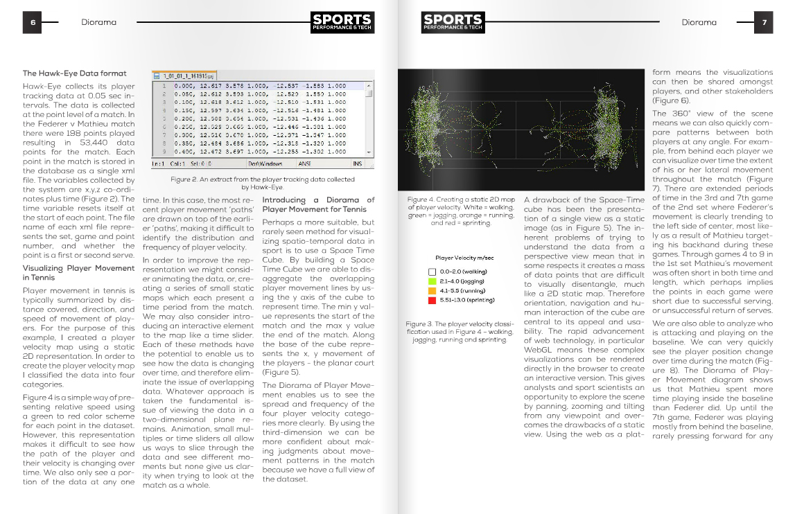
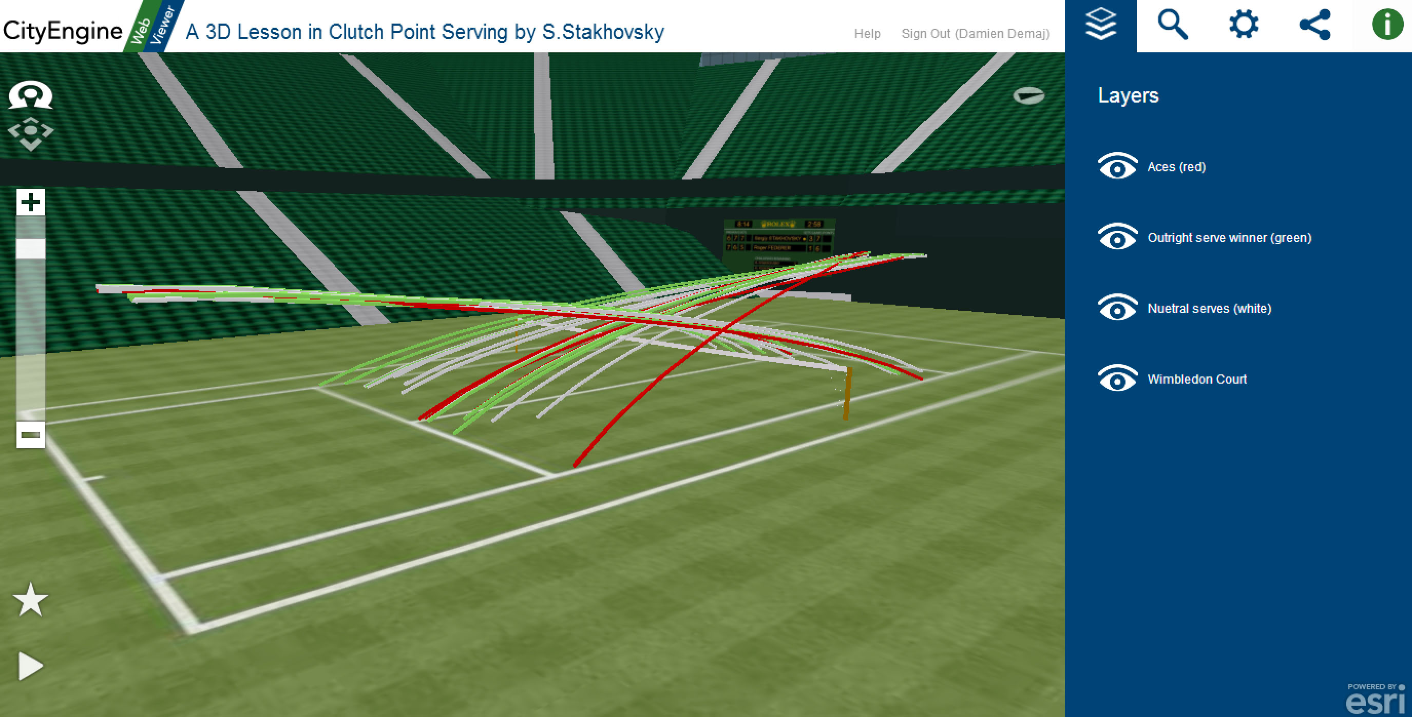
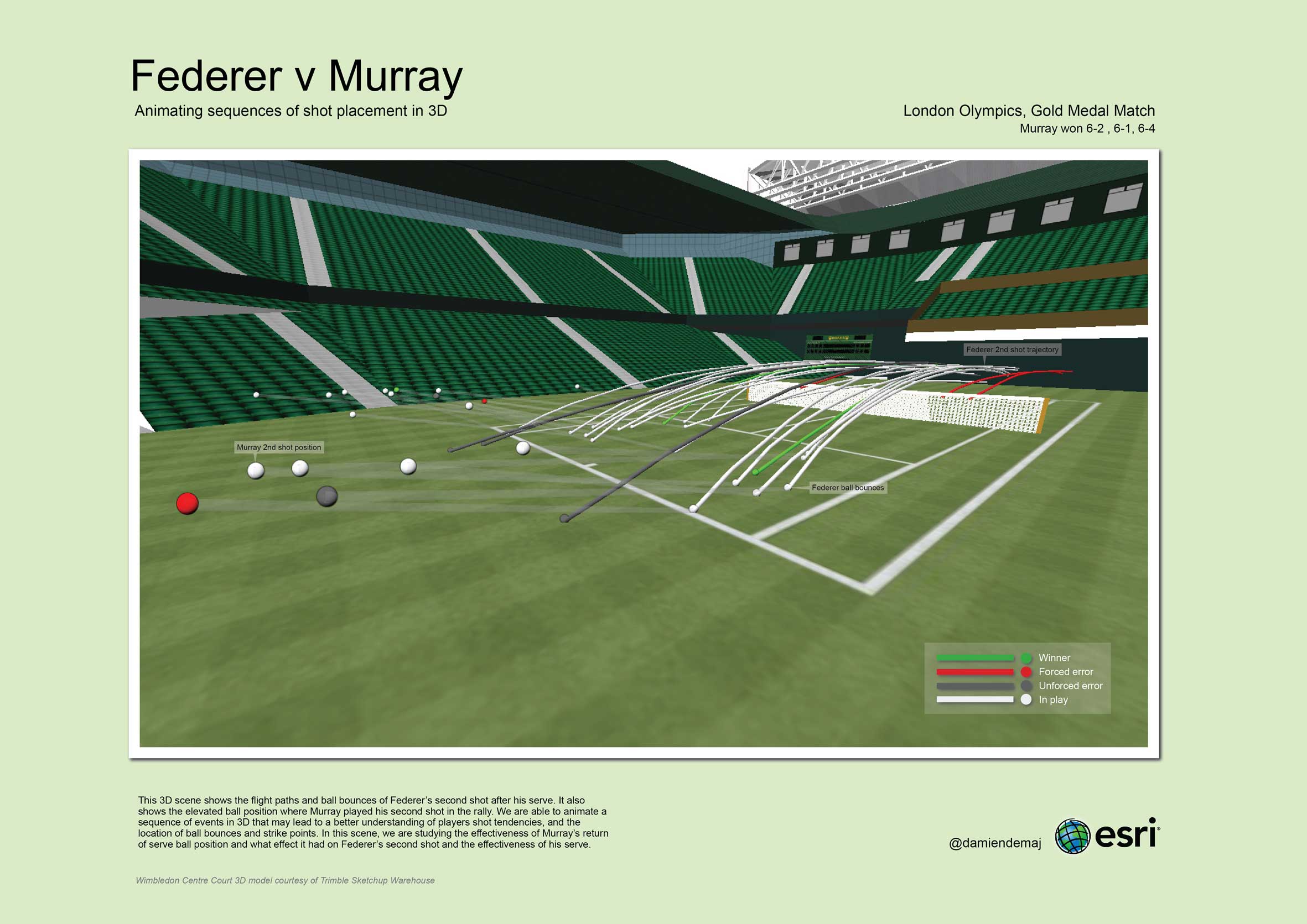
Figure 1: Igniting further exploration using visual analytics. Created in ArcScene, this 3D visualization depicts the effectiveness of Murray’s return in each rally and what effect it had on Federer’s second shot after his serve. (click to enlarge)

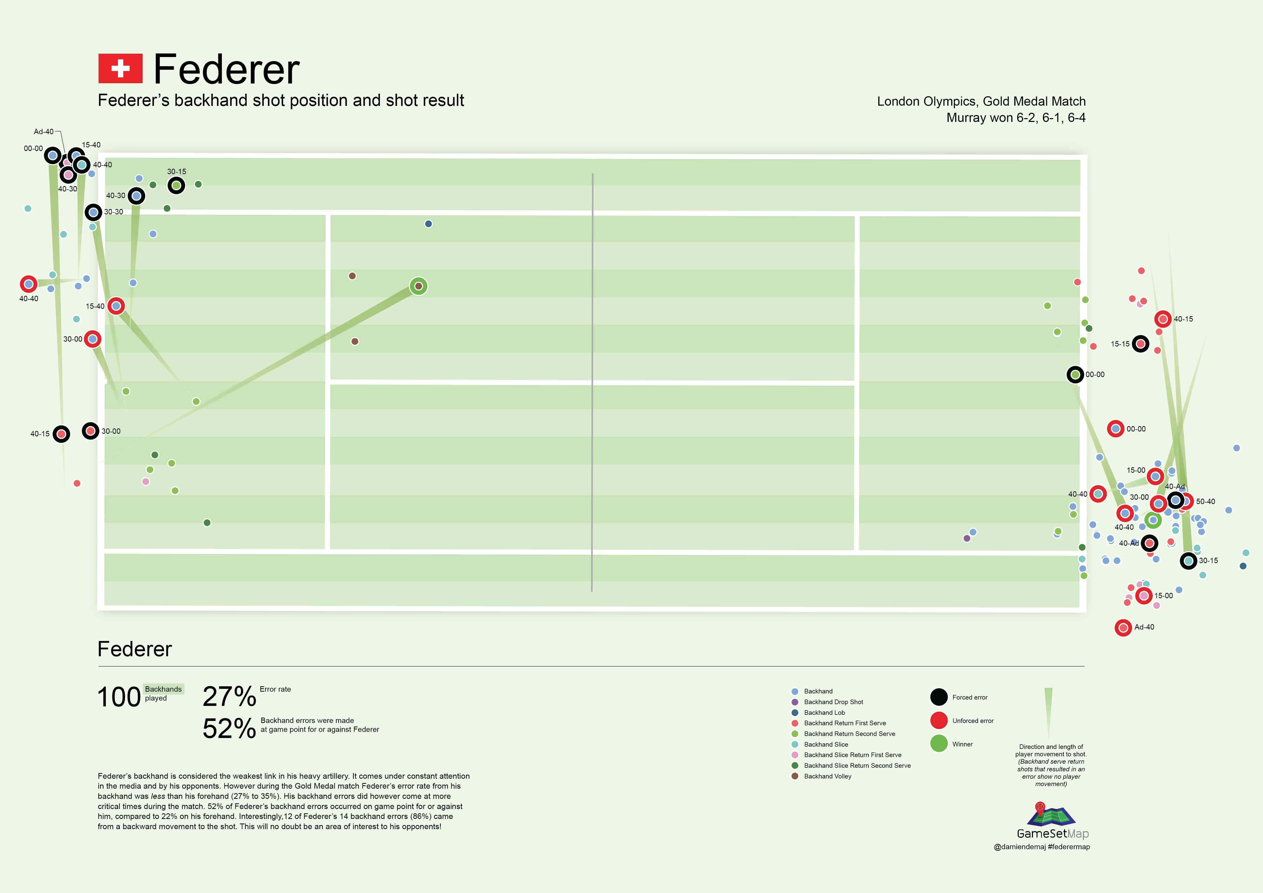
The Most Important Shot in Tennis?

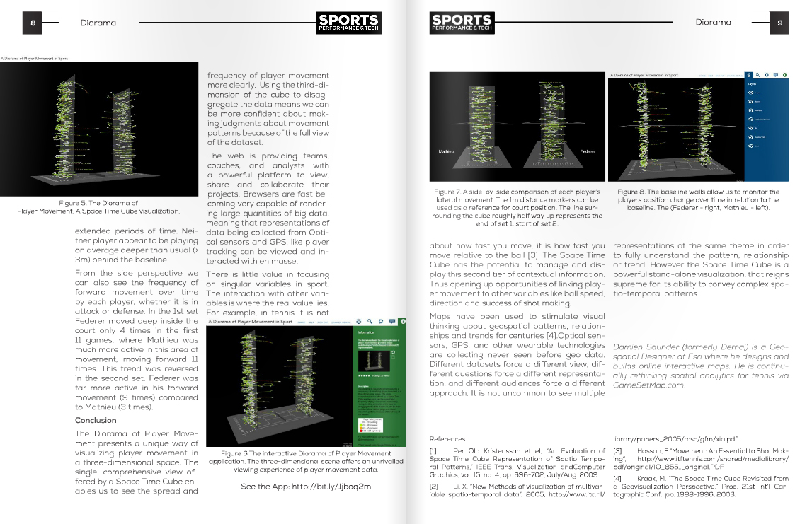
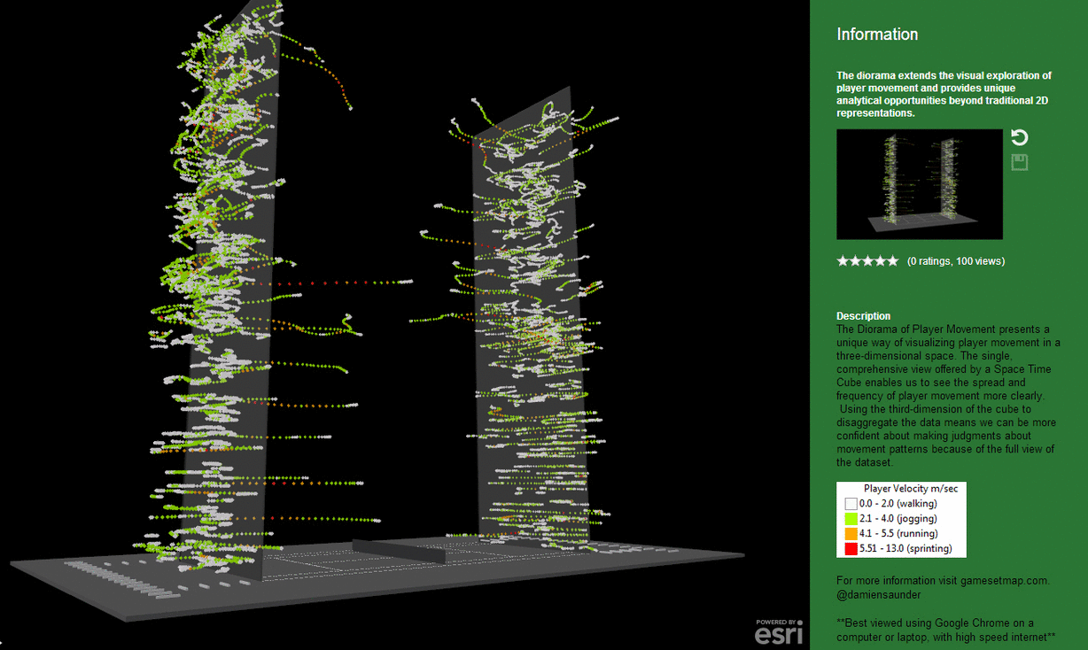
The serve is arguably the most important shot in tennis. The location and predictability of a players serve has a big influence on their overall winning serve percentage. A player is who is unpredictable with their serve, and can consistently place their serve wide into the service box, at the body or down the T is more likely to either win a point outright, or at least weaken their opponent’s return [1].

The results of tennis matches are often determined by a small number of important points during the game. It is common to see a player win a match who has won the same number of points as his opponent. The scoring system in tennis also makes it possible for a player to win fewer points than his opponent yet win the match [2]. Winning these big points is critical to a player’s success. For the player serving, their aim is to produce an ace or, force their opponent into an outright error, as this could make the difference between winning and losing. It is of particular interest to coaches and players to know the success of players serve at these big points.

Geospatial Analysis

In order to demonstrate the effectiveness of geo-visualizing spatio-temporal data using GIS we conducted a case study to determine the following: Which player served with more spatio-temporal variation at important points during the match?

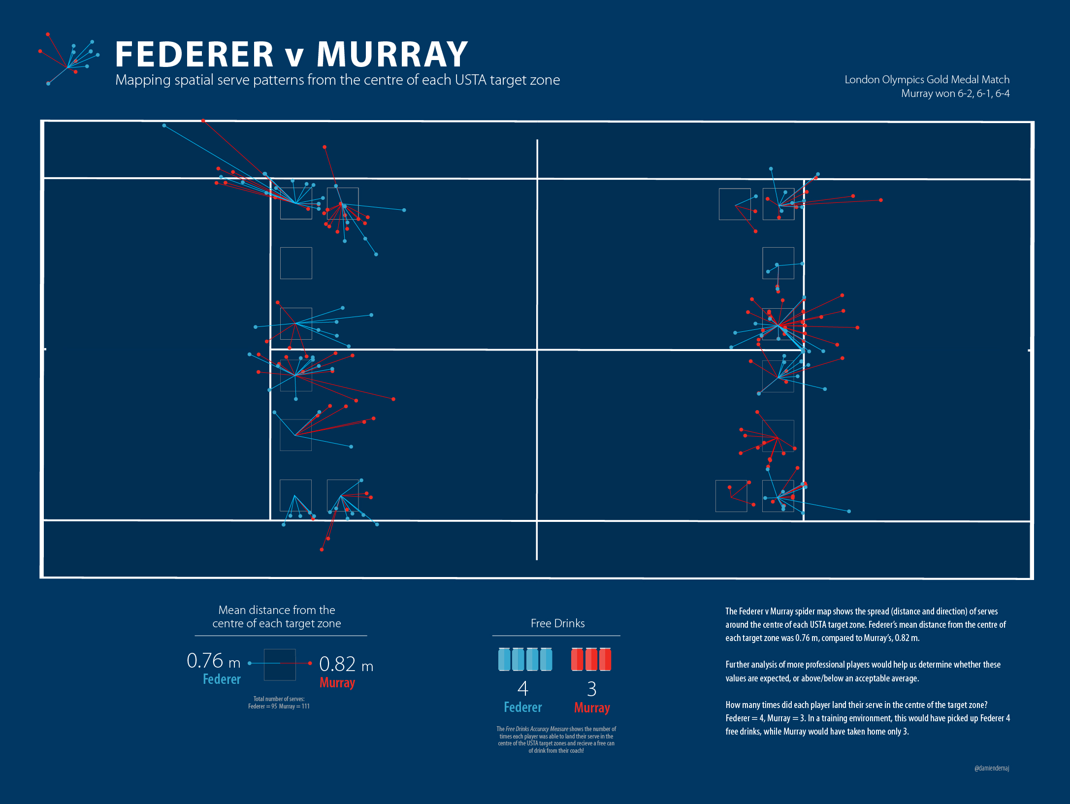
To find out where each player served during the match we plotted the x,y coordinate of the serve bounce. A total of 86 points were mapped for Murray, and 78 for Federer. Only serves that landed in were included in the analysis.  Visually we could see clusters formed by wide serves, serves into the body and serves hit down the T. The K Means algorithm [3] in the Grouping Analysis tool in ArcGIS (Figure 2) enabled us to statically replicate the characteristics of the visual clusters. It enabled us to tag each point as either a wide serve, serve into the body or serve down the T. The organisation of the serves into each group was based on the direction of serve. Using the serve direction allowed us to know which service box the points belong to. Direction gave us an advantage over proximity as this would have grouped points in neighbouring service boxes.

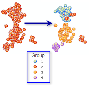
Figure 2. The K Means algorithm in the Grouping Analysis tool in ArcGIS groups features based on attributes and optional spatial temporal constraints. 

To determine who changed the location of their serve the most we arranged the serve bounces into a temporal sequence by ranking the data according to the side of the net (left or right), by court location (deuce or ad court), game number and point number. The sequence of bounces then allowed us to create Euclidean lines (Figure 3) between p1 (x1,y1) and p2 (x2,y2), p2 (x2,y2) and p3 (x3,y3), p3 (x3,y3) and p(x4,y4) etc in each court location. It is possible to determine, with greater spatial variation, who was the more predictable server using the mean Euclidean distance between each serve location. For example, a player who served to the same part of the court each time would exhibit a smaller mean Euclidean distance than a player who frequently changed the position of their serve. The mean Euclidean distance was calculated by summing all of the distances linking the sequence of serves in each service box divided by the total number of distances.

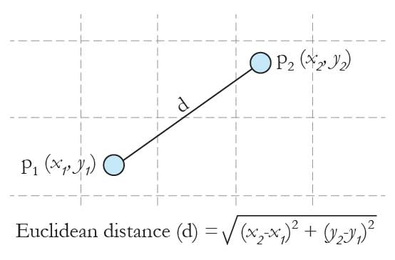
Figure 3. Calculating the Euclidean distance (shortest path) between two sequential serve locations to identify spatial variation within a player’s serve pattern.

To identify where a player served at key points in the match we assigned an importance value to each point based on the work by Morris [4]. The table in Figure 4 shows the importance of points to winning a game, when a server has 0.62 probability of winning a point on serve. This shows the two most important points in tennis are 30-40 and 40-Ad, highlighted in dark red. To simplify the rankings we grouped the data into three classes, as shown in Figure 4.

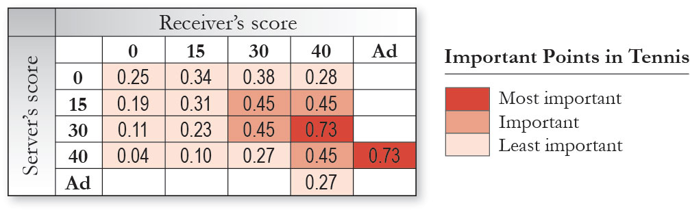
Figure 4. The importance of points in a tennis match as defined by Morris. The data for the match was classified into 3 categories as indicated by the sequential colour scheme in the table (dark red, medium red and light red).

In order see a relationship between outright success on a serve at the important points we mapped the distribution of successful serves and overlaid the results onto a layer containing the important points. If the player returning the serve made an error directly on their return, then this was deemed to be an outright success for the player. An ace was also deemed to be an outright success for the server.

Results

Federer’s spatial serve cluster in the ad court on the left side of the net was the most spread of all his clusters. However, he served out wide with great accuracy into the deuce court on the left side of the net by hugging the line 9 times out 10 (Figure 5). Murray’s clusters appeared to be grouped overall more tightly in each of the service boxes. He showed a clear bias by serving down the T in the deuce court on the right side of the net. Visually there appeared to be no other significant differences between each player’s patterns of serve.

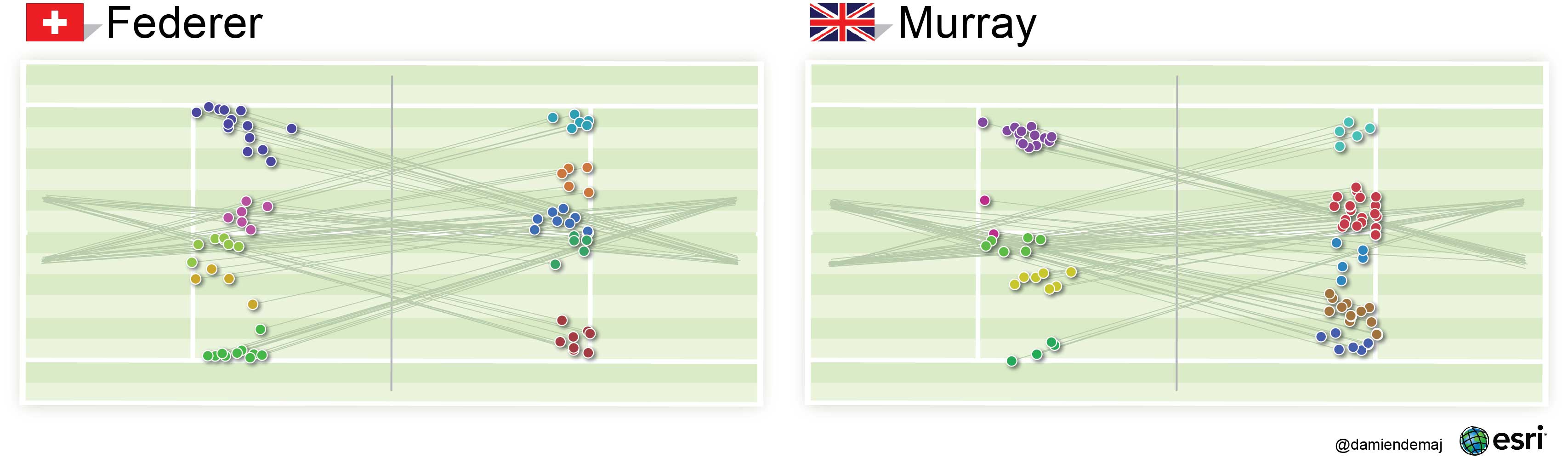
Figure 5. Mapping the spatial serve clusters using the K Means Algorithm. Serves are grouped according to the direction they were hit. The direction of each serve is indicated by the thin green trajectory lines.  The direction of serve was used to statistically group similar serve locations.  (click to enlarge)

By mapping the location of the players serve bounces and grouping them into spatial serve clusters we were able to quickly identify where in the service box each player was hitting their serves. The spatial serve clusters, wide, body or T were symbolized using a unique color, making it easier for the user to identify each group on the map. To give the location of each serve some context we added the trajectory (direction) lines for each serve. These lines helped link where the serve was hit from to where the serve landed. They help enhance the visual structure of each cluster and improve the visual summary of the serve patterns.

The Euclidean distance calculations showed Federer’s mean distance between sequential serve bounces was 1.72 m (5.64 ft), whereas Murray’s mean Euclidean distance was 1.45 m (4.76 ft). These results suggest that Federer’s serve had greater spatial variation than Murray’s. Visually, we could detect that the network of Federer’s Euclidean lines showed a greater spread than Murray’s in each service box. Murray served with more variation than Federer in only one service box, the ad service box on the right side of the net.

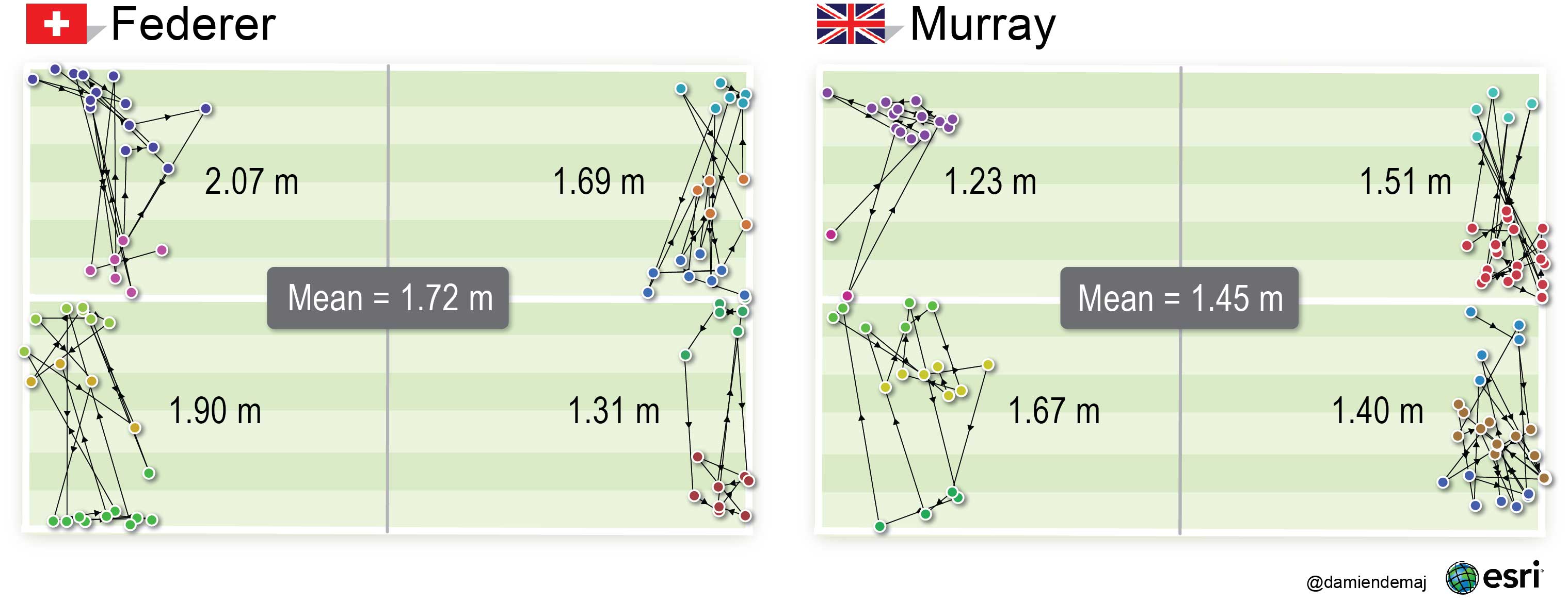
Figure 6. A comparison of spatial serve variation between each player. Federer’s mean Euclidean distance was 1.72m (5.64 ft) –  Murrray’s was 1.45m (4.76 ft). The results suggest that Federer’s serve had greater spatial variation than Murray’sThe lines of connectivity represent the Euclidean distance (shortest path) between each sequential service bounce in each service box.  (click to enlarge)

The directional arrows in Figure 6 allow us to visually follow the temporal sequence of serves from each player in any given service box. We have maintained the colors for each spatial serve cluster (wide, body, T) so you can see when a player served from one group into another.

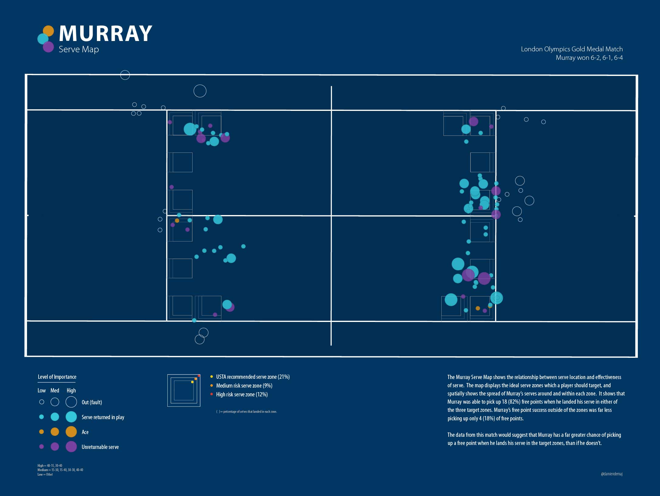
At the most important points in each game (30-40 and 40-Ad), Murray served out wide targeting Federer’s backhand 7 times out of 8 (88%). He had success doing this 38% of the time, drawing 3 outright errors from Federer. Federer mixed up the location of his 4 serves at the big points across all of the spatial serve clusters, 2 wide, 1 body and 1 T. He had success 25% of the time drawing 1 outright error from Murray.  At other less important points Murray tended to favour going down the T, while Federer continued his trend spreading his serve evenly across all spatial serve clusters (Figure 7).

The proportional symbols in Figure 7 indicate a level of importance for each serve. The larger circles represent the most important points in each game – the smallest circles the least important. The ticks represent the success of each serve. By overlaying the ticks on-top of the graduated circles we can clearly see a relationship between the success at big points on serve. The map also indicates where each player served.

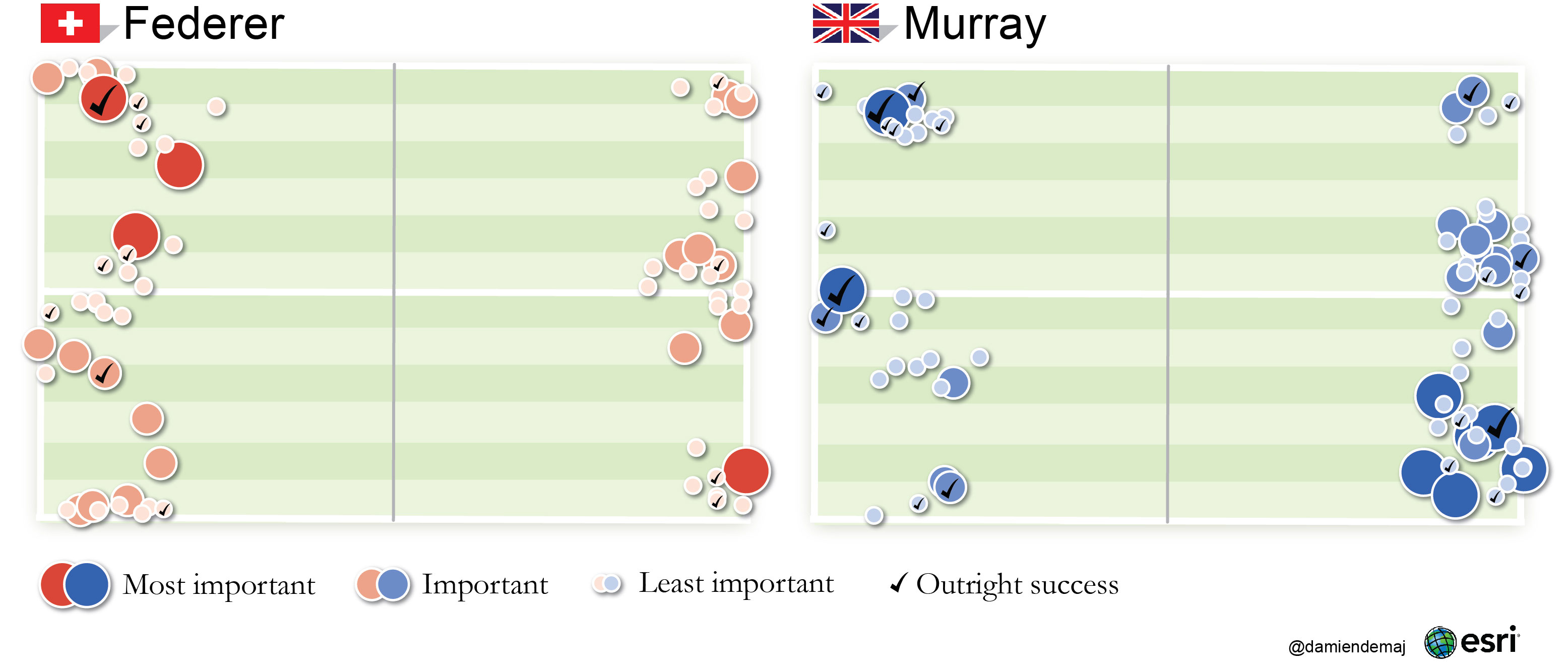
Figure 7. A proportional symbol map showing the relationship of where each player served at big points during the match, and their outright success at those points.  (click to enlarge)

The results suggest that Murray served with more spatial variation across the two most important point categories, recording a mean Euclidean distance of 1.73 m (5.68 ft) to Federer’s 1.64 m (5.38 ft).

Conclusion

Successfully identifying patterns of behavior in sport in an on-going area of work [5] (see figure 8), be that in tennis, football or basketball. The examples in this blog show that GIS can provide an effective means to geovisualize spatio-temporal sports data, in order to reveal potential new patterns within a tennis match. By incorporating space-time into our analysis we were able to focus on relationships between events in the match, not the individual events themselves. The results of our analysis were presented using maps. These visualizations function as a convenient and comprehensive way to display the results, as well as acting as an inventory for the spatio-temporal component of the match [6].

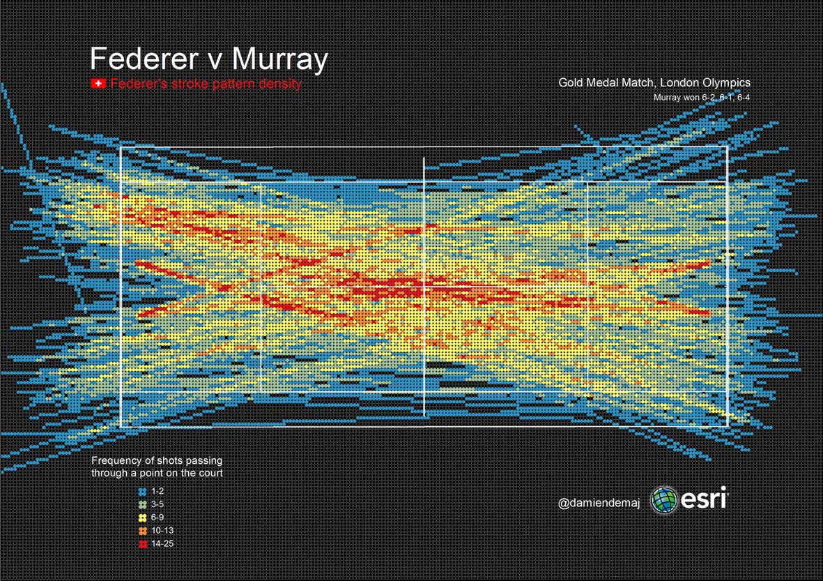
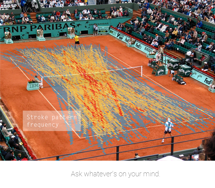
Figure 8. The heatmap above shows Federer’s frequency of shots passing through a given point on the court. The map displays stroke paths from both ends of the court, including serves. The heat map can be used to study potential anomalies in the data that may result in further analysis.  (click to enlarge)

Expanding the scope of geospatial research in tennis, and other sports relies on open access to reliable spatial data.  At present, such data is not publically available from the governing bodies of tennis. An integrated approach with these organizations, players, coaches, and sports scientists would allow for further validation and development of geospatial analytics for tennis. The aim of this research is to evoke a new wave of geospatial analytics in the game of tennis and across other sports. Furthermore, to encourage statistics published on tennis to become more time and space aware to better improve the understanding of the game, for everyone.

References

[1] United States Tennis Association, “Tennis tactics, winning patterns of play”, Human Kinetics, 1st Edition, 1996.

[2] G. E. Parker, “Percentage Play in Tennis”, In Mathematics and Sports Theme Articles, http://www.mathaware.org/mam/2010/essays/

[3] J. A. Hartigan and M. A. Wong, “Algorithm AS 136: A K-Means Clustering Algorithm”, Journal of the Royal Statistical Society. Series C (Applied Statistics), vol. 28, No. 1, pp. 100-108, 1979.

[4] C. Morris, “The most important points in tennis”, In Optimal Strategies in Sports, vol 5 in Studies and Management Science and Systems, , North-Holland Publishing, Amsterdam, pp. 131-140, 1977.

[5] M. Lames, “Modeling the interaction in games sports – relative phase and moving correlations”, Journal of Sports Science and Medicine, vol 5, pp. 556-560, 2006.

 [6] J. Bertin, “Semiology of Graphics: Diagrams, Networks, Maps”, Esri Press, 2nd Edition, 2010.