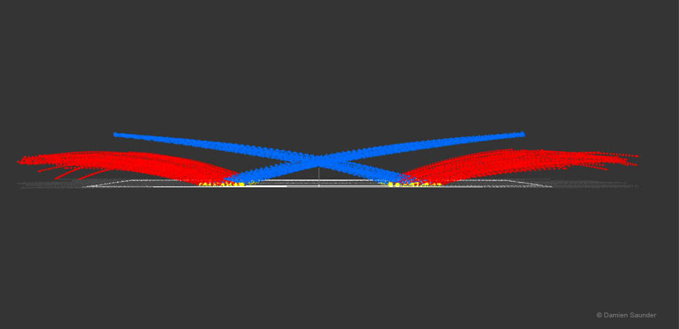
Late last night I was running some analysis on serving, and serve return hit points and I stumbled across this 3D view of the data which made me stop and marvel at how unique the symmetry of a tennis serve is. The image below visualizes over 350 serves. The view of the image is taken from side on to the court.
- The blue dots represent the serve trajectories.
- The yellow dots are the location of serve bounces.
- The red lines are the trajectories of the ball bounces.
This image was created using Hawk-Eye data from an ATP men’s match. Tennis is a unique game in many ways, and the data driving the game is more beautiful than ever. Unfortunately I can’t share any of the results from the analysis but I hope you appreciate the symmetry in this rare image like I did.

