Recently Japan’s National Broadcaster (NHK) contacted me to provide Hawk-Eye analytical support for a documentary they were preparing on Kei Nishikori. I was asked to process and analyze the raw Hawk-Eye data. I teamed up with Jordan Montreuil, an animator from LA to provide high-quality 3D scenes that would support the analysis. The documentary aired in Japan on the 13th January prior to the Australian Open. You can watch the program here.
The rise in popularity of Kei Nishikori is illustrated in NHK’s documentary titled “Kei Nishikori: Trails of the Progress” (translated). The documentary explores Nishikori’s growth and development as a player.
Below are a few samples from the project. Unfortunately I can’t share too many details but I hope this gives you some idea of the work completed.
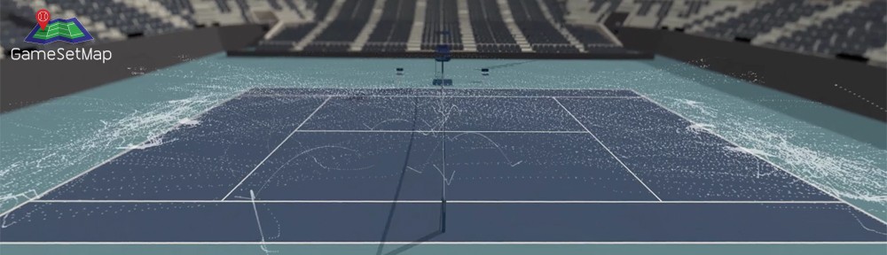
The results of the Hawk-Eye analysis were told using a series of 3D computer generated (CG) animations. The images above are stills taken from the story surrounding Djokovic’s shot depth against Nishikori at the World Tour Finals.
For each scene, storyboards and animation concepts were drafted in order to understand how the story would unfold.
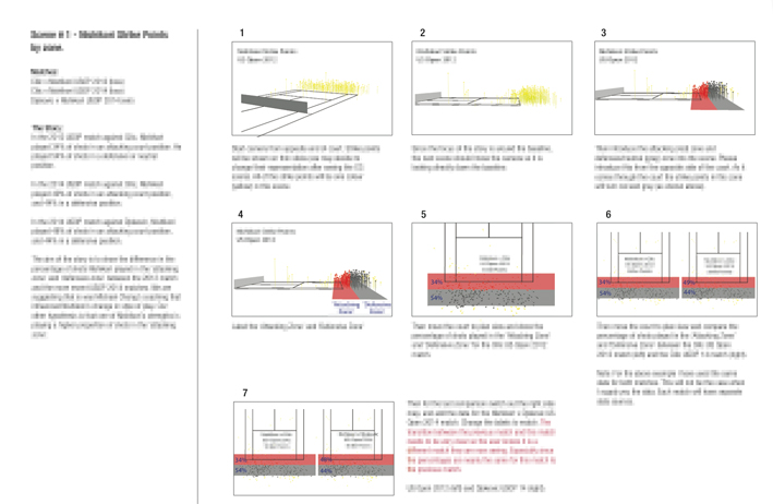
A typical storyboard which was used to prepare and support the animations. Text is blurred on purpose.
The following clip (2:14 min) from the documentary introduces the viewer to the millions of Hawk-Eye data points that were analyzed for the documentary, and how the data was used to identify trends and patterns in Nishikori’s game.
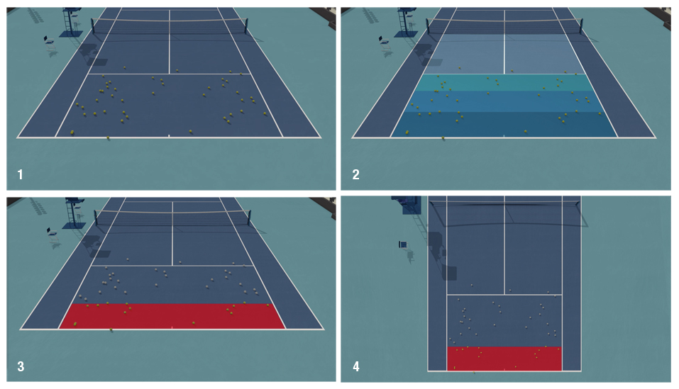
The video then goes on to compare Nishikori’s hit point location from his 2012 and his 2014 US Open matches against Cilic. One of Nishikori’s strengths under Chang is that he plays ‘up’ on the baseline, taking time away from his opponent. In 2012 before Chang, Nishikori played only 34% of shots 1 m either side of the baseline. We refer to this zone as the attacking zone. In 2014 against Cilic again at the US Open, Nishikori played 49% of his shots in the attacking zone.
Finally we graph Nishikori and Wawrinka’s shot speed trend at the 2014 US Open. Nishikori’s shot speed trended constantly upwards throughout the entire match, while Wawrinka’s trended downwards. This was a distinguishing feature of Nishikori’s game at the US Open.
The complete documentary can be viewed here.
The analysis of the Hawk-Eye data provided ‘scientific’ proof of Nishikori’s strengths and weaknesses. It was also clear during the analysis and cross validating the results against player interviews that the players and coaches don’t always have a clear understanding of why they won or lost a match. We were able to validate the many assumptions, or commentary about a match with the use of such data.
The producer’s primary goal was to tell a story that was backed by real data. The animations played a critical part in delivering the story and messaging. They allowed us to simplify the 1 million plus data points that were analyzed, crunched, and spat out. Unfortunately there is only 43 minutes of tape in the final cut, but there were many revealing patterns and trends identified that are no doubt valuable to tennis players, coaches and sports reporters. If you would like to know more please get in touch. But for now, as they say in show business – that’s a wrap!
Video’s copyright NHK. Analysis and images copyright GameSetMap. Do not share the contents of this webpage without permission.