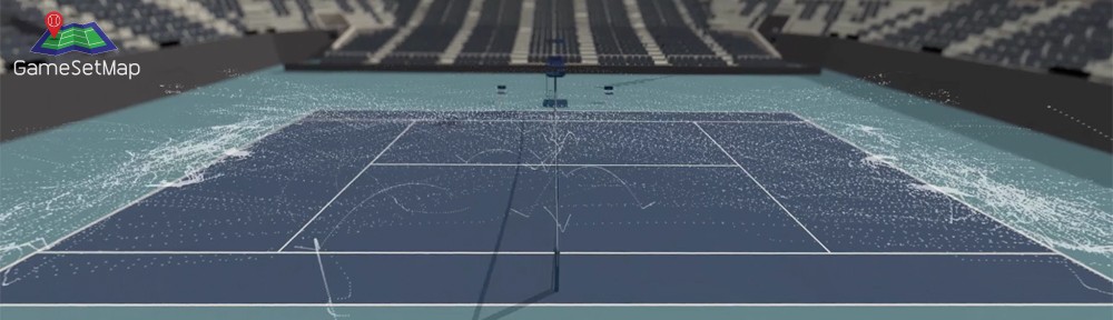
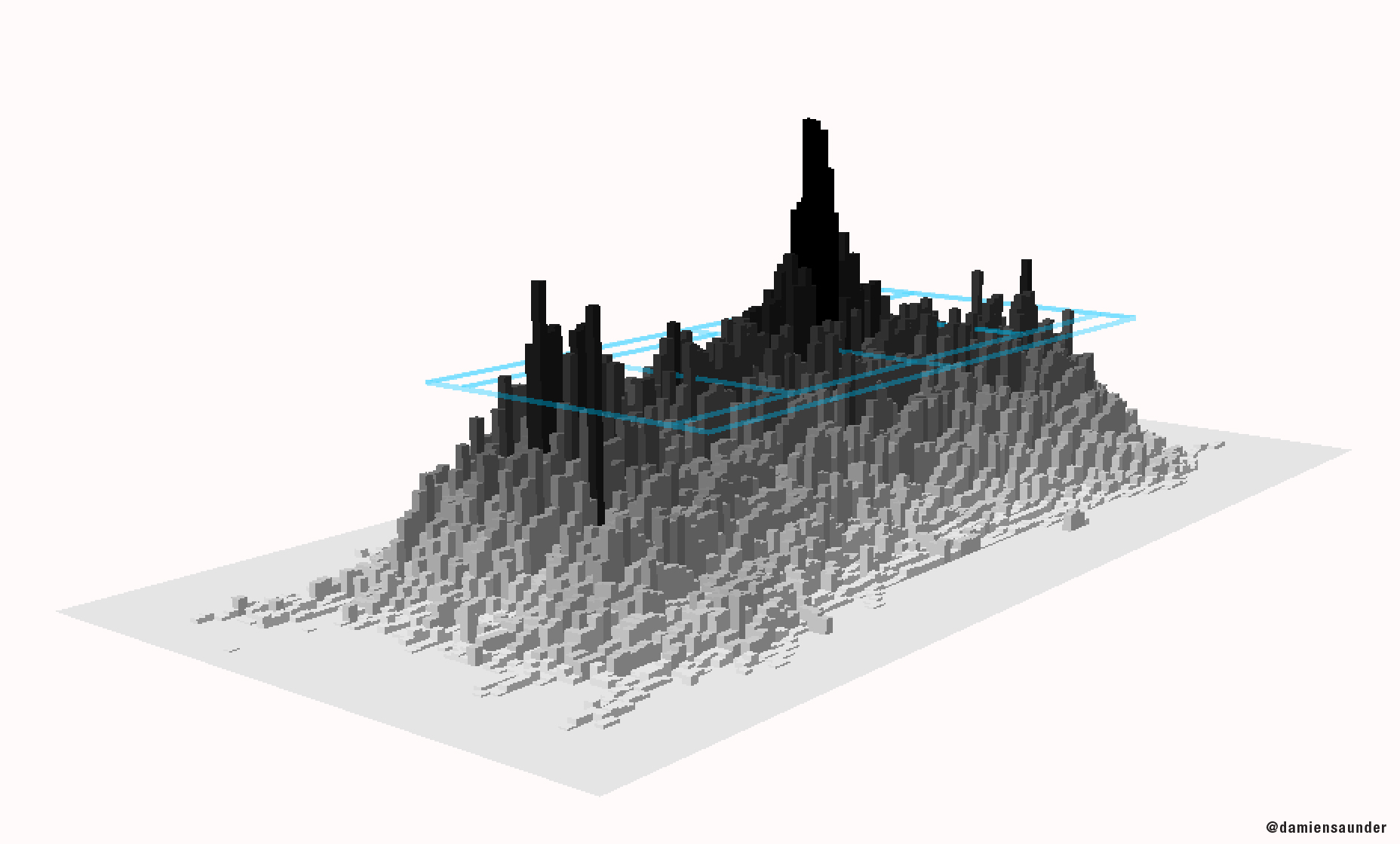
Late last week I was running some exploratory analysis on stroke patterns for a client when I stumbled across this during one of my 3D sessions.The image is a 3D heat map and shows the frequency of ball movement on the court. A heat map is a essentially a graphical representation of the data where individual values contained in a each cell on the grid are represented as colours, or by height. For example the tallest and darkest areas show where the ball was most frequent, and the shortest lightest grey areas show where the ball was the least frequent. You can see (as expected) that the ball passed over the central part of the net more than anywhere else on the court. Both these players were right handers and the majority of cross court exchanges were played from the backhand side of the court. You will also notice that tall pillars exist at each end of the court where the serve is hit from.
 <click image to enlarge>
The data used in this visualisation is from official Hawk-Eye data played over 5 sets at the US Open. The raw data contains 10’s of thousands of data points and it is impossible to detect any sort of pattern in the data without applying some sort of cluster analysis to the data. The 3D aspect of the visualisation accentuates the values in each cell even more. Unfortunately in this static image the tall pillars hide other pillars behind them making it difficult to get a true feel for the overall pattern in the data. Thankfully in the live 3D scene you have the ability to constantly change your viewing angle so the problem of hidden data is largely void. The grid spacing used above is 30 cm.
There are many ways which you can cluster your data to provide more meaningful insights. Heat maps provide a quick snapshot of your data and help better understand the key components of your data. From here I’m taking a deeper dive into analysing stroke patterns. The analysis continues…