The story from week one at Wimbledon was the exit of so many big name players either through defeat or injury. Rafael Nadal and Maria Sharapova were both forced to pack their bags and head home much earlier than they would have liked. As did the reigning Champion Roger Federer.
Sergiy Stakhovsky played out of his skin against the swiss mystro putting on a clinic of clutch point serving throughout the match. Sergiy was able to back-up his serving with sublime touch at the net. Sergiy won the match 6-7, 7-6, 7-5, 7-6 in just under 3 hours.
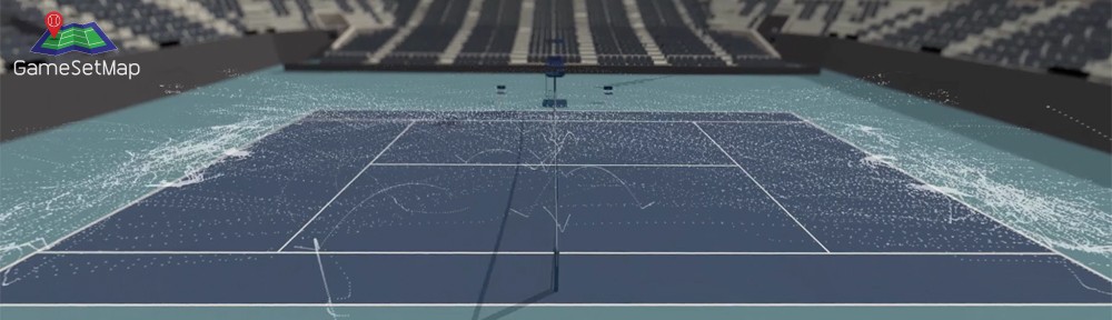
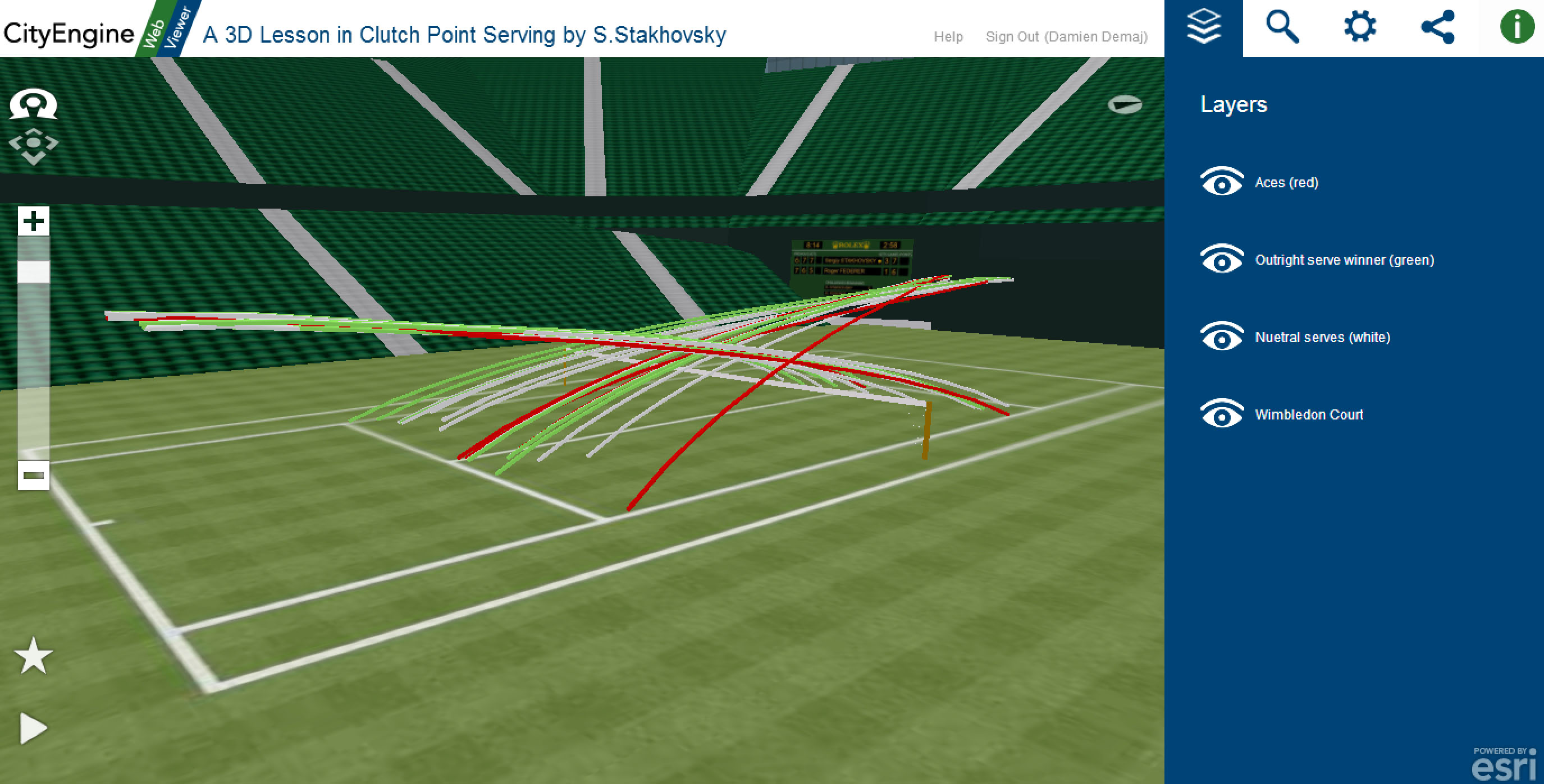
To celebrate Sergiy’s win I’ve prepared a unique 3D tennis visualization that invites you to step onto Centre Court at Wimbledon and see how Sergiy bundled out the 7 time Wimbledon Champion Roger Federer in the 2nd round.
Click here to open the 3D application. (Best viewed in Google Chrome on a desktop machine).
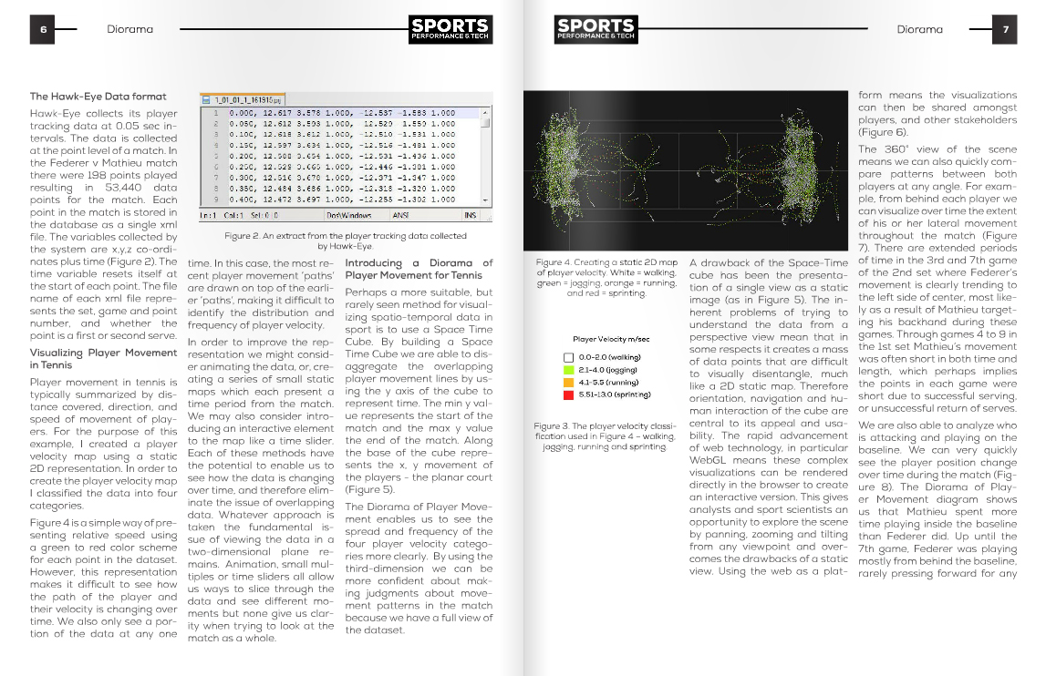
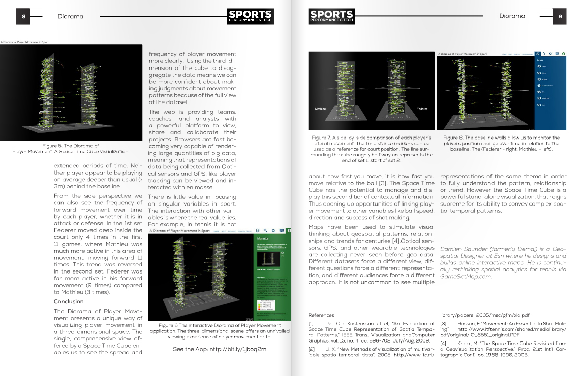
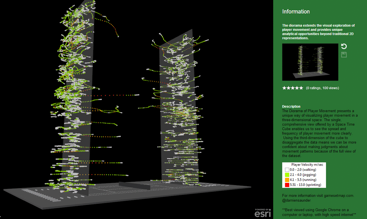
Sergiy served almost exclusively to Federer’s backhand at important points (37 out of 43, 86%). On 4 occasions Sergiy went to Federer’s forehand side. Of those 4 serves he aced him twice! And in the duece court he went straight at Federer’s body two times, having success half of those times.
When Federer was able to return Sergiy’s serve into play (as shown by the white lines on the map), he won 9 of 22 points (40%), while Sergiy won 13 of 22 (59%).
The visualisation only includes serves at 15-30, 30-30, 15-40, 30-40 ans 40-Ad, and all of Sergiy’s serves during each tiebreak.
The red lines on the map are aces. The green lines are where Sergiy forced Federer into a direct error on his return of serve. The white lines are serves that Federer put back in play.
The 3D map is completely interactive. Click on each line and retrieve information about when the serve was made and what the score was.
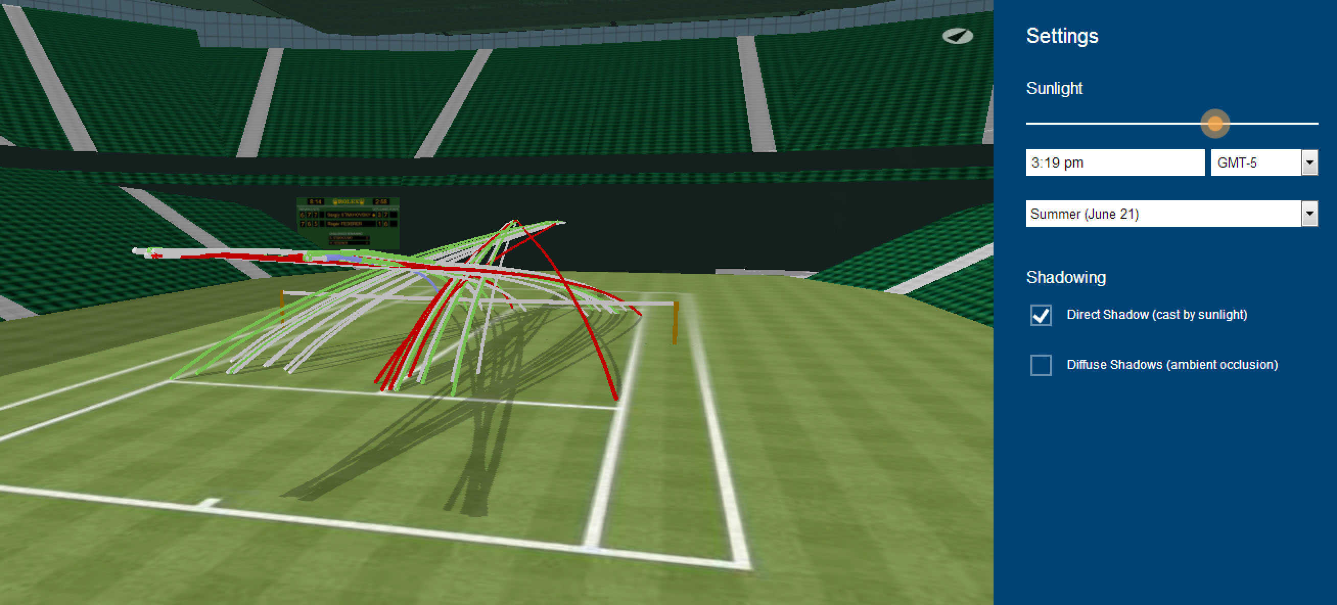
You can even add a little more realism to the scene by adding shadows to the court.
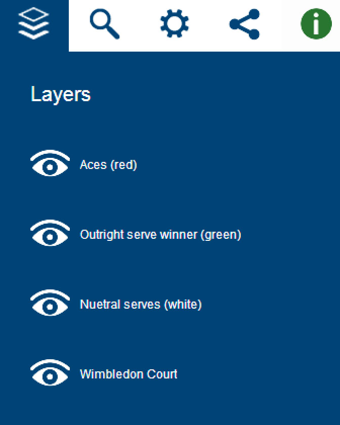
Use the eye icons in the menu below to turn on/off layers in your scene.
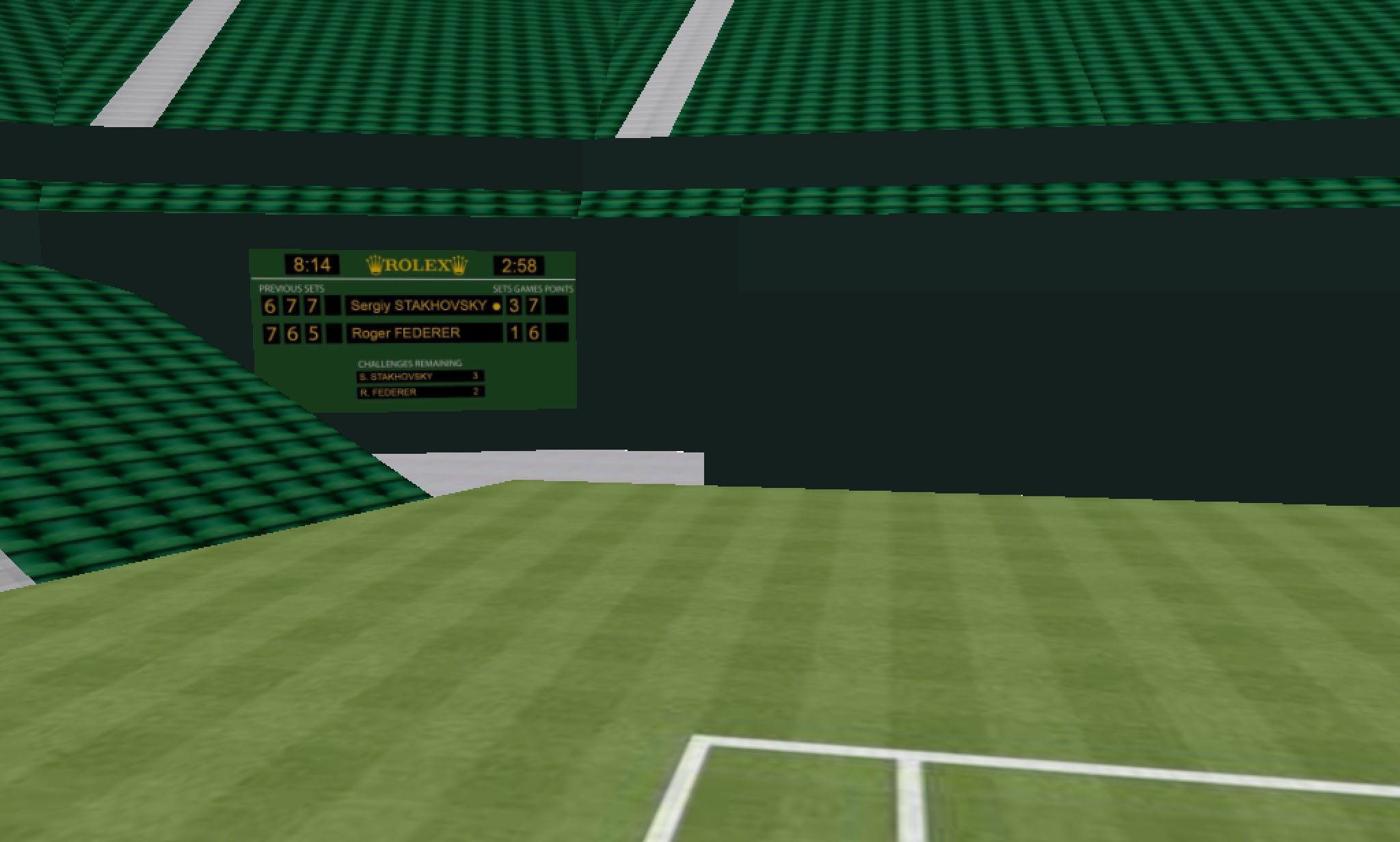
To record the historic moment I have added the final score of the match, the match duration and the time the match was completed (local time) to the scoreboard!
Spatial serve variation is thought to be a good indicator of ones serve success. However as you can see in the visualization Sergiy was not afraid of becoming predictable. I guess when you are having so much success doing one thing, why change it up right?
I hope you enjoy this immersive 3D tennis experience!
The above scene uses new HTML 5 WebGL technology, so there is no need to install a plugin to view the scenes. For more information about the City Engine viewer click here.