ATP World Tour Interactive Map – 2014

With the 2014 ATP World Tour underway in Brisbane, Doha and Chennai this week, I thought I would put together a quick interactive map that locates this year’s 61 tournaments around the world. The ATP World Tour map allows fans to follow the world’s greatest players around the world as they battle it out in 2014.

ATP World Tour Map 2014

The ATP World Tour Map – 2014. Click here to access the map.

The map shows the location of the four Grand Slam tournaments, the nine Masters 1000’s, the eleven 500 and the forty 250 series tournaments, as well as the season ending World Tour Finals played in London.

Use the map to check out the site of the newest tournament on the tour this year, The Rio 500 in Brazil. Remind yourself of where the clay tournament in Umag (Croatia) is played. A tournament that returns to the circuit this year after a one year absence. Check out the latest stop in China in 2014 at the Shenzhen Open, a city that is already familiar with the women on the WTA tour.

Explore each tournament in more detail by clicking on each of the icons to reveal further information about the tournament like the prize money on offer, who is the defending champion, what the tournament surface is and other important information.

ATP World Tour Map WimbledonInteract with each tournament to reveal important statistics about each event.

The map features some of the highest resolution available satellite imagery of the globe, meaning you can see the tournaments up close like never before. Click on the “Zoom To” link in the pop-up to quickly navigate to each tournament. You will find yourself being blown away by some of the global landscapes that sit at the doorstep of some of the lesser known tournaments, like the Credit Agricole Suisse Open.

Gstaad TournamentThe 250 series Credit Agricole Suisse Open, set against the backdrop of the beautiful Swiss Alps.

Valencia Open

Discover the Valencia Open 500 (Spain) played at the stunning Ciutat de les Arts i les Ciències where Mikhail Youzhny triumphed in 2013.

In each of the pop-up’s there is a link to the official tournament website where you can see who’s down to play in 2014, and where you can get tickets. I hope you have fun exploring the map throughout the year, and I hope it inspires you to plot your next tennis adventure!

Read the ATP press release about the 2014 tour here.

To view the full 2014 ATP World Tour calendar in PDF format, click here.

Where are you most likely to win a point on Nadal’s serve?

A couple of weeks back I released an interactive Game Tree of Nadal’s stellar 2013 season. The Game Tree was an experimental infographic that mapped Nadal’s service dominance, and showed us his most common path to victory.

Nadal Game Tree

Nadal’s Game Tree captured the imagination of many for its originality and groundbreaking way of visualizing tennis games. 

The flow lines through the original game tree (above) allow us to see some interesting patterns emerging from his 666 service games.

Using the data from the flow lines, I developed the Proportional Symbol Game Tree (see below). It maps the chances an opponent has of winning a point on Nadal’s serve.

Nadal Proportional Symbol mapA Proportional Symbol Game Tree. Mapping the chances an opponent has of winning a point on Nadal’s serve. <click to enlarge>

Below I’ll talk you through a few interesting observations I’ve made about the Proportional Symbol Game Tree. If you see other patterns, and would like to share them drop a comment at the bottom of the page!

The Bad News (for Nadal’s opponents).

The bad news for Nadal’s opponents is that your best chance at winning a point on his serve is at best, only half a chance! 15-15, 0-30, 30-15 and 30-0 are where your best chances are of taking a point from Nadal on his serve. But even at these points, the data tells us that Nadal’s opponents are on average likely to win only 1 in every 2 (0.5) points. Of these points, 30-15 is your absolute best chance of winning a point, representing a 1 in 1.8 chance (0.56), which is hardly encouraging!

The story only get’s worse…

You might as well head to the chair when you get Nadal to Deuce. You have virtually no chance of winning the game from Deuce onwards (see the smallest circle on the proportional symbol diagram above). Nadal dominates his opponents at Deuce more than any other point. He teases his opponents by going back-and-forth between 40-Ad and Ad-40, but according to his 666 service games, he only gives his opponents 1 in 5 chance (0.2) of winning the game from Deuce onwards. OK, so heading for the chair at Deuce might be slightly over doing it, but you had better step up your game big time at Deuce otherwise Nadal will be notching up another game on serve!

If you’re lucky enough to score the first point on Nadal’s serve then history shows that he pulls out all punches to prevent the score line from going to 0-30. The 0-15 point is a clear turning point in the game tree. However if you can get to 0-30 on Nadal’s serve then you are back in with half a chance to take him to 0-40!

The far right bottom three points (40-30, 40-15 and 40-0) indicate that once Nadal get’s a sniff of the finish line, he makes sure he closes it out.  From this position his opponent only ever has on average 1 in 3.3 (0.3) chance of pegging him back to Deuce.

Interestingly at the most important points in each game (15-30, 30-30, 15-40, 30-40 and Deuce) Nadal gives you a very small window of opportunity compared to other points in the game tree. At Deuce we know he dominates, but he’s not putting the hammer down quite as much as expected at these big points.

Summary

Nadal’s 2013 season was historic – no doubt. He rarely lost any games on serve. In fact he won 88% of his 666 service games that we studied.  Apart from the Deuce point there is little variation between the chances his opponents have of winning a point on his serve (0.35 to 0.55). His brutal consistency is clearly evident in these figures, and in the above graphic. The variable scaling of the circles in the Proportional Symbol Game Tree allows us to easily identify opponents areas of opportunity (even if they are only half chances)!

So it’s now off to the video tape and other supplemental tennis stats to see what Nadal is consistently doing at Deuce that makes him so dominant!

—-

Source: Nadal’s Game Tree. The Game Tree app is coded so we can plug it into any ATP, WTA or Challenger event. Let us know who you’d like to see mapped next!

Original data source: William Hill

References: C. Morris, “The most important points in tennis”, In Optimal Strategies in Sports, vol 5 in Studies and Management Science and Systems, , North-Holland Publishing, Amsterdam, pp. 131-140, 1977.

The Comeback. An interactive Game Tree of Nadal’s extraordinary 2013 season.

On February 5, 2013, following a 222 day break from the game, Rafael Nadal returned to tennis ranked #8 in the world. Just 9 months later he completed an almost flawless comeback ending the year ranked the #1 player in the world for the third time.

To celebrate Nadal’s historic season we present his 2013 interactive Game Tree. Nadal’s Game Tree allows you to explore how his 600+ service games played out in the Grand Slams, Masters 1000 and World Tour Finals.

NadalGameTree_new

Click here to access Nadal’s interactive Game Tree application. 

This rare point-by-point summary shows where Nadal’s history breaking season was won and rarely lost.

The Game Tree presents an alternate way of visualizing game momentum. The challenge was to come up with a visualization that better reflects game momentum, and therefore shows how easily, or not a player wins their service game.

Each point in Nadal’s Game Tree is colour coded to reflect the momentum in each game. Blue representing positive momentum, and red negative momentum. The spine of the game tree is coloured white indicating neutral territory for Nadal.

About Nadal Game Tree

Mapping momentum through the Game Tree. Each point in the Game Tree diagram is tagged with a colour that matches its momentum classification.

When Nadal dominates a match you will see him flow through the outside ‘positive’ points of the Game Tree. When he struggles to hold serve, or looses his serve his flow will tend to move the through the ‘neutral’, or outside ‘negative’ points. The Game Tree clearly shows how Nadal dominated his opponents on serve this season by the frequency of points through the positive side of the Game Tree.

Game Tree’s are perfect for coaches and players to see where in the game a player is making it, or breaking it. Once they identify the breaking points, they can go to the tape and see what’s happening on court.

And the great news is we have coded the app so we can plug in any ATP, WTA or Challenger match/es into their own Game Tree!

We believe this is the first interactive point-by-point Game Tree that maps an entire season of service games for one player. The Game Tree interactive is an experiment to see what we can do with traditional forms of tennis data. Please let us know what you think; we’d love to hear from you.

A massive thanks to David Webb for coding this up, and Ella Ling for allowing me to use her fantastic Nadal pic on the opening page. Next week we’ll go into a little more detail about the concept, design and development of the app.

Enjoy!

Pinpointing the serve. Who missed, and by how much.

(Part 3 of 3)

In the final part of this three part series, I determine who picks up the most free drinks as a result of hitting the centre of the USTA target zone, and by how much. I also extend the analysis to see how much each player missed the ‘optimum’ serve locations.

Who picks up the most free drinks?

For a bit of fun let’s see who would have picked up the most free drinks by hitting the ‘imaginary’ cone in the center of each target zone. We know coaches run this drill with their players, so let’s see how well each player fared in a match environment. Let’s assume the cone is 20 cm in diameter.

Federer Murray Serve Map Spider DiagramFigure 1. Federer v Murray. Mapping spatial serve patterns from the centre of each target zone. (click to enlarge)

The results show us that Federer picked up 4 free drinks, while Murray picked up only 3.   I don’t feel too bad since each player hit 100 or so serves each. That’s a pretty poor strike rate given these guys are best players in the world!

Each player missed the target by almost the same amount. Federer was on average     0.76 m from the centre of the each target  zone, while Murray was out by an average of 0.82 m.

Let’s take a look at the School Boys…

NCAA Tennis Serve Spider DiagramFigure 2. School Boy A v School Boy B. Mapping spatial serve patterns from the centre of each target zone. (click to enlarge)

The results show us that School Boy A picked up only 1 free drink, while School Boy B went thirsty not hitting the center of any of the targets! Ok, so now I’m feeling really good.

School Boy A on average missed the centre of the target zone by 0.94 m, while School Boy B was only out by an average of 0.80 m.

As discussed in part 2 of the blog, it’s reasonable to assume that perhaps the players weren’t targeting the centre of each zone. What if they were aiming for a ‘optimum’ but higher risk serve position? In part 2 of the blog we argued that the corners and lines were the ‘optimum’ positions to land your serve. So let’s see how far each player was from these ‘optimum’ serve positions.

Federer Murray Serve Map Spider Diagram 2Figure 3. Federer v Murray. Mapping spatial serve patterns from the ‘optimum’ serve locations. (click to enlarge)

Figure 3 shows us that Federer missed the ‘optimum’ serve locations on average by     0.88 m, while Murray missed on average by 1.04 m.

NCAA Serve map Spider DiagramFigure 4. School Boy A v School Boy B. Mapping spatial serve patterns from the ‘optimum’ serve locations. (click to enlarge)

Figure 4 shows us that School Boy A missed the ‘optimum’ serve locations on average by 1.15 m, while School Boy B missed on average by 1.22 m.

What can we learn from this?

Well we know that Federer takes home as many free drinks as the other three put together! We also know that Federer was on average serving closer to the ‘optimum’ locations than Murray which supports our analysis in part 2 of the blog, where we found Federer to target the high risk zones more than any other player.

We all expected the spread of the School Boy serves around the ‘optimum’ zones to be greater than the Big Boys due the results in part 2, where the Big Boys landed more balls in these ‘optimum’ areas. When we changed the target position back to the centre of each zone the School Boys and Big Boys numbers pretty much evened up, again supporting the results in part 2.

Spider Diagrams: The spider diagrams allowed us to visually link the serves to their target points and see the spread (length and direction) around each point. The spider lines for each zone allow us to very quickly see any bias in direction and distance towards the spread of serve around the points.  Without the lines it would be difficult to identify the serve clusters, and which central point they belong to.

Outliers: There were a couple of serve outliers for the Big Boys but these didn’t affect their averages enough to remove them from the calculations. The School Boys certainly had some big misses, but because there were multiple instances of these so they were left in the calculations.

More Data: With a larger dataset across different players we would be able to determine what is the expected norm, and whether these results are above or below that. Unfortunately, large serve datasets that are easily accessible to the players, coaches or analyst do not exist in tennis (hint hint ATP and WTA).

0.75 m: Let’s think back to part 2 of the blog for a minute. The size of the USTA target zones are 0.75 m square. Perhaps this tells us something. On average the four players missed by 0.83 m. Maybe the USTA set their targets knowing these missed averages and that is the reason for the particular size of the boxes?

To Summarize…

Over the course of the three blogs I have presented an alternative way of assessing a player’s serve accuracy using the USTA defined serve zones, and an additional two ‘higher risk’ zones. When comparing serve accuracy around the USTA zones there was very little difference between the four players. However once we started to analyze the serve towards the higher risk zones (the ‘optimum’ serve areas) the results started to lean in favor of the Big Boys, Federer and Murray.

I also set out to determine whether serve location really matters in tennis. The results suggest that it depends on what level of tennis is being played. The Big Boys clearly had more outright success on serves that landed in the USTA zones, and the higher risk zones than if they missed these zones. It was a different story for the School Boys however, as it didn’t appear to make any difference to their outright success rate whether they served in or outside the zones.

There is much work to be done in expanding the analysis of serve accuracy, serve success, and general serve patterns. Let’s hope we start to see more meaningful statistics from broadcasters and commentators about the serve in order to better understand who really are the best servers in the game!

Pinpointing the serve. Who’s better? The Big Boys or the School Boys?

(Part 2 of 3)

In part 1 of this 3 part series, I set out to find which player out of Federer, Murray and two NCAA Division 1 players were able to land the highest proportion of their serves in the USTA target zones.

Surprisingly the School Boys outranked the big boys in this simple comparison. However once we moved the target to include zones closer to the lines, Federer’s serving clearly stood out as being the most accurate. See part 1 for the complete results of the analysis. In order to gain some real value out of this analysis, I set out to determine if there was a positive relationship between serve position and outright serve success.

To explore this relationship I classified each serve into an ‘outright success’ category. Throughout the blog I will refer to an outright success point as a free point (to keep things simple).

Free Point definition: An error made by the player returning serve OR an ace made by the server. The remaining serves were either classified as being “returned in play” or “out” (fault).

For each player I generated a Serve Map (see Figures 4 A-D) showing the position of their serves in relation to the three target zones and their free point success.

Click to enlarge each map.

Federer ServeFigure A. Federer’s Serve Map

Murray ServeFigure B. Murray’s Serve Map

NCAA Tennis PlayerAFigure C. School Boy A Serve Map

NCAA Tennis PlayerBFigure D. School Boy B Serve Map.

Mapping the relationship between serve location and the effectiveness of serve. The Serve Maps also show where each player served when it mattered most.

School Boy A was able to collect 3 (50%) free points from his serves inside the zones, compared to 5 (42%) for School Boy B.

Federer picked up 13 (76%) free points from his serves inside the zones, compared to 18 (82%) for Murray.

Summary: The Big Boys picked up 31 (79%) free points from serves that landed in the target zones, compared to 8 (44%) for the School Boys.

Across all four players, 39 (68%) serves out of 57 that landed in the target zones earned the players a free point.

Serves that missed the zones: To test the importance of serve position I calculated how many free points each player picked up off of their serve that landed outside the target zones, but still within the service box.

Federer picked up only 4 (24%) free points on serves outside the zones compared to 13 (76%) inside the zones. While Murray picked up 4 (18%) outside the zones, compared to 18 (82%) inside the zones.

School Boy A picked up 3 (50%) free points when serving outside the target zones, which equalled his inside count 3 (50%), while School Boy B picked up 7 (58%) free points outside, which was more than his inside count of 5 (42%).

Summary:  The Big Boys picked up only 8 (21%) free points from serves that landed outside the target zones, compared to a surprisingly high 10 (56%) for the School Boys.

Across all four players, 18 (31%) serves out of 57 that landed outside the target zones earned the players a free point.

Take-aways:

Based on the data in this analysis the Big Boys clearly had more success on their serve when they landed their serve into the target zones (79% to 21%). This is a significant difference. At this level the Big Boys almost quadruple their chances of getting a free point off of their serve if they land it in the target zones!

Interestingly, the same trend didn’t occur for the School Boys. Player B recorded more success outside the zones than inside (58% to 42%), while School Boy A had the same level of success inside to out. So does it mean at the lower levels of the game that serve position is not all that important? Well it is quite possible. However we need to be a little careful about the above statement given the small-ish sample size and the fact that the study only included two players. It would be interesting to see what the numbers would do over a larger sample size, and with more players. Likewise for the Big Boys, would the high level of success remain with a larger sample spread over different players?

Overall across the four players free points were easier to get inside the target zones than out.

The USTA suggest that improving and practicing your serve location will help strengthen your game, and with some luck you might just pick up some free points along the way! Well that may well be the case, but it also might depend on which level of the game you’re playing!

In part 3…

In the final part of this three-part blog we are going to have some fun and address the most important question of all. Which player picked up the most free drinks by landing their ball in the center of the target zones? I present another series of maps showing spider diagrams to visualize how far each player was from the centre of each zone!

Pinpointing the serve. Who’s better? The Big Boys or the School Boys?

(Part 1 of 3)

We have all been there, standing on the baseline when the coach places three cones in each service box and says “There’s your target, if you hit the cones you’ll get a free can of drink”.  If you were like me, you rarely hit the cone, and if you did, it was more luck than anything else!

Coaches have been using these types of serving drills for many years. Why? Well, in order to develop a successful serve, you need to practice the placement of your serve. In the USTA book titled Tennis Tactics, Winning Patterns of Play, drill 4.2 (p 45) outlines four target zones in each service court to aim for (see Figure 1).  It is in these zones where coaches place their cones to improve the serve placement of their players (and give away free drinks!).

USTA Target Serve Zones

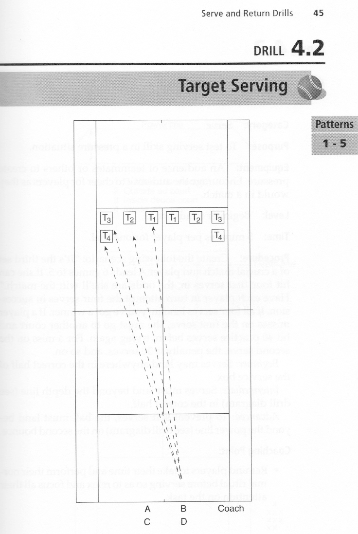
Figure 1. The four recommended serve target zones in each service court as recommended by the USTA. Down the T (T1), a body serve (T2), a wide serve (T3) and short-ish out-wide serve (T4). Source: Tennis Tactics, Winning Patterns of Play, USTA.

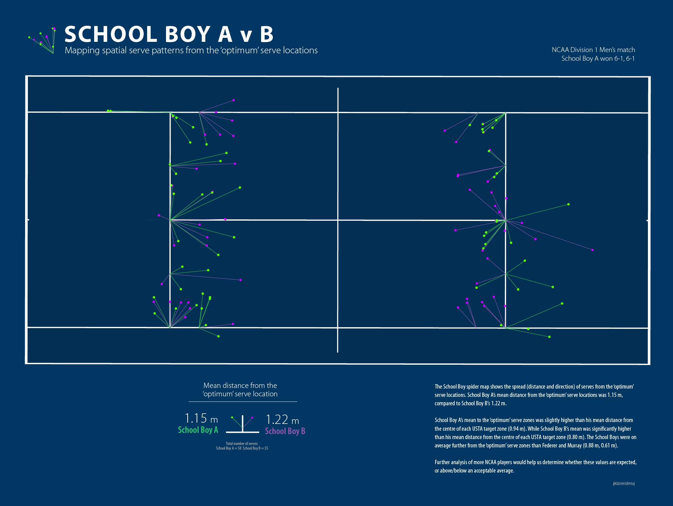
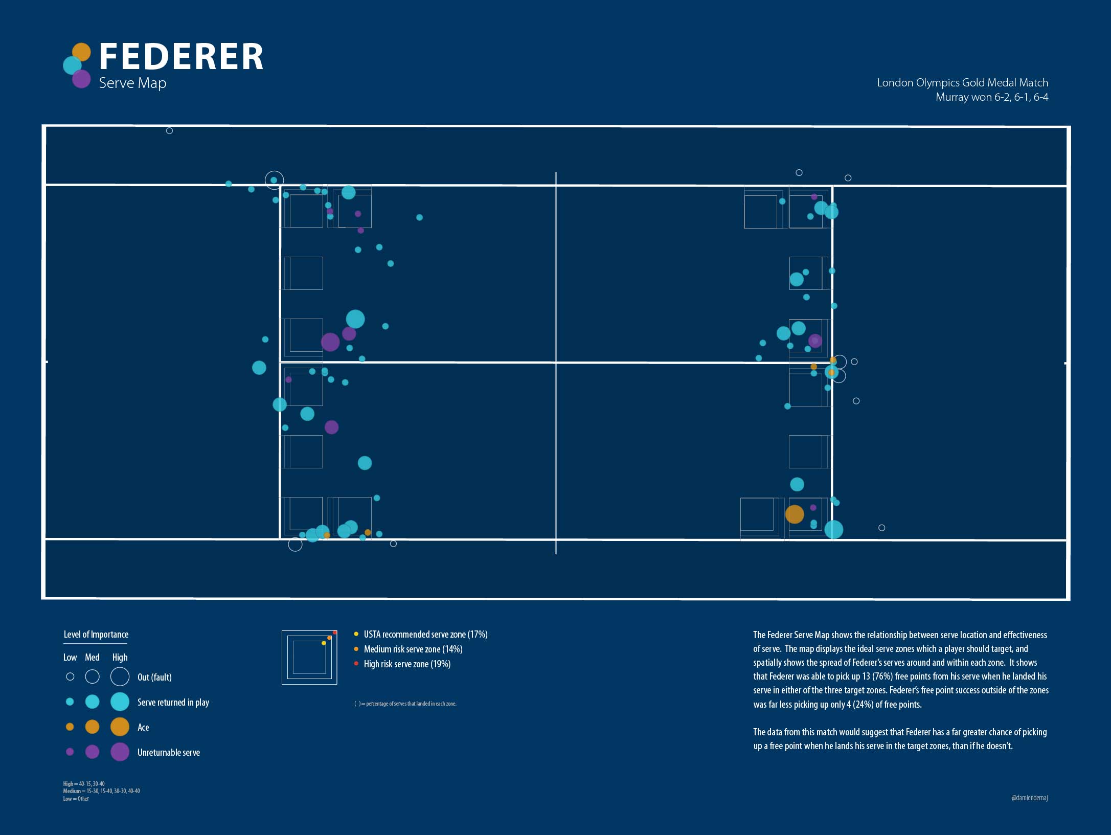
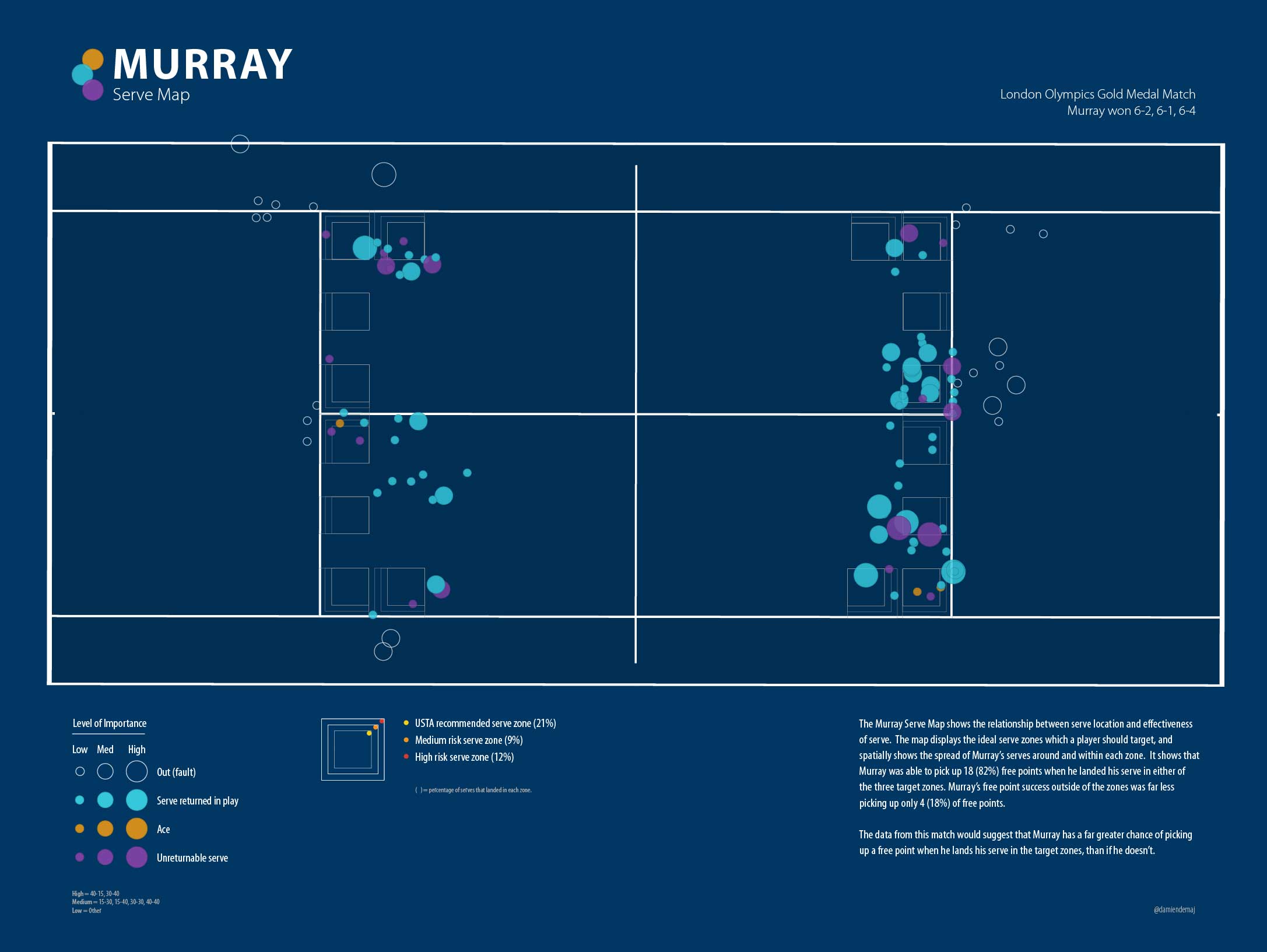
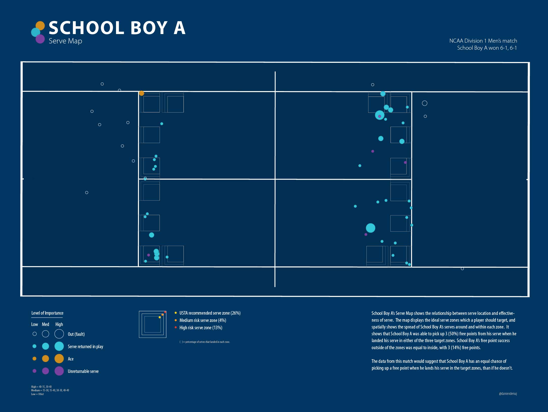
Given the continuous emphasis on serve placement I set out to run a simple analysis to see who was the more ‘accurate’ server, the Big Boys (professional players) or the School Boys (college level players)? Included in this analysis are Roger Federer and Andy Murray representing the Big Boys, and the School Boys (whom shall remain nameless) are from the NCAA Division 1 tennis competition.

Some Context:

  • Murray defeated Federer: 6-2, 6-1, 6-4
  • School Boy A defeated School Boy B: 6-1, 6-1

Total number of serves hit by each player:

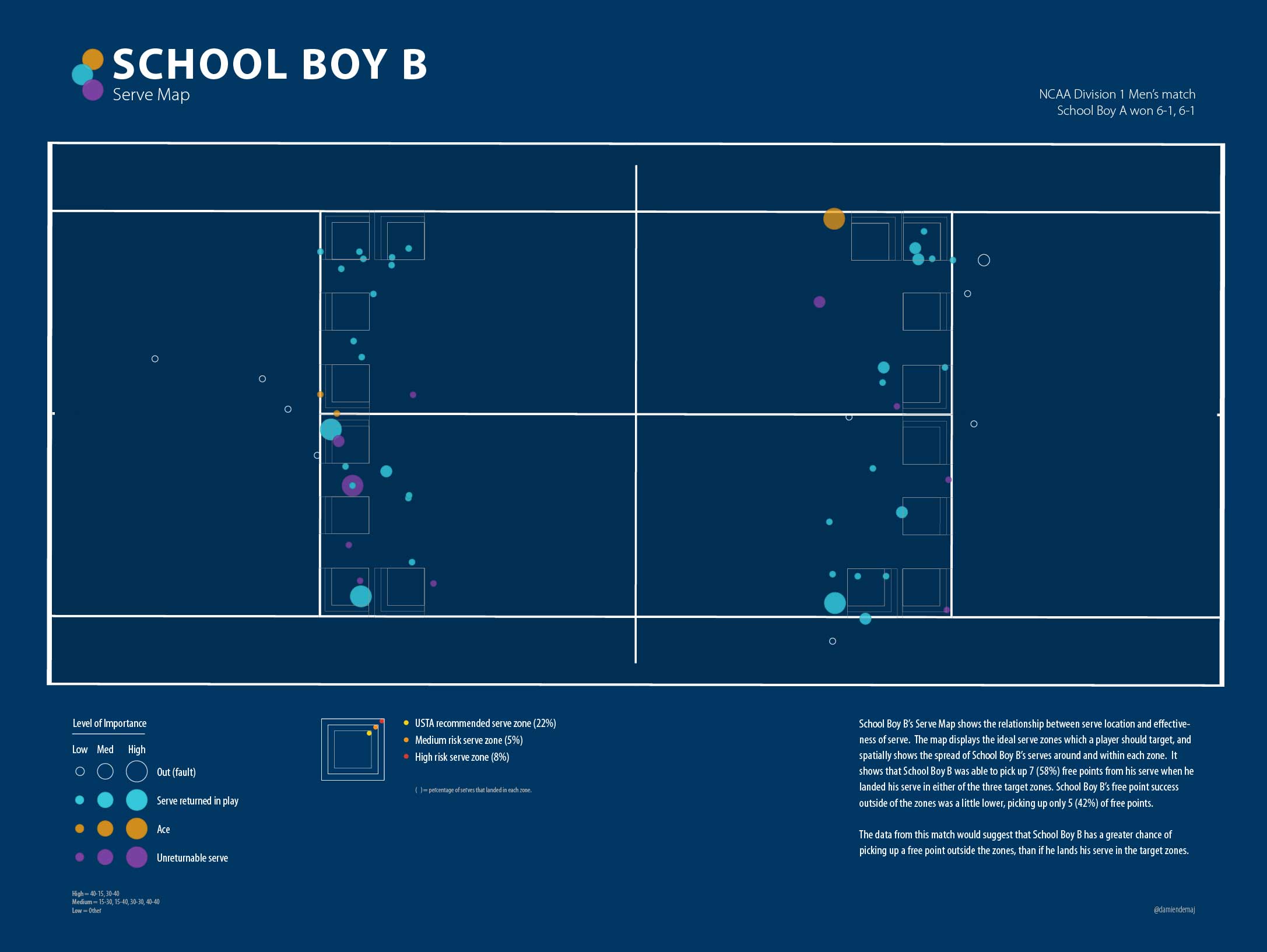
School Boy A: 58   School Boy B: 54   Federer: 95   Murray: 111

Total number of serves hit IN:

School Boy A: 44 (76%)   School Boy B: 45 (83%)   Federer: 78 (82%)   Murray: 86 (77%)

Total number of serves hit OUT:

School Boy A: 14 (24%)   School Boy B: 9 (17%)   Federer: 17 (18%)   Murray: 25 (23%)

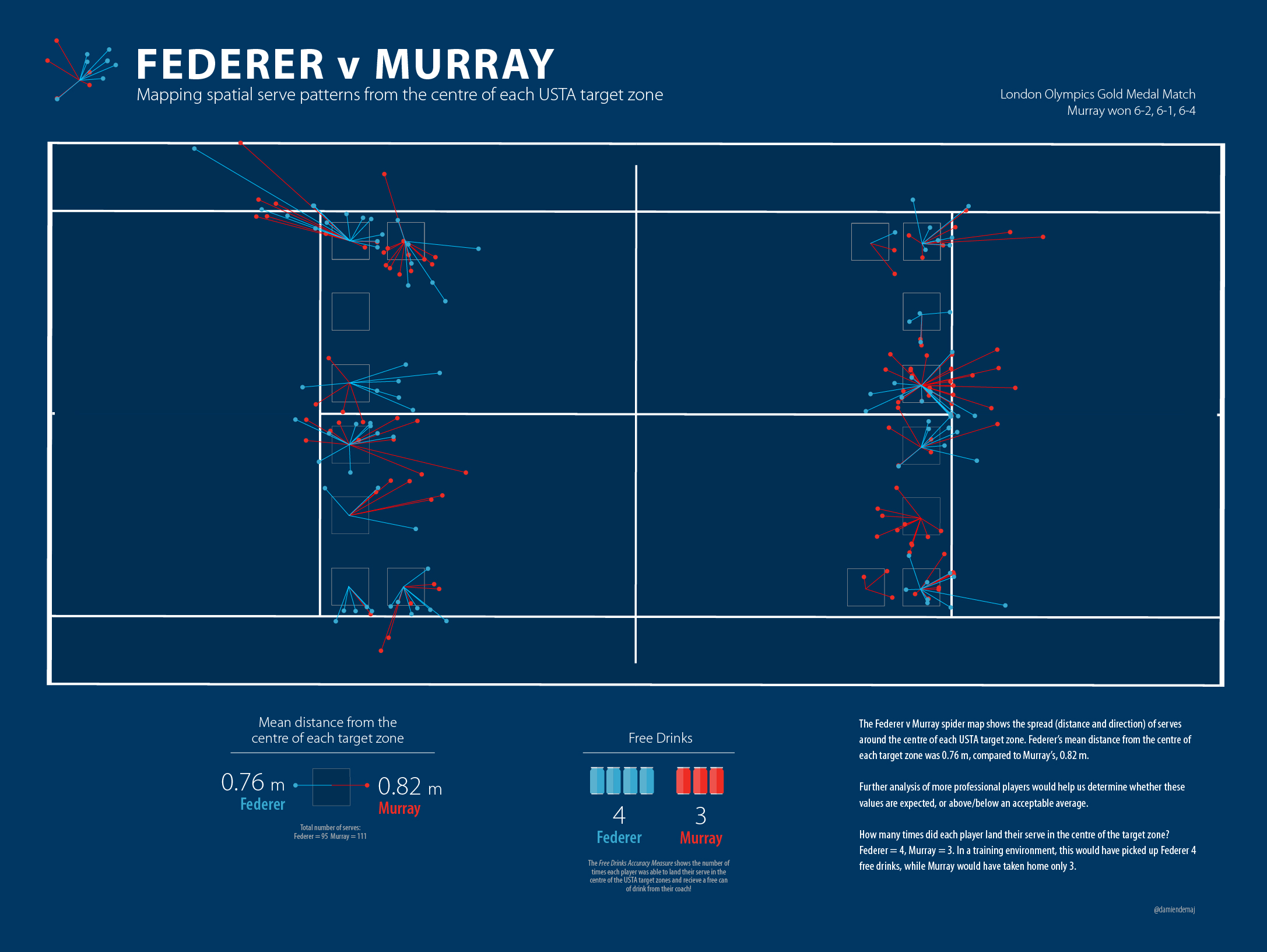
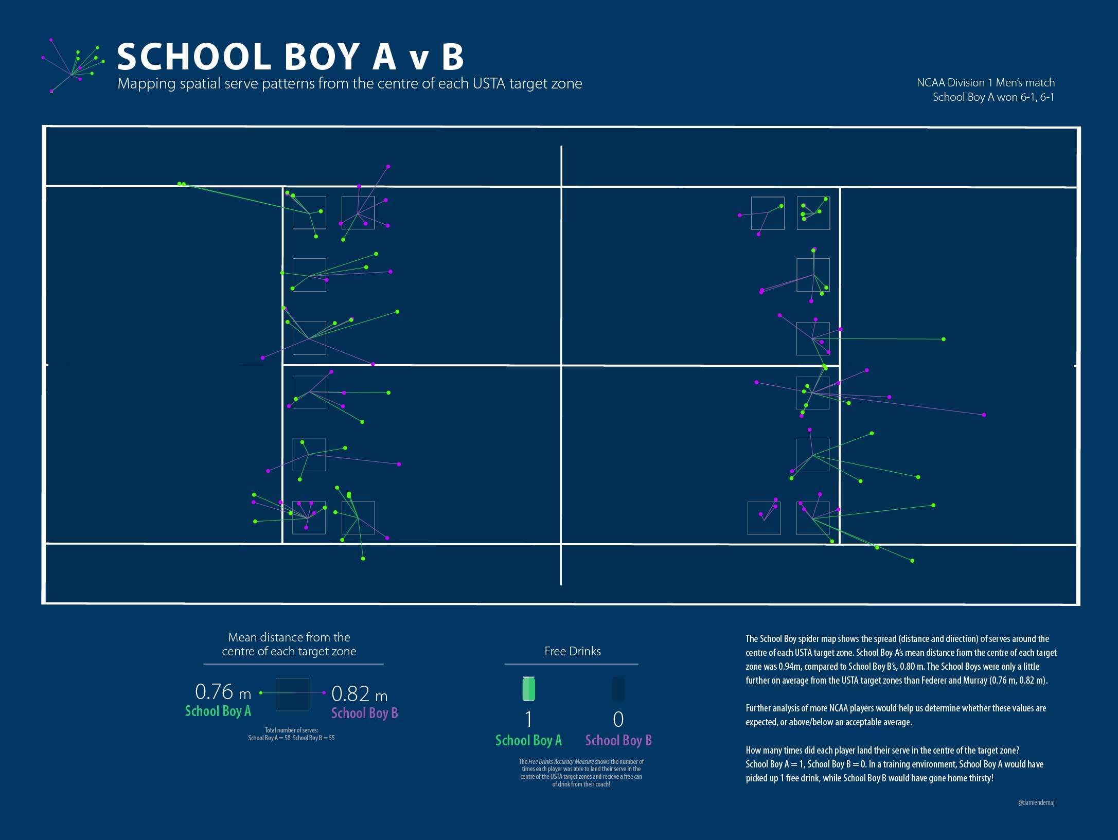
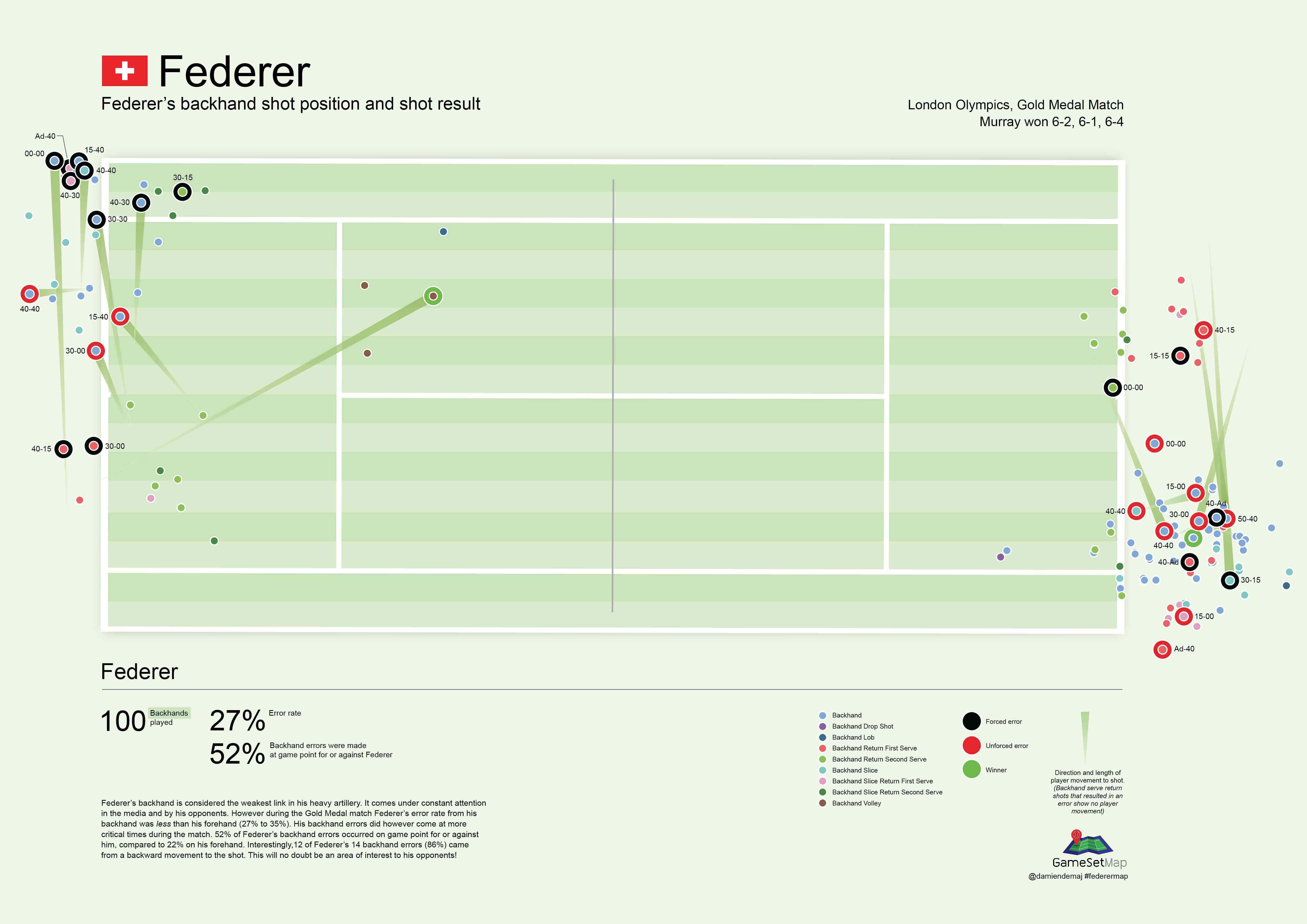
In order to determine which player landed the highest percentage of balls in the four USTA zones (and therefore could claim they were the most accurate server!) I ran a simple select by location algorithm between each serve bounce and the four target zones in each service court. This enabled me to very simply return a count of how many balls landed in each box, for each player. Figure 2 shows the results of the selection.

PinpointingYourServeFig1

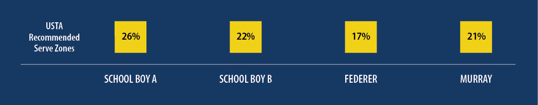
Figure 2. The percentage of serves that landed in the USTA defined target zones for each player.

Surprised? Most of us would expect the Big Boys to place a higher percentage of their serves in the target zones than the School Boys right? However the results showed that School Boy A landed 15 out his 58 (26%) serves into the target zones, making him arguably the most ‘accurate’ server of the four players. School Boy B closely followed with 12 out 58 (22%). Murray was next up, landing 23 of 111 (21%) serves into the boxes, while Federer brought up the rear with only 16 out of his 95 (17%) serves landing in the boxes.

Accuracy: If we loosely define accuracy as being how close a measured value is to an actual value, where the actual value are the USTA target zones, then we can with some caution claim the School Boys out served the Big Boys in the accuracy department. Hard to believe I know.

But wait a minute, what if the Big Boys weren’t actually aiming for the USTA target zones, and instead were aiming outside of those zones? Perhaps they were aiming for the lines, which are outside the USTA defined target areas but still legally within the service court? What would the results look like if we extended the target zones further towards the lines? Let’s see…

Playing the Lines

You could argue that the service line is the optimum position for the placement of your serve, and that the corners of each service box are the ultimate targets. However targeting the lines brings a higher degree of risk, and a lower margin or error. Which is why coaches & the USTA don’t recommend us amateurs to go-for these targets every time! However at the top level where the Big Boys play, where there is so much on the line and so little margin for error (in all facets of the game) they are more likely to take the risk. By sending their serves as close to the lines as possible they give themselves a greater chance of setting up the point in their favor. We would also expect that they are more likely to consistently execute a higher level of accuracy, given their higher-level skill set. We shall see…

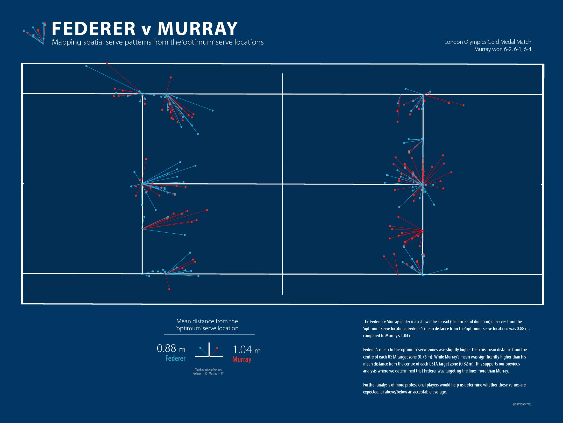
In order to test this I added two more 12.5cm (4.7 inch) wide target zones around the original USTA target zones. I call these Medium and High risk zones, where the High risk zone abuts and includes the service lines. By running the selection again using these two extra zones we will see who is taking the risk and pushing their serve towards the lines more, the School Boys or the Big Boys?

PinpointingYourServeFig2

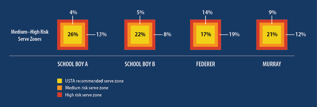
Figure 3. The percentage of serves that landed in the two additional High and Medium risk serve zones for each player. The width of each additional zone is 12.5cm (4.7 inches) (roughly twice the width of a tennis ball). In the second part of this blog we will see the spatial spread of serves across all target zones and all services boxes.

Figure 3 starts to tell a different story. By moving the target Federer was now clearly winning the most accurate server competition, landing 13 (14%) serves in the medium risk zone, and 18 (19%) in the high-risk zone. Murray’s success in these zones was a littler lower than Federer, with 10 (9%) for the medium risk zone, and 13 (12%) in the high-risk zone. School Boy A scored, 3 (4%) in the medium risk zone, and 5 (13%) in the high risk zone, while School Boy B scored, 2 (5%) and 7 (8%).

Clearly Federer was able to consistently pop more serves in the high-risk zones than any of the other three players. This would suggest that the Fed is arguably the most accurate server of the bunch? Most commentators of the game are unlikely to argue with that statement, but of course it depends on where the target is and where the players are aiming! School Boy A has every right to claim he is the most accurate server given he landed the highest proportion of his serves in the USTA target zones.

Some Further Ponderings

Given that each of the four USTA target zones in each service box are roughly 0.75m (2.46 ft) square I am surprised that the Big Boys are not landing a higher percentage of serves in these areas. No disrespect to the School Boys, they aren’t playing NCAA Level 1 tennis for no reason, but I expected the professional players to have a higher percentage of serves land in the target zones than the School Boys. I also expected Federer and Murray to land more serves in the higher risk zones. The results showed this was partly the case. Murray’s numbers in these zones are a little surprising given he swept aside Federer in straight sets on that day.

Perhaps at the highest level, simply aiming your serve at the USTA zones is not enough. Maybe the margin is too great. And in doing so you make life a little too easy for the returner?

So why do the School Boys have such a high percentage of serves in the USTA zones (compared to the Big Boys)? Is it because they serve with less speed and spin, therefore allowing them to slow things down and hit the ‘safe’ targets? Perhaps at this level, the players are taught to play the percentages? Perhaps their skill level forces them to do so?

The School Boys will no doubt develop their serving skills, and pop more serve speed and aggressive ‘kick’ on the ball as they mature. Being able to maintain that accuracy as they increase their serve speed and spin will be on ongoing player development challenge.

It is worth noting that each School Boy in the study served just over 50 times in their match, less than half that of Federer and Murray. Would they be able to maintain their high serve percentage into the USTA zones over a longer match where they may be required to serve 100+ serves? Would we see the same consistency, or could we expect it to see it drop off?

So what do these figures mean, if anything? What if I miss the USTA zones by a ball width or two? Am I still an accurate server? What if I’m only a little bit too short, or a little bit too central to the service box on my serve? Will I still win the same number of points if I’m a few centimeters or inches wide of the mark?

In part 2…

In the second part of this three-part blog I will endeavor to determine if there is a positive relationship between serve position, and outright success. I’ll explore if it’s possible to determine if the game of serving is really about a few centimeters or inches here and there? And in part 3 we will answer the most important question of all, who takes home the most free drinks!

Note: This study only looked at a very small sample of data from all players, so we need to be careful about making gross assumption based on the findings.

Around the world in 80 days, talking maps and tennis!

For those of you who follow my twitter feed you will have noticed that I’ve been traveling quite a bit lately. It’s been a busy Summer to say the least. So what’s been going on at GameSetMap? Plenty in fact…

During August I took a trip back to Australia and presented to a group of students from the School of Mathematical and Geospatial Science at my former university, RMIT. It’s always great to re-visit the place where so many seeds were planted for my career that lay ahead. And of course it’s rewarding to share your work with the students to give them a taste of what’s possible with their geo-spatial knowledge. Thanks to Gita and Lucas for having me!

RMIT University

Back where it all started at RMIT University, Melbourne.

After Australia I set off for Dresden, Germany where I presented my tennis work at the 26th International Cartographic Conference (ICC).  The conference is the premier bi-annual global cartographic/geospatial meet-up in the world, attracting over 1300 delegates. I presented my work under the stream of 4D Cartography. As we know, much of sports analytics is preformed across 4 dimensions, space (x,y,z) and time, so this was a perfect slot for my spatio-temporal tennis analysis. It was great to see a packed house in for my talk, it certainly raised a few eyebrows!

Google Glass and Tennis

Talking about wearable technology and Google Glass for tennis at ICC in Dresden.

After Germany I was invited to talk at the IE Sports Analytics Innovation Summit in Boston, MA. There were some big names on the program from Manchester United, New York Knicks, NFL, Nike and Adidas so it was humbling to share the same space with some of the big guns of the sports world. Much of the talk from the conference was about data, in particular geo-sports data, what to do with it, how to make sense of it etc. This area is about to blow up big time!

The slides from the conference can be viewed below:


Over the journey I met so many great people, and collected many new ideas! My mind is buzzing with endless possibilities. In the next few months you’ll start to see the results of these ideas come to fruition on GameSetMap.com. Stay tuned…

A 3D Lesson in Clutch Point Serving by S.Stakhovsky

The story from week one at Wimbledon was the exit of so many big name players either through defeat or injury. Rafael Nadal and Maria Sharapova were both forced to pack their bags and head home much earlier than they would have liked. As did the reigning Champion Roger Federer.

Sergiy Stakhovsky played out of his skin against the swiss mystro putting on a clinic of clutch point serving throughout the match. Sergiy was able to back-up his serving with sublime touch at the net. Sergiy won the match 6-7, 7-6, 7-5, 7-6 in just under 3 hours.

To celebrate Sergiy’s win I’ve prepared a unique 3D tennis visualization that invites you to step onto Centre Court at Wimbledon and see how Sergiy bundled out the 7 time Wimbledon Champion Roger Federer in the 2nd round.

3D Interactive Tennis Visualization

Click here to open the 3D application. (Best viewed in Google Chrome on a desktop machine). 

Sergiy served almost exclusively to Federer’s backhand at important points (37 out of 43, 86%). On 4 occasions Sergiy went to Federer’s forehand side. Of those 4 serves he aced him twice! And in the duece court he went straight at Federer’s body two times, having success half of those times.

When Federer was able to return Sergiy’s serve into play (as shown by the white lines on the map), he won 9 of 22 points (40%), while Sergiy won 13 of 22 (59%).

The visualisation only includes serves at 15-30, 30-30, 15-40, 30-40 ans 40-Ad, and all of Sergiy’s serves during each tiebreak.

The red lines on the map are aces. The green lines are where Sergiy forced Federer into a direct error on his return of serve. The white lines are serves that Federer put back in play.

The 3D map is completely interactive. Click on each line and retrieve information about when the serve was made and what the score was.

You can even add a little more realism to the scene by adding shadows to the court.

3D Tennis Visualization Shadows

Use the eye icons in the menu below to turn on/off layers in your scene.

3D Tennis Visualization Menu

To record the historic moment I have added the final score of the match, the match duration and the time the match was completed (local time) to the scoreboard!

3D Tennis Visualization Scoreboard

Spatial serve variation is thought to be a good indicator of ones serve success. However as you can see in the visualization Sergiy was not afraid of becoming predictable. I guess when you are having so much success doing one thing, why change it up right?

I hope you enjoy this immersive 3D tennis experience!

The above scene uses new HTML 5 WebGL technology, so there is no need to install a plugin to view the scenes. For more information about the City Engine viewer click here.

Mapping Roger Federer’s backhand

With the 2013 Wimbledon Championships just around the corner, I thought I’d take this opportunity to explore how Andy Murray exposed Roger Federer’s backhand in last year’s Olympic final on centre court at SW19.

Analysts claim that if Federer has one weakness it’s his backhand. But what is the most effective way to draw an error on the Federer backhand? Some say it is to force Federer to hit his one handed backhand above shoulder height. Whilst this may be true, as we have seen against Rafael Nadal many times there may be other ways to beat the Federer backhand.

Data from the Gold Medal Olympic match shows there is potential to draw a high error rate on Federer’s backhand by moving him backward into the shot.

Mapping Federer's BackhandMapping Federer’s backhands. The green swooshes indicate Federer’s movement to a backhand error or success. (Click image to enlarge).

Backward Movement to the Shot

We know that the direction and length a player must cover from their previous shot has a significant influence on the player’s next shot. In order to better understand the Federer backhand I plotted a vector of his movement to each shot (from his previous shot location). The map above shows his movement to a backhand error or outright success from his backhand. We can see from the map that 12 of Federer’s 14 backhand errors (86%) came from a backward movement to the shot. Some of the movement vectors are clearly more ‘backward’ in direction than others, but in any case there is a pattern here that may warrant further investigation. The length of movement to each error on his backhand varies from half a court to only a few steps.

Time: Success at important points wins you matches!

With a little more digging we can see further patterns emerging in the data. The map shows us that 52% of Federer’s backhand errors occurred on game point for or against him, compared to 22% on his forehand. To see this pattern a little clearer I labeled each of his errors with a time stamp, indicating when each of his errors (and winners) was made.

Federer Map Important PointsAdding a time stamp annotation to the map (like Ad-40, 15-40) allows us to understand the temporal component of Federer’s shot making tendencies.

The data from the match suggests that Federer is more likely to make an error at an important point on his backhand than his forehand. Perhaps his opponents at Wimbledon this year might want to take note of this!

Visual Exploration of Spatial Data

GameSetMap is always searching for new ways to visually explore the spatial component of tennis and I hope you agree that this infographic of Federer’s backhand begins to the lay the foundations of a potentially interesting story, a story that perhaps tells us a little more about how to draw an error on Federer’s backhand, and when to attack his backhand.

Examples like this are just the tip of the iceberg. We have much work to do in sports analytics for tennis, but hopefully this example and others like it ignite further work and discussions about what’s possible with spatial tennis data!

Notes: As discussed in my earlier research there are other spatial components that could be integrated into the map that could potentially help improve the analysis and strengthen the argument. Clearly the speed and spin on the ball are other important variables that if available would further enhance the story.

“OK Glass, show me Tennis Analytics”. How Google Glass will revolutionize the way we see tennis.

Early in 2012, the tech world was buzzing with the news that Google was about to release a wearable augmented reality device. Enter Google Glass.  Google Glass puts augmented reality right in front of your eyes, literally!

Sergey-Brin-Wearing-Google-GlassSergey Brin, co-founder of Google models Google Glass earlier this year.

There has been plenty of hype surrounding the product since it’s preview early last year, and we have seen examples how Google Glass can be used to take a picture, record a video, or get directions.

But what else might one do with Google Glass?

To activate Google Glass, you start by saying “OK Glass”. Then you ask Google Glass to show, do, or tell you something. So let’s give it a try:

Lets start with a simple question. “OK Glass, show me the weather forecast at the Australian Open today”

Google Glass Australian Open

Imagine sitting courtside at the Australian Open and wondering what the weather is going to be like for the afternoons play. Up pops the current weather conditions. It’s as simple as that.

Google Glass has the ability to overlay all kinds of information in your field of view. So let’s try this:

“OK Glass, show me Federer’s second shot placement”

Google Glass Federer

Imagine sitting courtside at the Cincinnati Open and wondering where Federer had previously played his second shot after Novak’s return of serve. Bam, up pops the trajectory lines of Federer’s second shot to show you where he’s likely to hit his next shot. Excited yet? Let’s try one more example.

“OK Glass, show me a stroke pattern heat map”

French Open Heat Map

Imagine sitting in the stands at court Philippe Chatrier and wondering where this player is going to hit his forehand? Google Glass immediately overlays the stroke pattern right onto the court so you can see where his shots have been passing on the court. Wow!

These images are a few quick examples that I put together to show you the potential of Google Glass in tennis. Google Glass will enhance our viewing experience of tennis (and all sports) by 10 fold! Sitting court side, we will be able to control when we see the stats, what stats we see and for how long. Whether it is seeing a live heat map, or 3D ball trajectory the potential is endless.

Of course, if tennis analytics isn’t your thing you may find Google Glass useful to find a friend in the crowd, or to video a point and share it on Facebook. You might even ask Google Glass for directions to Arthur Ashe Stadium!

The real time visualization of sports statistics and Google Glass are a match made in heaven. Let’s hope the ATP, WTA, and ITF fast track the delivery of real time tennis analytics to everyone so when Google Glass goes live, the game and our eyes will be ready!

To find out more about Google Glass visit their homepage.

Image Credits:

Sergy Brin wearing Google Glass: Copyright CBS Interactive

Australian Open: http://madamebonbon.com.au/blog/archives/7968

Roland Garros pic: http://lewebpedagogique.com/alaricenglishspeakers/the-tennis-and-roland-garros/

Cincy Tennis: https://shop.cincytennis.com/SeatViewer.aspx