Murray’s Act of Tennis Espionage

Screen Shot 2015-07-12 at 4.03.53 pm

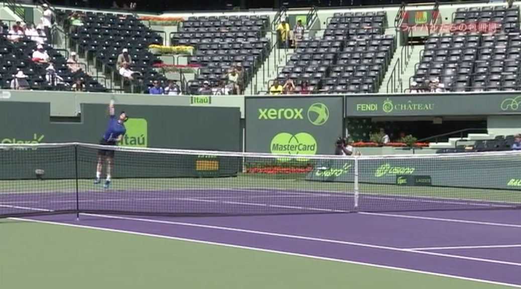
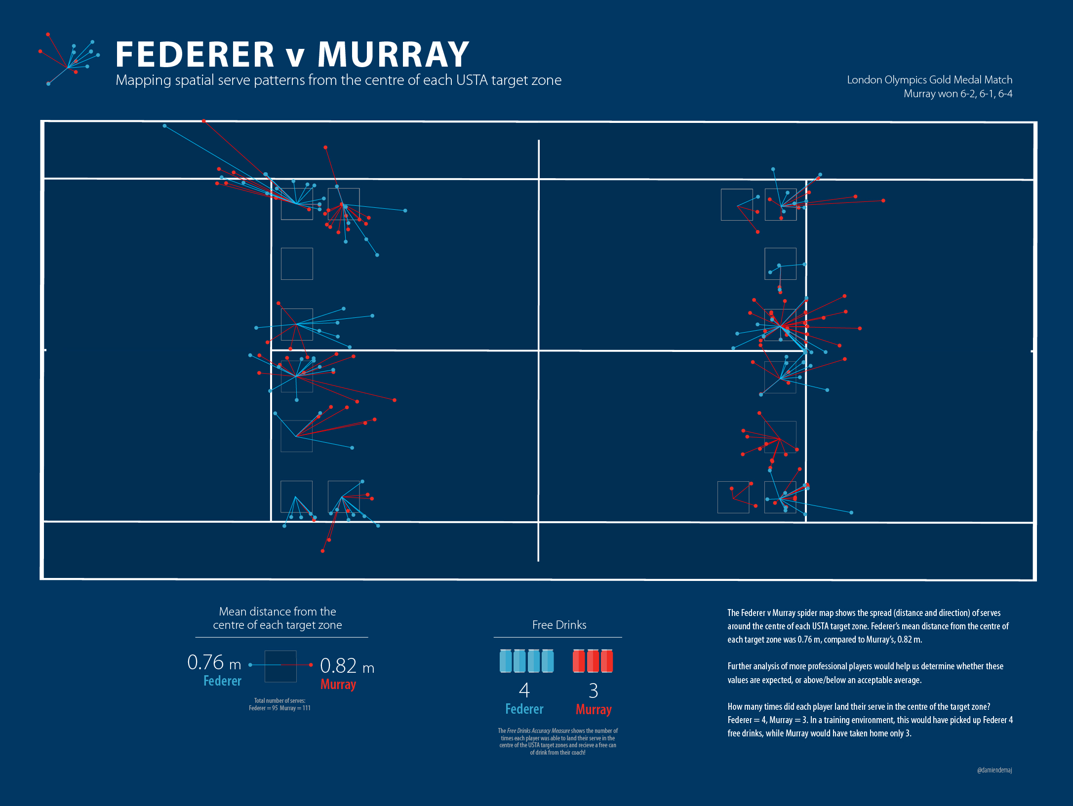
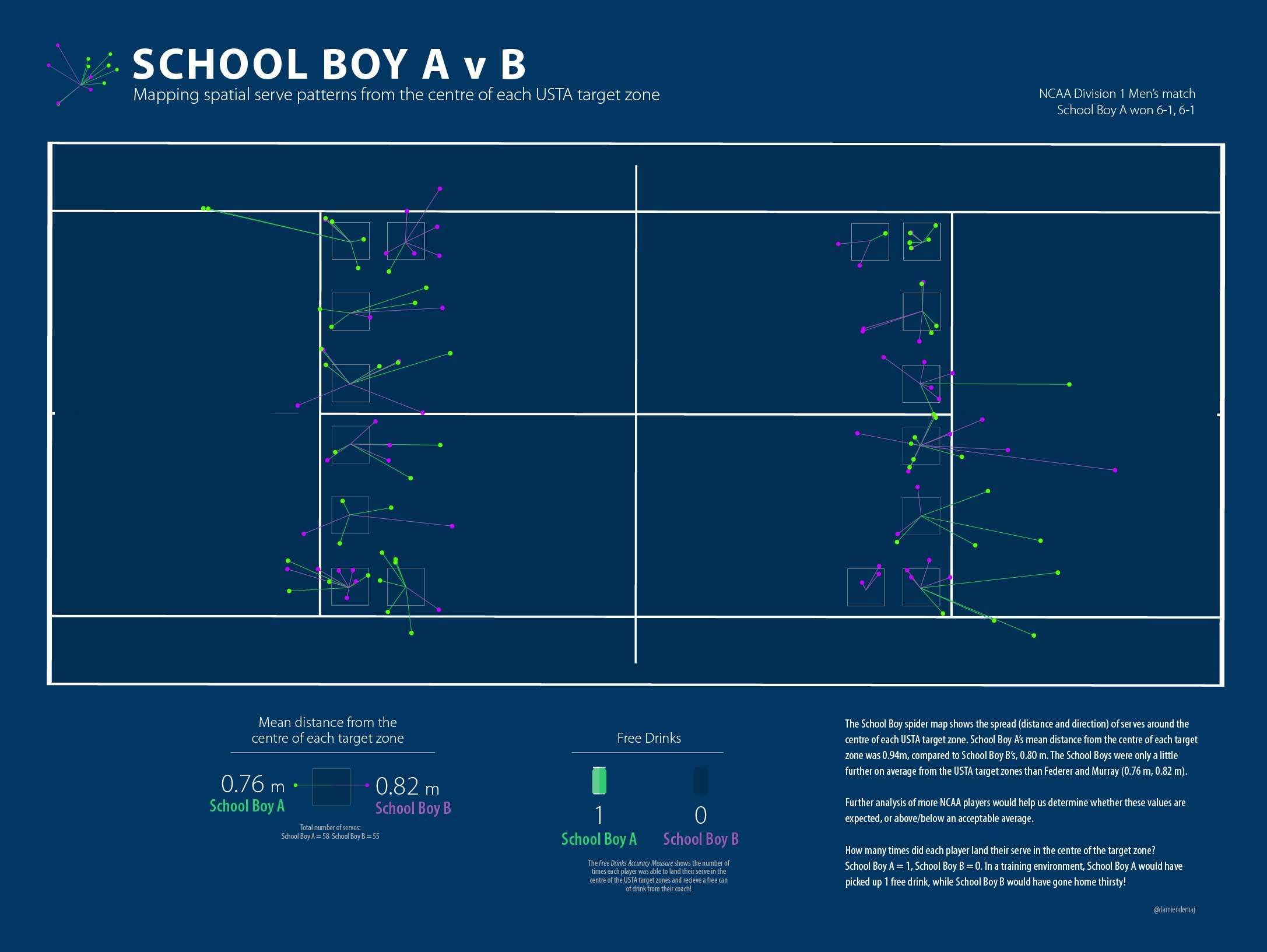
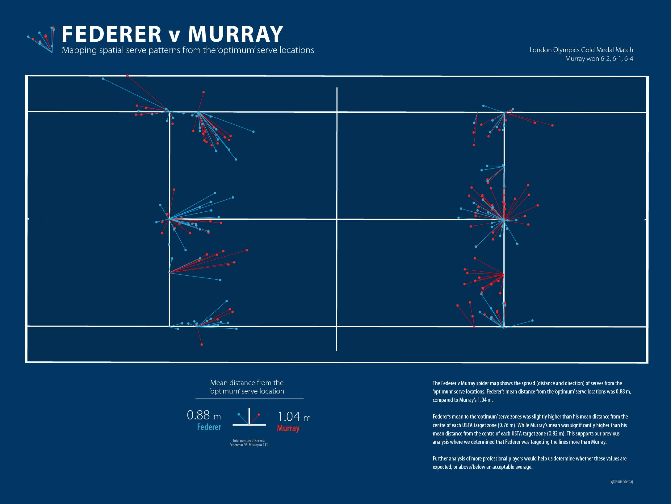
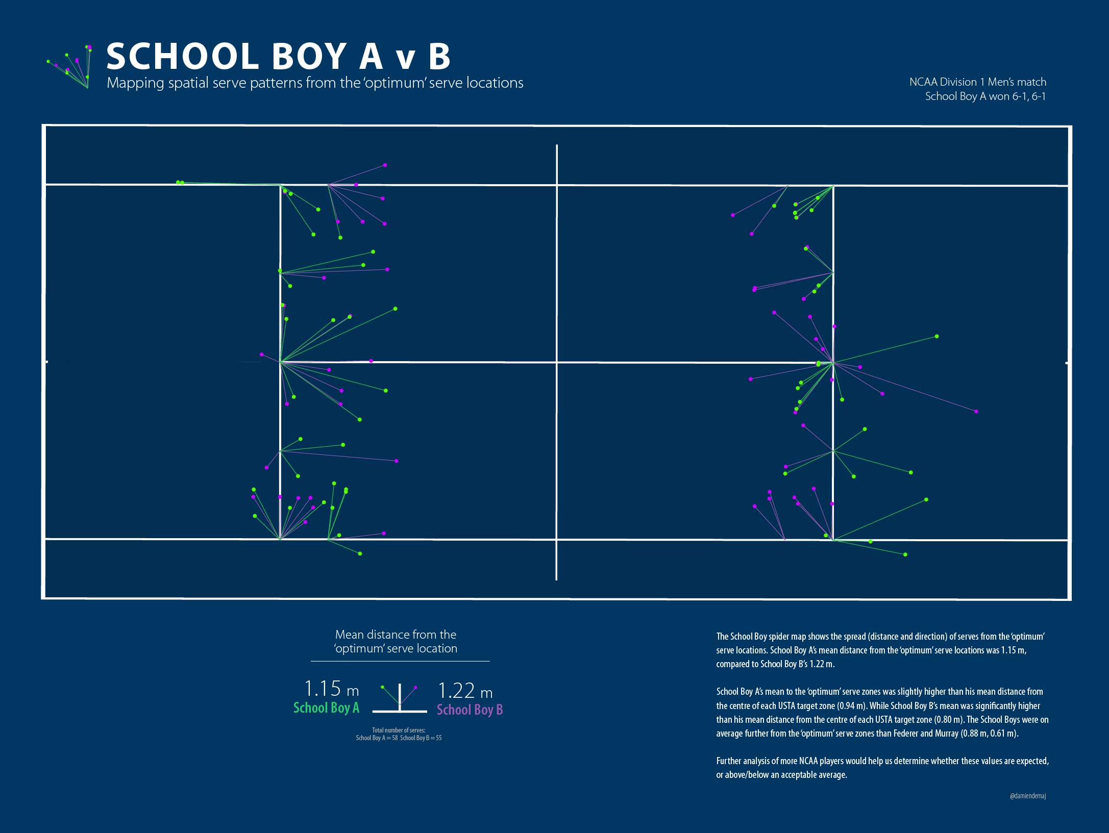
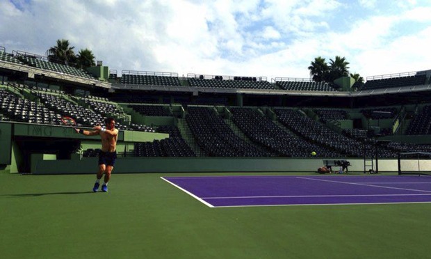
Andy Murray training with Nishikori in Miami earlier this year. Source: NHK.

In a recent documentary on NHK it was revealed that a new level of espionage was creeping into men’s professional tennis. It was reported that Andy Murray approached Hawk-Eye to track his practice session with Kei Nishikori at Miami earlier this year. It was also revealed that Murray was now a regular customer of Hawk-Eye and is using the data to seek new insights into his game, and his opponents.

In recent years there have been a number of high profile spying events in sport that have made headlines. In 2007 the New England Patriots were caught filming the New York Jets defensive coaches’ signals during a game. In 2014 the French National Football (soccer) team sighted a drone over one if its practice sessions prior to the 2014 world cup and in the same year Australian Rules Football club Port Power ejected an opposing spy from one of their training sessions.

Spying on rival players in tennis is not new. Tennis coaches have long sat courtside at practice sessions to try and catch a glimpse of their next opponent or an up and coming player making headlines in the junior ranks. Coaches and players regularly use video to scout opponents technique, tactics and fitness. But Murray’s request for Hawk-Eye to secretly track a training session is perhaps a whole new level of spying that we have not seen in tennis before. Did Murray crossed the line? Are there even rules in place to prevent this?

Players can request match data from Hawk-Eye at any time. Few do, but the option is available for them and this is within the rules. What’s interesting is that this is the first time we have heard players requesting that the Hawk-Eye system be turned on to secretly track the ball and player movement in a training session. From what we understand Nishikori had no knowledge about Murray’s request.

Screen Shot 2015-07-12 at 4.06.40 pm

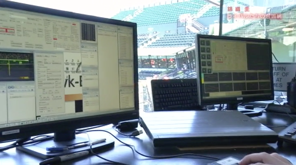
Inside the Hawk-Eye bunker in Miami during Murray’s training session with Nishikori.

The richness of the Hawk-Eye dataset cannot be underplayed, evidence of this was on display during the NHK documentary. One of the huge advantages to players is that when they make a request for the data they are supplied with both their data and their opponents data. So not only can the player answer questions about their own game but they get valuable insights into their opponents too. It does however raise the question about what benefit a single training session would provide to Murray. From my experience a single match, and in this case a single training session only provides a limited insight into a players patterns and tendencies. Studying trends and patterns over time is where the real value lies.

Hawk-Eye

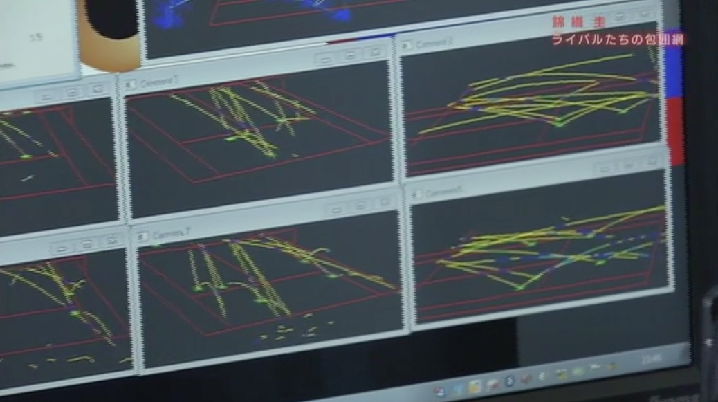
The output from Hawk-Eye during the Murray Nishikori training session.

Murray is no stranger to technology. He recently joined the board of Seedrs Advisory where he gives business advice in the areas of health, sport and wearable technology. His growing interest in UK tech starts ups shows he has a genuine interest in this area, and he seems keen to use the latest technology to his advantage on and off the court.

Other sports like the NBA, EPL and NHL are caught up in an analytics storm at the moment. Tennis has traditionally been left in the dark ages with respect to analytics but perhaps Murray’s actions are confirmation that the game is changing. Tennis players and coaches are becoming more intrigued by analytics, and the data that is being collected on them. Murray is now a regular user of Hawk-Eye data, but it seems he is keen to take advantage of the system one step further. Perhaps Murray was simply being curious? Or perhaps he and Amélie Mauresmo had genuinely planned to gain insights from the training data. Players are starting to ask the right questions, and some of them are clearly pushing forward with their own independent analytics and detective work. I say fair play to Andy Murray for pushing the boundaries, and seeking an edge wherever he can. Tennis may be on the edge of a new frontier in analytics after-all.

Pinpointing the serve. Who missed, and by how much.

(Part 3 of 3)

In the final part of this three part series, I determine who picks up the most free drinks as a result of hitting the centre of the USTA target zone, and by how much. I also extend the analysis to see how much each player missed the ‘optimum’ serve locations.

Who picks up the most free drinks?

For a bit of fun let’s see who would have picked up the most free drinks by hitting the ‘imaginary’ cone in the center of each target zone. We know coaches run this drill with their players, so let’s see how well each player fared in a match environment. Let’s assume the cone is 20 cm in diameter.

Federer Murray Serve Map Spider DiagramFigure 1. Federer v Murray. Mapping spatial serve patterns from the centre of each target zone. (click to enlarge)

The results show us that Federer picked up 4 free drinks, while Murray picked up only 3.   I don’t feel too bad since each player hit 100 or so serves each. That’s a pretty poor strike rate given these guys are best players in the world!

Each player missed the target by almost the same amount. Federer was on average     0.76 m from the centre of the each target  zone, while Murray was out by an average of 0.82 m.

Let’s take a look at the School Boys…

NCAA Tennis Serve Spider DiagramFigure 2. School Boy A v School Boy B. Mapping spatial serve patterns from the centre of each target zone. (click to enlarge)

The results show us that School Boy A picked up only 1 free drink, while School Boy B went thirsty not hitting the center of any of the targets! Ok, so now I’m feeling really good.

School Boy A on average missed the centre of the target zone by 0.94 m, while School Boy B was only out by an average of 0.80 m.

As discussed in part 2 of the blog, it’s reasonable to assume that perhaps the players weren’t targeting the centre of each zone. What if they were aiming for a ‘optimum’ but higher risk serve position? In part 2 of the blog we argued that the corners and lines were the ‘optimum’ positions to land your serve. So let’s see how far each player was from these ‘optimum’ serve positions.

Federer Murray Serve Map Spider Diagram 2Figure 3. Federer v Murray. Mapping spatial serve patterns from the ‘optimum’ serve locations. (click to enlarge)

Figure 3 shows us that Federer missed the ‘optimum’ serve locations on average by     0.88 m, while Murray missed on average by 1.04 m.

NCAA Serve map Spider DiagramFigure 4. School Boy A v School Boy B. Mapping spatial serve patterns from the ‘optimum’ serve locations. (click to enlarge)

Figure 4 shows us that School Boy A missed the ‘optimum’ serve locations on average by 1.15 m, while School Boy B missed on average by 1.22 m.

What can we learn from this?

Well we know that Federer takes home as many free drinks as the other three put together! We also know that Federer was on average serving closer to the ‘optimum’ locations than Murray which supports our analysis in part 2 of the blog, where we found Federer to target the high risk zones more than any other player.

We all expected the spread of the School Boy serves around the ‘optimum’ zones to be greater than the Big Boys due the results in part 2, where the Big Boys landed more balls in these ‘optimum’ areas. When we changed the target position back to the centre of each zone the School Boys and Big Boys numbers pretty much evened up, again supporting the results in part 2.

Spider Diagrams: The spider diagrams allowed us to visually link the serves to their target points and see the spread (length and direction) around each point. The spider lines for each zone allow us to very quickly see any bias in direction and distance towards the spread of serve around the points.  Without the lines it would be difficult to identify the serve clusters, and which central point they belong to.

Outliers: There were a couple of serve outliers for the Big Boys but these didn’t affect their averages enough to remove them from the calculations. The School Boys certainly had some big misses, but because there were multiple instances of these so they were left in the calculations.

More Data: With a larger dataset across different players we would be able to determine what is the expected norm, and whether these results are above or below that. Unfortunately, large serve datasets that are easily accessible to the players, coaches or analyst do not exist in tennis (hint hint ATP and WTA).

0.75 m: Let’s think back to part 2 of the blog for a minute. The size of the USTA target zones are 0.75 m square. Perhaps this tells us something. On average the four players missed by 0.83 m. Maybe the USTA set their targets knowing these missed averages and that is the reason for the particular size of the boxes?

To Summarize…

Over the course of the three blogs I have presented an alternative way of assessing a player’s serve accuracy using the USTA defined serve zones, and an additional two ‘higher risk’ zones. When comparing serve accuracy around the USTA zones there was very little difference between the four players. However once we started to analyze the serve towards the higher risk zones (the ‘optimum’ serve areas) the results started to lean in favor of the Big Boys, Federer and Murray.

I also set out to determine whether serve location really matters in tennis. The results suggest that it depends on what level of tennis is being played. The Big Boys clearly had more outright success on serves that landed in the USTA zones, and the higher risk zones than if they missed these zones. It was a different story for the School Boys however, as it didn’t appear to make any difference to their outright success rate whether they served in or outside the zones.

There is much work to be done in expanding the analysis of serve accuracy, serve success, and general serve patterns. Let’s hope we start to see more meaningful statistics from broadcasters and commentators about the serve in order to better understand who really are the best servers in the game!