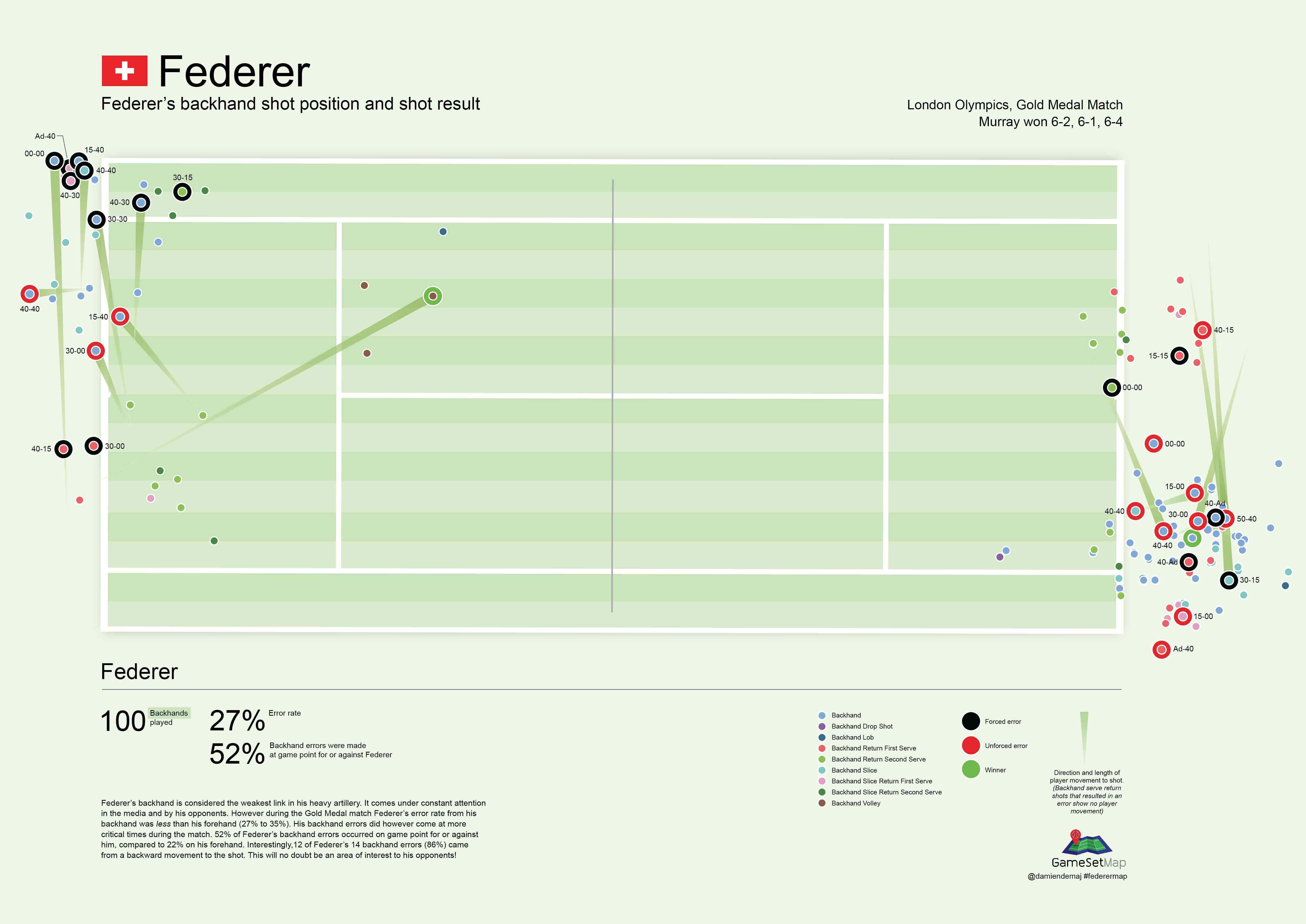
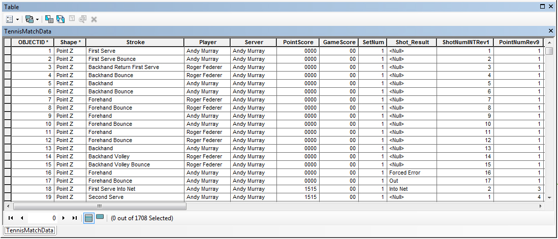
Pinpointing the serve. Who missed, and by how much.

(Part 3 of 3)

In the final part of this three part series, I determine who picks up the most free drinks as a result of hitting the centre of the USTA target zone, and by how much. I also extend the analysis to see how much each player missed the ‘optimum’ serve locations.

Who picks up the most free drinks?

For a bit of fun let’s see who would have picked up the most free drinks by hitting the ‘imaginary’ cone in the center of each target zone. We know coaches run this drill with their players, so let’s see how well each player fared in a match environment. Let’s assume the cone is 20 cm in diameter.

Federer Murray Serve Map Spider Diagram
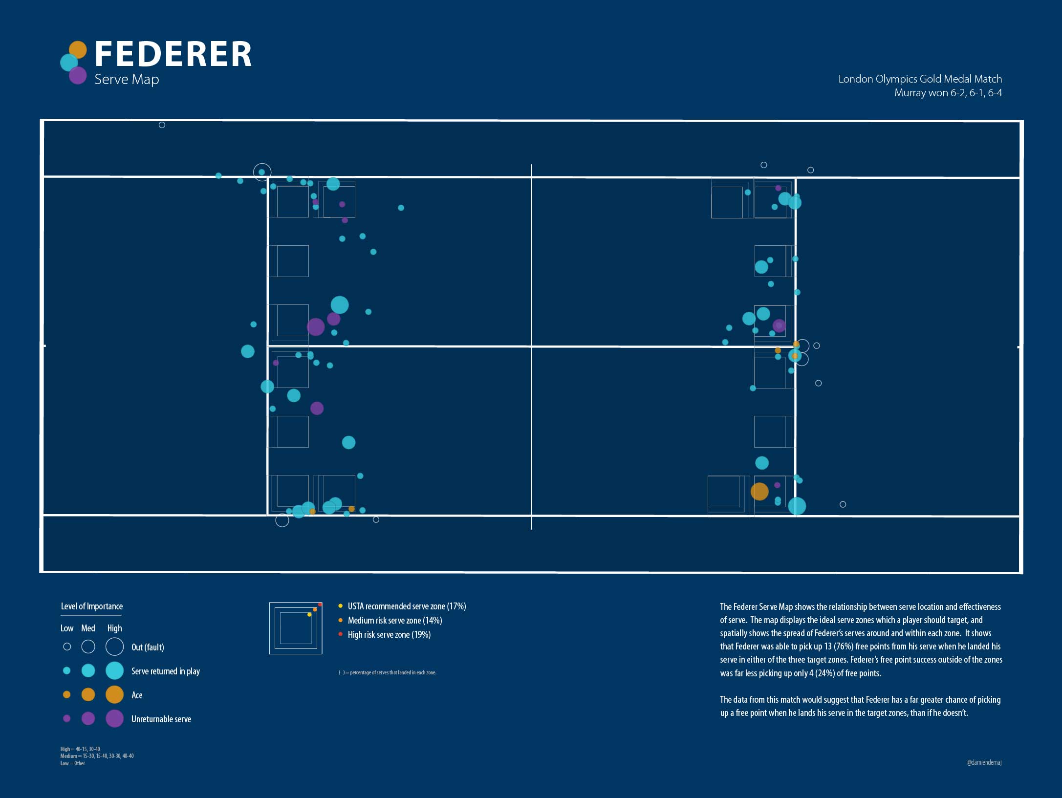
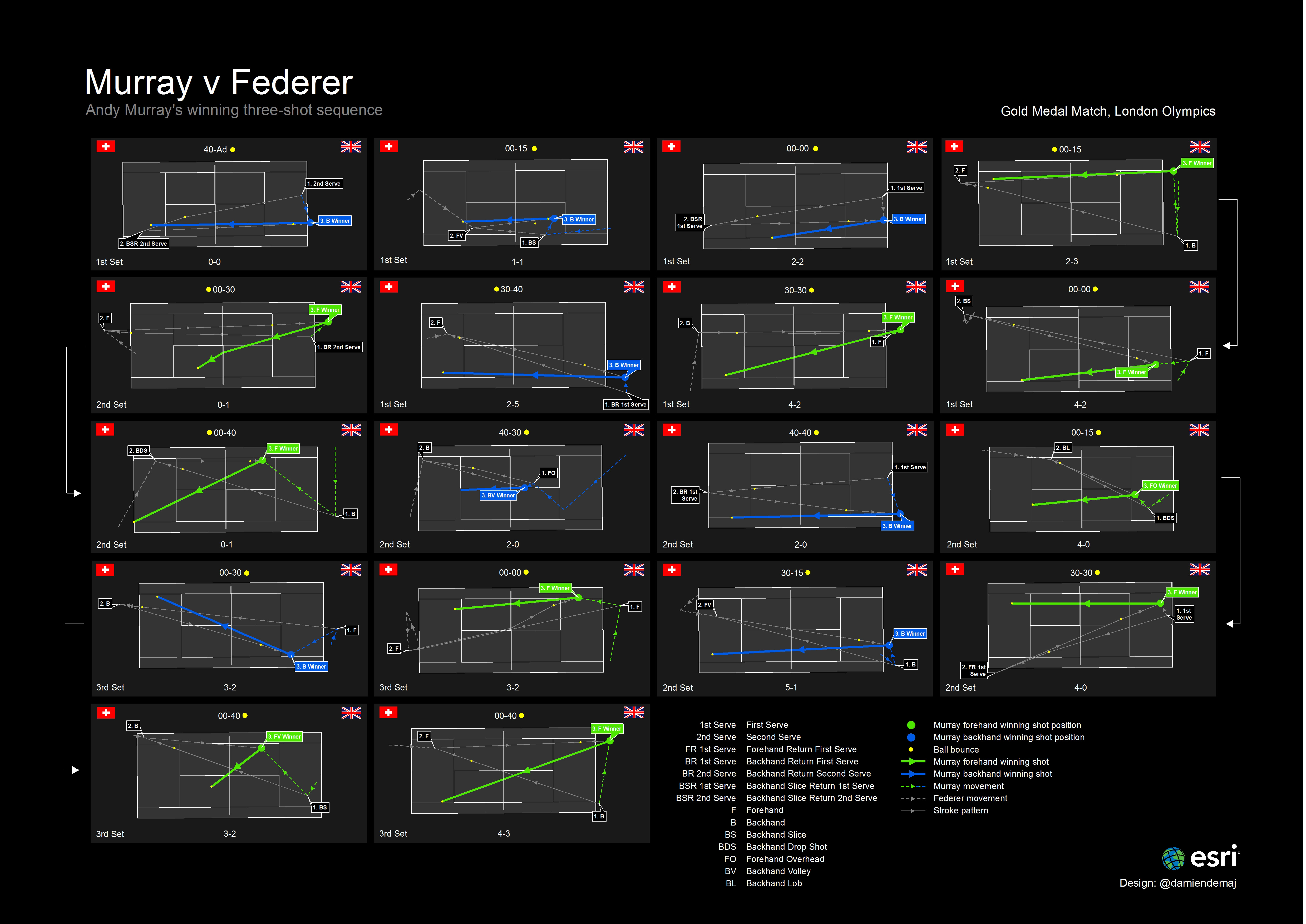
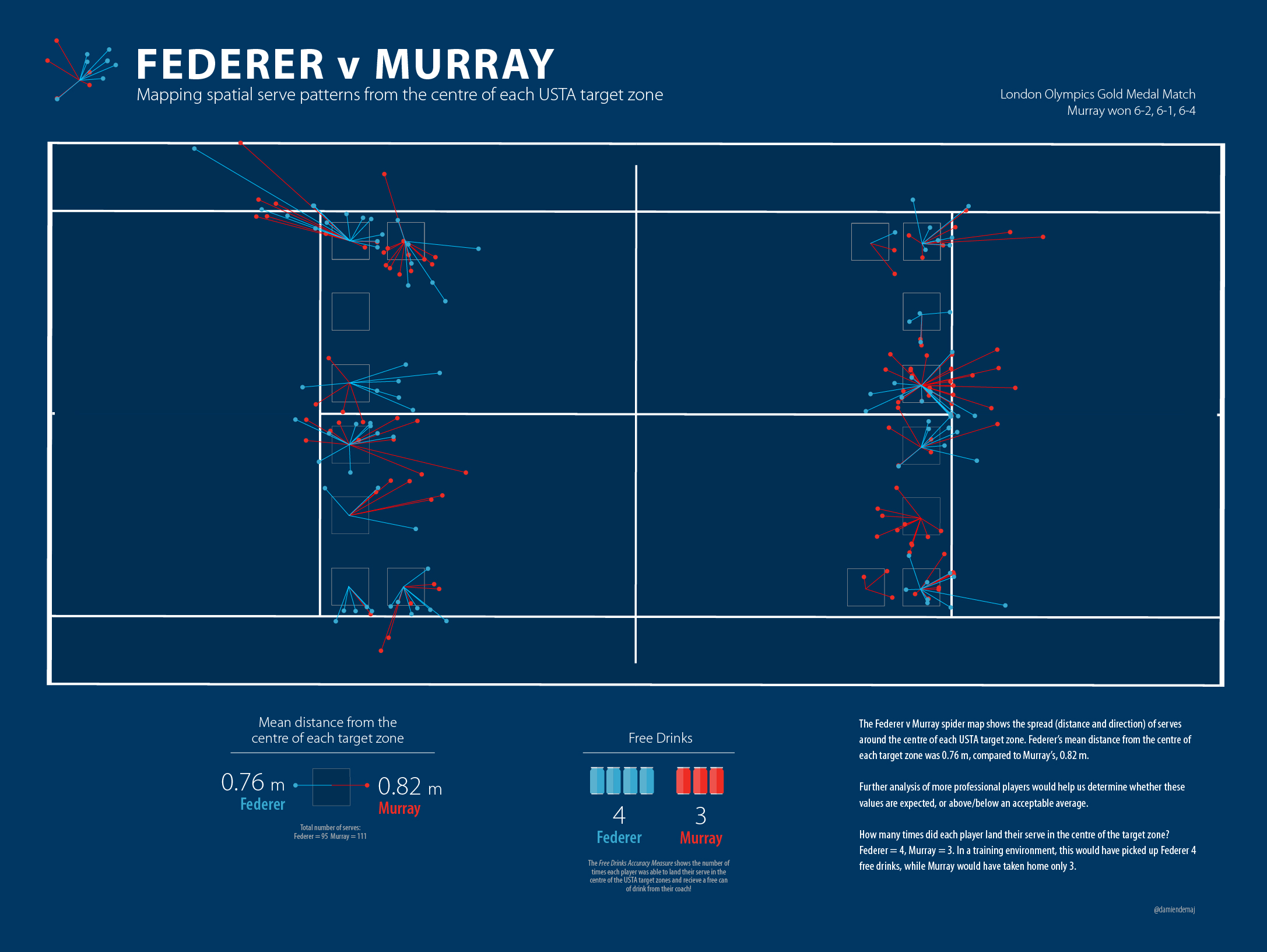
Figure 1. Federer v Murray. Mapping spatial serve patterns from the centre of each target zone. (click to enlarge)

The results show us that Federer picked up 4 free drinks, while Murray picked up only 3.   I don’t feel too bad since each player hit 100 or so serves each. That’s a pretty poor strike rate given these guys are best players in the world!

Each player missed the target by almost the same amount. Federer was on average     0.76 m from the centre of the each target  zone, while Murray was out by an average of 0.82 m.

Let’s take a look at the School Boys…

NCAA Tennis Serve Spider Diagram
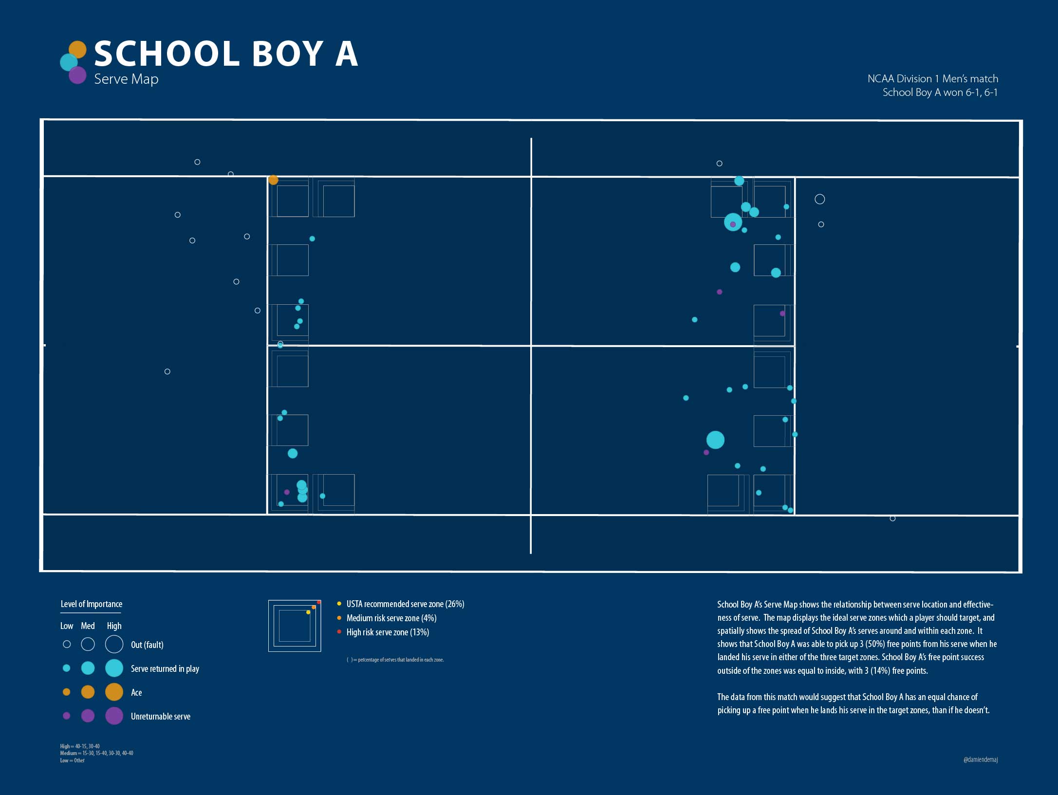
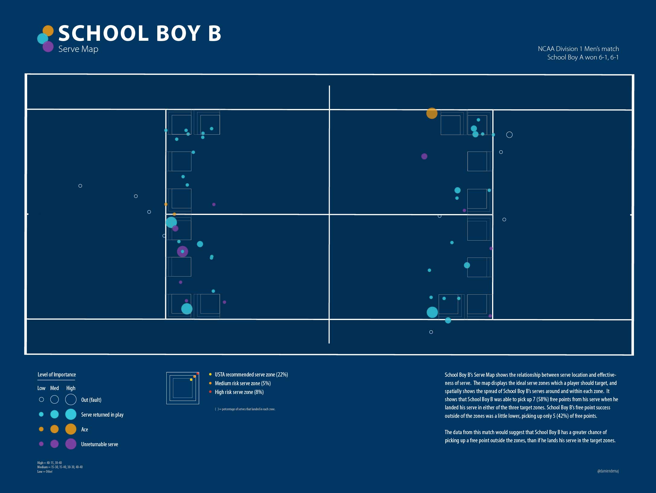
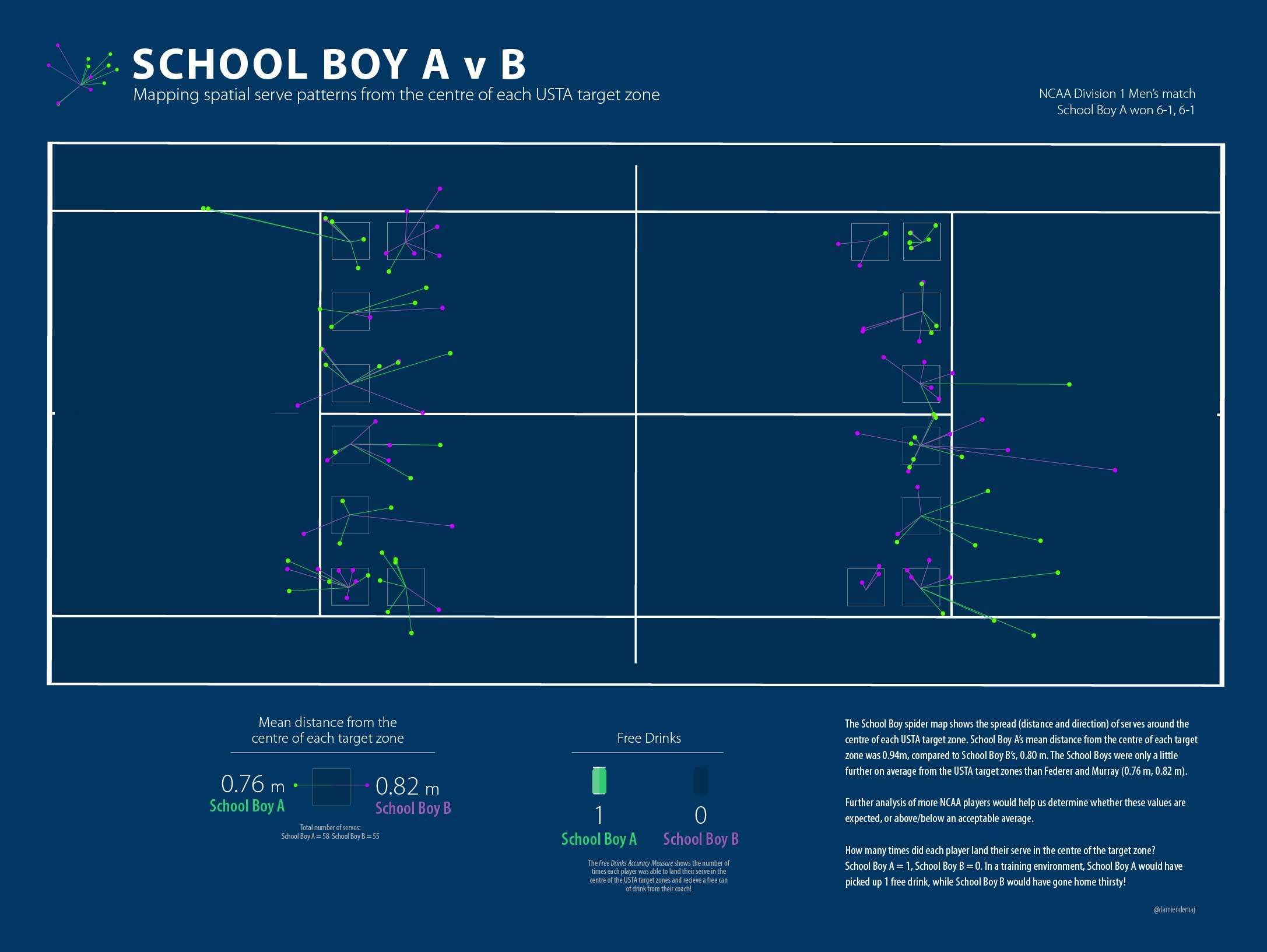
Figure 2. School Boy A v School Boy B. Mapping spatial serve patterns from the centre of each target zone. (click to enlarge)

The results show us that School Boy A picked up only 1 free drink, while School Boy B went thirsty not hitting the center of any of the targets! Ok, so now I’m feeling really good.

School Boy A on average missed the centre of the target zone by 0.94 m, while School Boy B was only out by an average of 0.80 m.

As discussed in part 2 of the blog, it’s reasonable to assume that perhaps the players weren’t targeting the centre of each zone. What if they were aiming for a ‘optimum’ but higher risk serve position? In part 2 of the blog we argued that the corners and lines were the ‘optimum’ positions to land your serve. So let’s see how far each player was from these ‘optimum’ serve positions.

Federer Murray Serve Map Spider Diagram 2
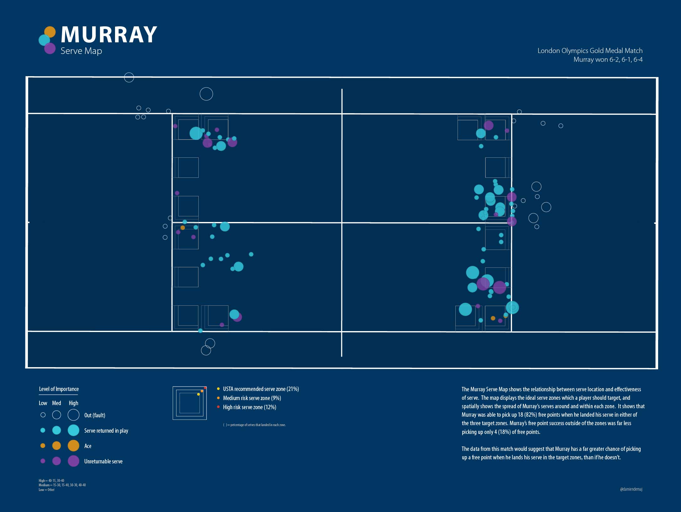
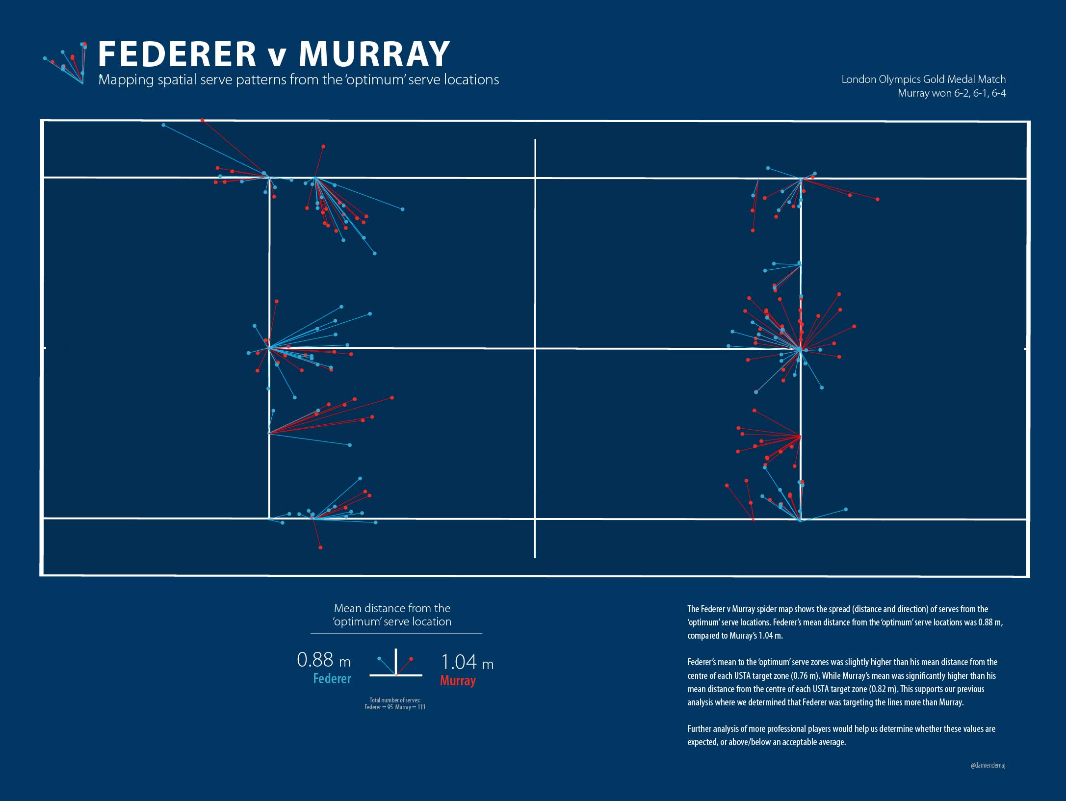
Figure 3. Federer v Murray. Mapping spatial serve patterns from the ‘optimum’ serve locations. (click to enlarge)

Figure 3 shows us that Federer missed the ‘optimum’ serve locations on average by     0.88 m, while Murray missed on average by 1.04 m.

NCAA Serve map Spider Diagram
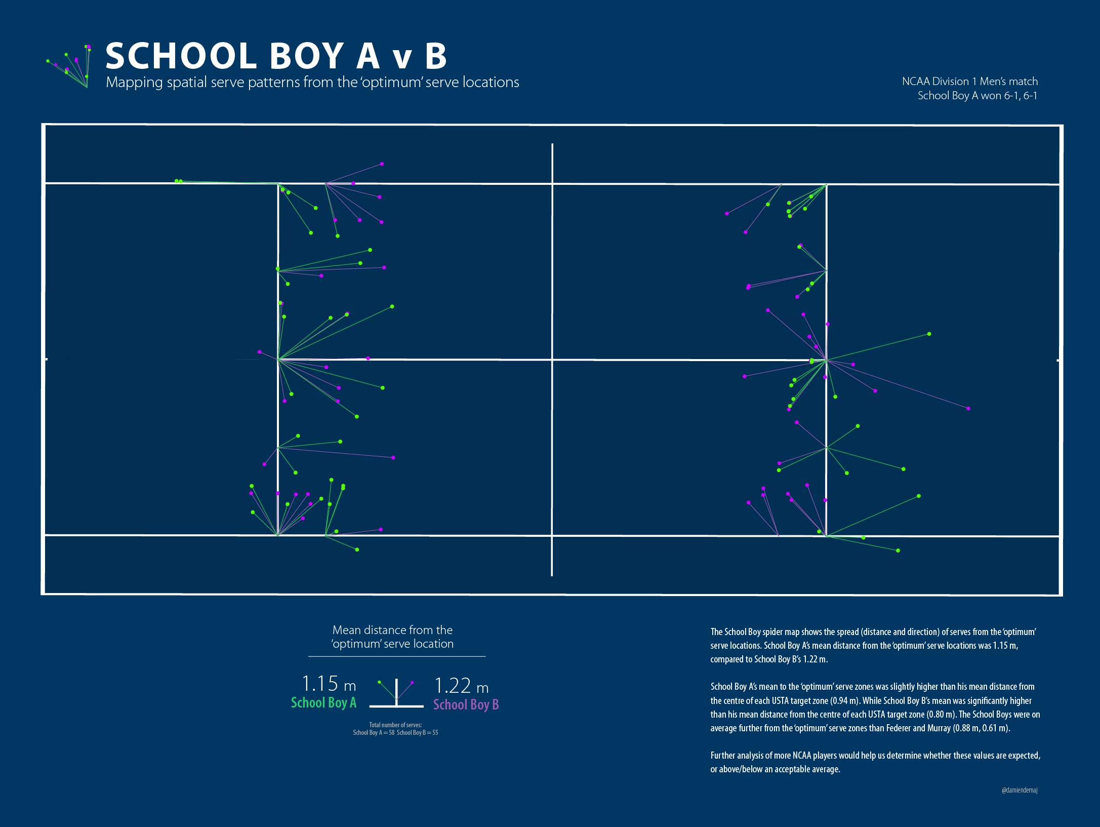
Figure 4. School Boy A v School Boy B. Mapping spatial serve patterns from the ‘optimum’ serve locations. (click to enlarge)

Figure 4 shows us that School Boy A missed the ‘optimum’ serve locations on average by 1.15 m, while School Boy B missed on average by 1.22 m.

What can we learn from this?

Well we know that Federer takes home as many free drinks as the other three put together! We also know that Federer was on average serving closer to the ‘optimum’ locations than Murray which supports our analysis in part 2 of the blog, where we found Federer to target the high risk zones more than any other player.

We all expected the spread of the School Boy serves around the ‘optimum’ zones to be greater than the Big Boys due the results in part 2, where the Big Boys landed more balls in these ‘optimum’ areas. When we changed the target position back to the centre of each zone the School Boys and Big Boys numbers pretty much evened up, again supporting the results in part 2.

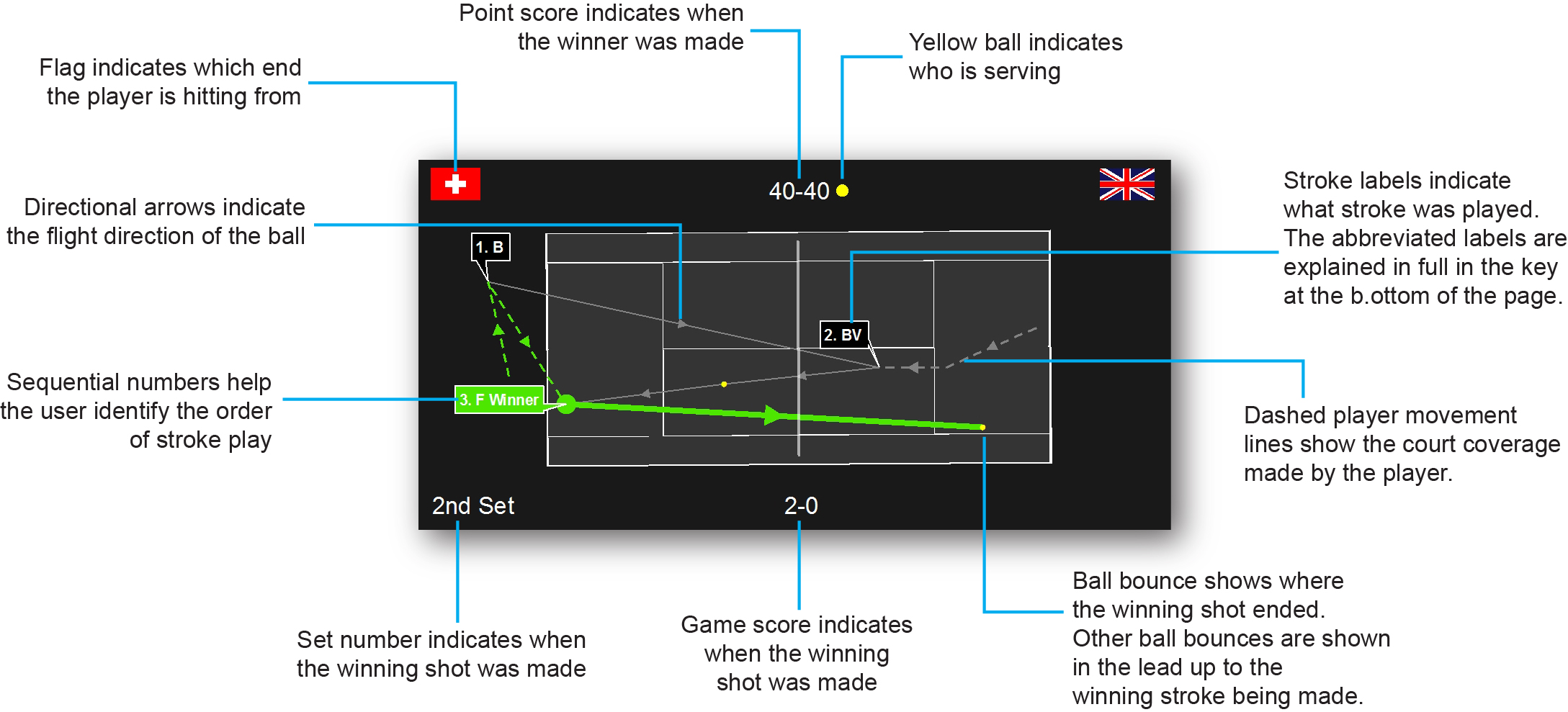
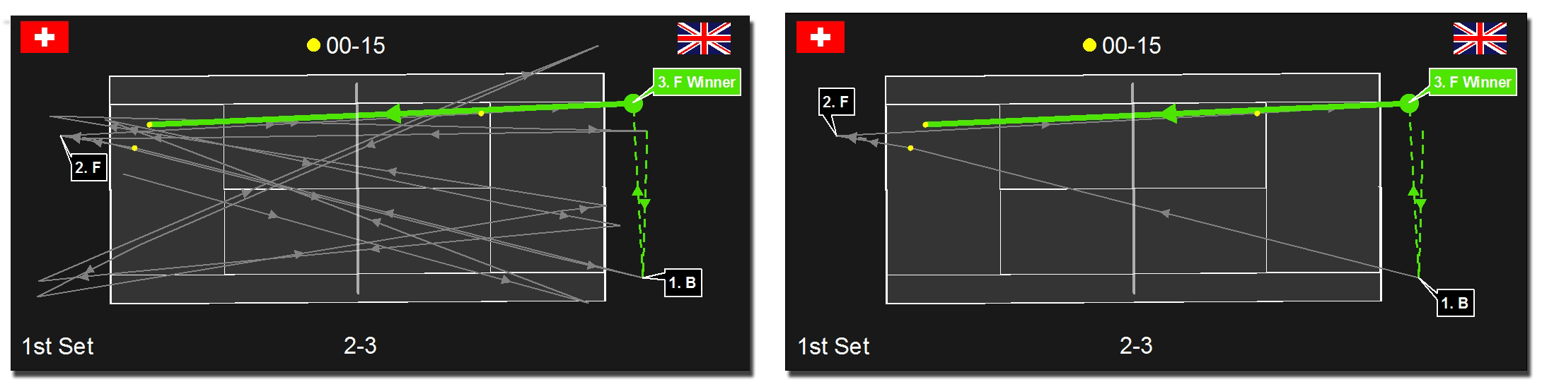
Spider Diagrams: The spider diagrams allowed us to visually link the serves to their target points and see the spread (length and direction) around each point. The spider lines for each zone allow us to very quickly see any bias in direction and distance towards the spread of serve around the points.  Without the lines it would be difficult to identify the serve clusters, and which central point they belong to.

Outliers: There were a couple of serve outliers for the Big Boys but these didn’t affect their averages enough to remove them from the calculations. The School Boys certainly had some big misses, but because there were multiple instances of these so they were left in the calculations.

More Data: With a larger dataset across different players we would be able to determine what is the expected norm, and whether these results are above or below that. Unfortunately, large serve datasets that are easily accessible to the players, coaches or analyst do not exist in tennis (hint hint ATP and WTA).

0.75 m: Let’s think back to part 2 of the blog for a minute. The size of the USTA target zones are 0.75 m square. Perhaps this tells us something. On average the four players missed by 0.83 m. Maybe the USTA set their targets knowing these missed averages and that is the reason for the particular size of the boxes?

To Summarize…

Over the course of the three blogs I have presented an alternative way of assessing a player’s serve accuracy using the USTA defined serve zones, and an additional two ‘higher risk’ zones. When comparing serve accuracy around the USTA zones there was very little difference between the four players. However once we started to analyze the serve towards the higher risk zones (the ‘optimum’ serve areas) the results started to lean in favor of the Big Boys, Federer and Murray.

I also set out to determine whether serve location really matters in tennis. The results suggest that it depends on what level of tennis is being played. The Big Boys clearly had more outright success on serves that landed in the USTA zones, and the higher risk zones than if they missed these zones. It was a different story for the School Boys however, as it didn’t appear to make any difference to their outright success rate whether they served in or outside the zones.

There is much work to be done in expanding the analysis of serve accuracy, serve success, and general serve patterns. Let’s hope we start to see more meaningful statistics from broadcasters and commentators about the serve in order to better understand who really are the best servers in the game!

Pinpointing the serve. Who’s better? The Big Boys or the School Boys?

(Part 2 of 3)

In part 1 of this 3 part series, I set out to find which player out of Federer, Murray and two NCAA Division 1 players were able to land the highest proportion of their serves in the USTA target zones.

Surprisingly the School Boys outranked the big boys in this simple comparison. However once we moved the target to include zones closer to the lines, Federer’s serving clearly stood out as being the most accurate. See part 1 for the complete results of the analysis. In order to gain some real value out of this analysis, I set out to determine if there was a positive relationship between serve position and outright serve success.

To explore this relationship I classified each serve into an ‘outright success’ category. Throughout the blog I will refer to an outright success point as a free point (to keep things simple).

Free Point definition: An error made by the player returning serve OR an ace made by the server. The remaining serves were either classified as being “returned in play” or “out” (fault).

For each player I generated a Serve Map (see Figures 4 A-D) showing the position of their serves in relation to the three target zones and their free point success.

Click to enlarge each map.

Federer ServeFigure A. Federer’s Serve Map

Murray ServeFigure B. Murray’s Serve Map

NCAA Tennis PlayerAFigure C. School Boy A Serve Map

NCAA Tennis PlayerBFigure D. School Boy B Serve Map.

Mapping the relationship between serve location and the effectiveness of serve. The Serve Maps also show where each player served when it mattered most.

School Boy A was able to collect 3 (50%) free points from his serves inside the zones, compared to 5 (42%) for School Boy B.

Federer picked up 13 (76%) free points from his serves inside the zones, compared to 18 (82%) for Murray.

Summary: The Big Boys picked up 31 (79%) free points from serves that landed in the target zones, compared to 8 (44%) for the School Boys.

Across all four players, 39 (68%) serves out of 57 that landed in the target zones earned the players a free point.

Serves that missed the zones: To test the importance of serve position I calculated how many free points each player picked up off of their serve that landed outside the target zones, but still within the service box.

Federer picked up only 4 (24%) free points on serves outside the zones compared to 13 (76%) inside the zones. While Murray picked up 4 (18%) outside the zones, compared to 18 (82%) inside the zones.

School Boy A picked up 3 (50%) free points when serving outside the target zones, which equalled his inside count 3 (50%), while School Boy B picked up 7 (58%) free points outside, which was more than his inside count of 5 (42%).

Summary:  The Big Boys picked up only 8 (21%) free points from serves that landed outside the target zones, compared to a surprisingly high 10 (56%) for the School Boys.

Across all four players, 18 (31%) serves out of 57 that landed outside the target zones earned the players a free point.

Take-aways:

Based on the data in this analysis the Big Boys clearly had more success on their serve when they landed their serve into the target zones (79% to 21%). This is a significant difference. At this level the Big Boys almost quadruple their chances of getting a free point off of their serve if they land it in the target zones!

Interestingly, the same trend didn’t occur for the School Boys. Player B recorded more success outside the zones than inside (58% to 42%), while School Boy A had the same level of success inside to out. So does it mean at the lower levels of the game that serve position is not all that important? Well it is quite possible. However we need to be a little careful about the above statement given the small-ish sample size and the fact that the study only included two players. It would be interesting to see what the numbers would do over a larger sample size, and with more players. Likewise for the Big Boys, would the high level of success remain with a larger sample spread over different players?

Overall across the four players free points were easier to get inside the target zones than out.

The USTA suggest that improving and practicing your serve location will help strengthen your game, and with some luck you might just pick up some free points along the way! Well that may well be the case, but it also might depend on which level of the game you’re playing!

In part 3…

In the final part of this three-part blog we are going to have some fun and address the most important question of all. Which player picked up the most free drinks by landing their ball in the center of the target zones? I present another series of maps showing spider diagrams to visualize how far each player was from the centre of each zone!

Mapping Roger Federer’s backhand

With the 2013 Wimbledon Championships just around the corner, I thought I’d take this opportunity to explore how Andy Murray exposed Roger Federer’s backhand in last year’s Olympic final on centre court at SW19.

Analysts claim that if Federer has one weakness it’s his backhand. But what is the most effective way to draw an error on the Federer backhand? Some say it is to force Federer to hit his one handed backhand above shoulder height. Whilst this may be true, as we have seen against Rafael Nadal many times there may be other ways to beat the Federer backhand.

Data from the Gold Medal Olympic match shows there is potential to draw a high error rate on Federer’s backhand by moving him backward into the shot.

Mapping Federer's BackhandMapping Federer’s backhands. The green swooshes indicate Federer’s movement to a backhand error or success. (Click image to enlarge).

Backward Movement to the Shot

We know that the direction and length a player must cover from their previous shot has a significant influence on the player’s next shot. In order to better understand the Federer backhand I plotted a vector of his movement to each shot (from his previous shot location). The map above shows his movement to a backhand error or outright success from his backhand. We can see from the map that 12 of Federer’s 14 backhand errors (86%) came from a backward movement to the shot. Some of the movement vectors are clearly more ‘backward’ in direction than others, but in any case there is a pattern here that may warrant further investigation. The length of movement to each error on his backhand varies from half a court to only a few steps.

Time: Success at important points wins you matches!

With a little more digging we can see further patterns emerging in the data. The map shows us that 52% of Federer’s backhand errors occurred on game point for or against him, compared to 22% on his forehand. To see this pattern a little clearer I labeled each of his errors with a time stamp, indicating when each of his errors (and winners) was made.

Federer Map Important PointsAdding a time stamp annotation to the map (like Ad-40, 15-40) allows us to understand the temporal component of Federer’s shot making tendencies.

The data from the match suggests that Federer is more likely to make an error at an important point on his backhand than his forehand. Perhaps his opponents at Wimbledon this year might want to take note of this!

Visual Exploration of Spatial Data

GameSetMap is always searching for new ways to visually explore the spatial component of tennis and I hope you agree that this infographic of Federer’s backhand begins to the lay the foundations of a potentially interesting story, a story that perhaps tells us a little more about how to draw an error on Federer’s backhand, and when to attack his backhand.

Examples like this are just the tip of the iceberg. We have much work to do in sports analytics for tennis, but hopefully this example and others like it ignite further work and discussions about what’s possible with spatial tennis data!

Notes: As discussed in my earlier research there are other spatial components that could be integrated into the map that could potentially help improve the analysis and strengthen the argument. Clearly the speed and spin on the ball are other important variables that if available would further enhance the story.

Using ArcGIS for sports analytics

The statistical component of sport has always provided a fascinating way to analyze performance and success. This might simply be the final score, but for some sports, such as football, baseball, cricket, golf and tennis, meaningful analysis of every facet of the game and a player or team’s actions is part of the essence of the game itself. It is as common to see statistics and graphical summaries of the action reported as it is to see the action itself and this provides a fascinating insight into strategy as well as an explanation of outcome. In this blog entry we explore the results of the London Olympics Gold Medal tennis match between Roger Federer and Andy Murray to show how you can use GIS to identify particular patterns within the match that may not have been exposed by using traditional non-geographical analysis and display techniques.

Created using ArcGIS, figure 1 shows the location of where each player played a winning shot and their movement during every point of the gold medal match.

Figure 1: An infographic showing the player movement and winning shot positions from the Olympic Gold Medal Match between Roger Federer and Andy Murray.

Whilst figure 1 certainly carries a lot of visual impact it doesn’t actually tell us a whole lot. The player movement lines overlap one another and make it hard to distinguish which line relates to which point. We cannot tell the direction of movement in many cases because there are no directional arrows. The infographic also doesn’t show where the winning stroke landed, or the direction of the shot. It also fails to show the temporal component of the match.

Figure 2: The complete data set from the Olympic Gold Medal Match. 1708 point locations were collected from the 3 set match

Capturing the data

For the study we captured the  tennis match data using ArcScene 10.1 and video footage of the match (see figure 3). We built a court at a scale of 1:1 in its correct geographic location (center court at Wimbledon) and were able to quickly capture the location of each player’s stroke and corresponding ball bounce for the match entirely from the video footage. At each location we collected a set of key attributes like who played the stroke, what type of stroke it was, the stroke number, point number, game number, set number, who was serving etc. The data captured provides a statistical summary of every shot in the match.

Figure 3: Video footage of the match in ArcScene. The red dots represent the player’s stroke position and ball bounce. The green lines represent the direction of ball travel for each shot.

By using ArcScene we were able to plot the player’s position and ball bounces to within +/-20cm using the 3D editing tools. We approximated the camera angle of the video footage and set our data view to match. This made the data capture process rapid and increased accuracy, compared to a 2D environment, because we were able to continuously match the changing camera view in the video by using the Navigate Scene control in ArcScene. This also helped us counter the scale distortion in the camera view when capturing points at the end furthest from the camera.

Once all of the point data was captured, we used the XY To Line tool to create connectivity between the points using the shot, point, game and set number attributes. The lines are instrumental in allowing us to visualize stroke patterns (as you will see later in the blog entry). We ran the same XY To Line process to create player movement lines.

Visualising the data

Statistics from the match tell us that Andy Murray made a total of 18 winners to Roger Federer’s 13. What these statistics don’t tell us is where those winners occurred, the stroke of each winner, when the winner occurred and what led to the winning shot occurring. They also fail to show us any potential stroke patterns during the match. By capturing and storing all of the match data in a file geodatabase (figure 4) we are able to take advantage of the geo-location of these winners and create some interesting visualizations to tell a far more interesting story than single snapshots allow.

Figure 4: Using a file geodatabase to store sports data in ArcGIS

One of the challenges in dealing with sports data is that there are many instances of similar events occurring at the same or similar locations over relative small periods of time. This often results in very tight clusters of points over very small areas of your court, pitch or field. If your data has an element of connectivity, you will additionally have overlapping lines along similar bearings and distances or lines that run in completely random directions, depending on the type of sport you are analyzing. This provides us with an interesting challenge of how to represent and compare this information meaningfully.

One way to make sense of so many overlapping points and lines is to use a visualization technique (often promoted by Edward Tufte) called Small Multiples (see figure 5). Small multiples use a series of common basemaps (in our case a tennis court) with different slices of data on top of each map. The maps are arranged in a logical sequence, much like animated movie frames. Small multiples are useful to disaggregate your data, reducing the visual complexity and quantity of information so that it can more easily be seen and interpreted.

Figure 5: Andy Murray’s winning three shot sequence visualized using small multiples. The green lines represent the forehand winning strokes and the blue lines, the backhand winning strokes.

Figure 5 allows us to very quickly see some important patterns from the match that were not visible using traditional tabular statistics. The most immediate pattern observed is the direction of each winning shot (half of Murray’s backhands were down-the-line winners). You can also quickly identify the position of where the player made the winning shot (half of Murray’s shots were made deep inside the court, near or around the service line) and the type of shot that was played (Murray’s number of forehands to backhands ratio was 10 to 8). Temporally, we can see that 7 of Murray’s winners were made on game point, either for or against him. Figure 6 illustrates the amount of information each small multiple illustrates and, therefore, the potential for recognition of patterns across a game or match.

Figure 6: An explanation of the variables being mapped in the small multiples matrix

Each individual image presents a second level of visual information that is likely to suit coaches, players or die-hard fans who want to know a little more about the game’s pattern of play than maybe your average tennis fan or someone scanning the morning news. We have added some important temporal labels to the images to help users identify when the winning shot occurred, we have varied the colour and lineweight of lines in each image to reflect a level of importance and distinguish between line classes.  Each stroke location is dynamically labeled from the stroke field in our file geodatabase, as is the sequence number. The player movement lines show us where the player has run from to make the winning shot. In 6 of Andy Murray’s winners, he moved a considerable distance across the court to make the winning shot. The player movement lines also allow us to see the previous one or two strokes without actually showing the stroke lines on the map.

You will notice we are only showing the two shots prior to the winning shot being made. We are mapping the ‘set-up‘ stroke (point 1), the opponents returning stroke (point 2) and the winning stroke (point 3). Showing more than two lead up strokes prior to the winning shot can cause confusion and potential distraction to the user (figure 7).

Figure 7: The image on the left displays all of the strokes (14 in total) leading up to the 4th winning shot. The image on the right displays only two shots leading up to the winning shot.

Some generalization is needed to ensure you don’t overwhelm the user with information. Finding the correct balance of generalization is one aspect of the research that we are continuing to explore. Trying to determine how many events, and what type of events led to a particular event happening is incredibly dynamic and problematic so it is vital erroneous assumptions aren’t introduced during generalization.

In order for the small multiples to work better in sequence we rotated the data frame of each image using the Data Frame tools in ArcGIS. This allowed us to map all Murray’s shots from one end and Federer’s from another which enabled clearer patterns in the match to be seen. Whilst it was suitable in this instance to shift all of a players strokes to one end for visualization, in some cases this might not be suitable if, for instance, there were particular weather conditions that made play at one end more challenging.  In this situation, being able to assess how different players react to different conditions might be an important component of the pattern of the match itself.

Having already explored Murray’s winning shot sequence, let’s take a quick look at Federer’s three stroke winning pattern in figure 8, below.

Figure 8: Roger Federer’s winning three shot sequence. The green lines represent the forehand winning stroke and the blue lines, the backhand winning stroke.

Federer made only two winners on his backhand side (indicated by the blue lines) and 10 out of his 13 winners came directly from the result of moving his opponent off the court from a wide serve, leaving an open court for Federer to hit an easy winner into. His two backhand winners were both struck with little or no room for error. These two shots could have easily missed the mark, leaving Federer only 11 winners from 3 sets of tennis, all from the forehand side. Five of Federer’s 13 winners came at either game point against or for him.

The small multiple format was perfect for this type of analysis. We were able to present a series of events over time in a logical, clear and concise manner. The two examples of gameplay explored in this blog entry show how powerful representing the results of sports data in a graphic form can be using GIS. By glancing at the images you take more away from the data than you would by simply seeing the totals of each winner in tabular form. By exploring them in detail we are able to reveal dimensions in the points, games and match that are simply impossible to gauge from other approaches. We are currently working on ways to animate particular scenes and looking into applications that serve the data up in an online environment giving users the ability to query the map for themselves and run their own analysis on the data.

Sport Analytics is a growing field, but currently a less frequented field in the world of GIS. Some of the worlds largest sporting organizations like Manchester City, Adidas, Nike and leagues like the EPL, NBA and AFL and are capturing every movement their players make and recording their actions. The challenge is to understand the best way to present this data to the players, coaches, media and fans.